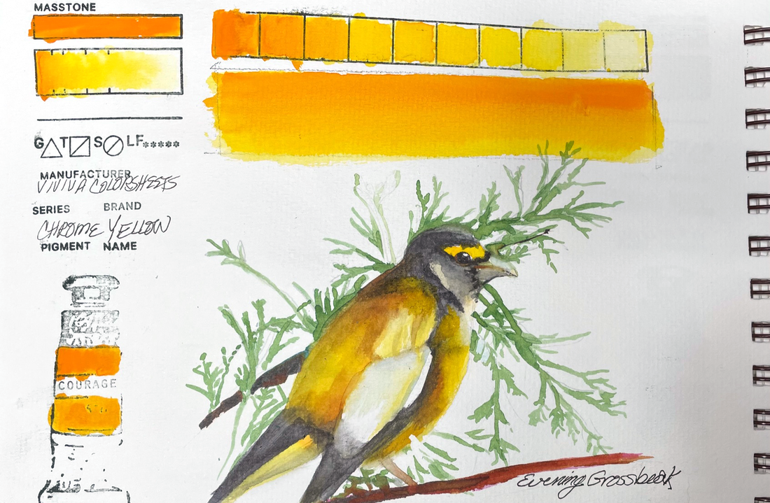
 CHROME YELLOWViviva's Chrome Yellow Colorsheet is reminiscent of New Gamboge and a lovely portion of their 16 Color Palette. It is transparent, vibrant and a stainer. It does lift with some effort but the yellow ghost it leaves does not go unnoticed. Just plan for that and it will be your best friend for a warm yellow when you are out in the field.
Every year, for a couple of days in May, we get a great visitation from a number of Evening Grosbeaks. What a lovely, sunshine yellow treat.
0 Comments
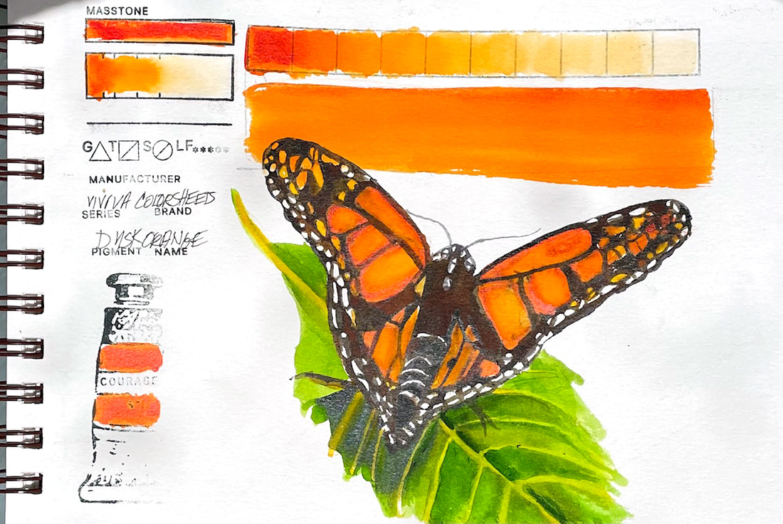 DUSK ORANGEDusk Orange by Viviva in their "Original" Colorsheets Set is the yellow end of the spectrum when it comes to the reds and oranges in their sets. It is, then, a nice compliment to their offering and necessary to allow for a full range of color in a set that can be taken on a hike at a moments notice. This orange was exactly what I needed to make this little butterfly take flight.
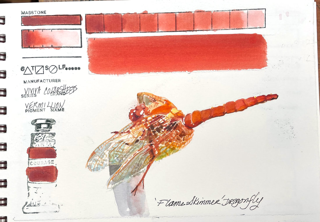 VERMILLIONFalling somewhere between Transparent Pyrrol Orange and Perinone Orange, this warm reddish orange pigment infused sheet from the Original Set of Viviva Colorsheets is stunning. A few years ago, a flaming orange dragon fly choose to land on my care antennae, and "hung out" with my granddaughters, daughter-in-law and I as a sort of gift after the recent passing of my daughter-in-laws father. That special visit has remained in our hearts and minds ever since. Painting the messenger today brought back many of the same emotions.
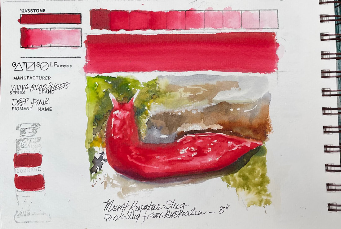 DEEP PINKViviva Colorsheet, Deep Pink is fairly similar to their Crimson, maybe just a tiny it more blue but not much. But like I said yesterday, I love red and this is beautiful. And yes, there really is a deep pink slug. Of course it is found in Australia, like many other very interesting, and sometimes deadly critters. This one, the Mount Kaputar Pink Slug, is about 8" long.
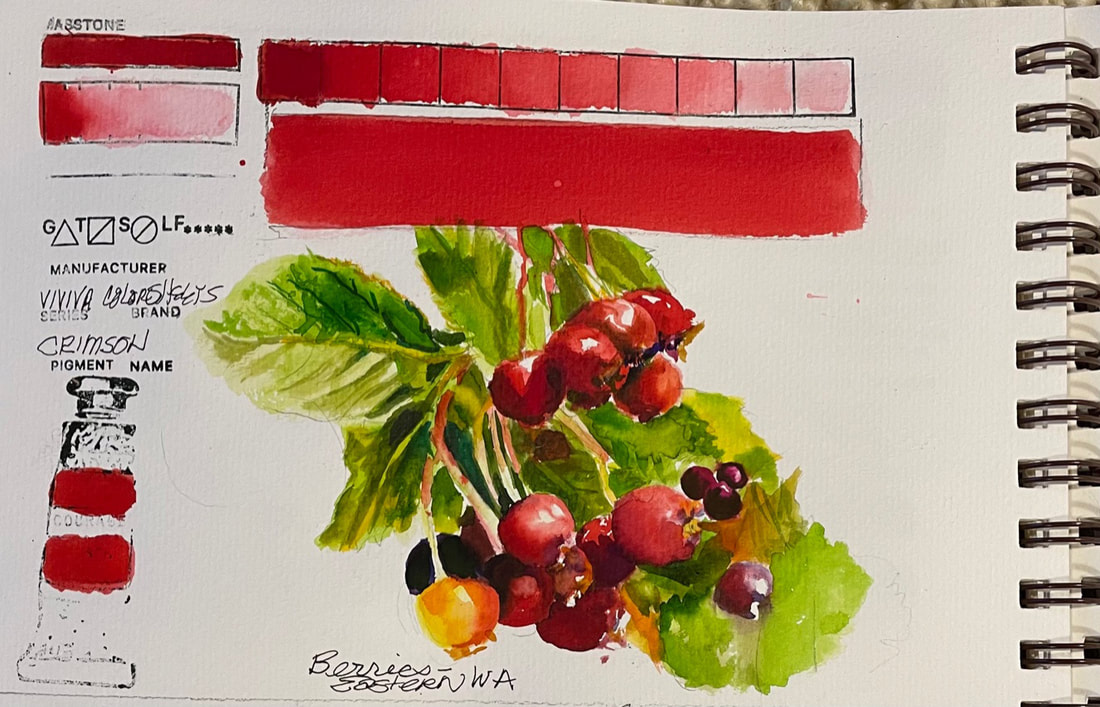 CRIMSONCrimson is the first color in the "Original" set of Colorsheets by Viviva. I love red, but this red is gorgeous. And the berries were the perfect image to play with Crimson. It is a vibrant red similar to Cadmium Red Deep and delivers a full range of values.
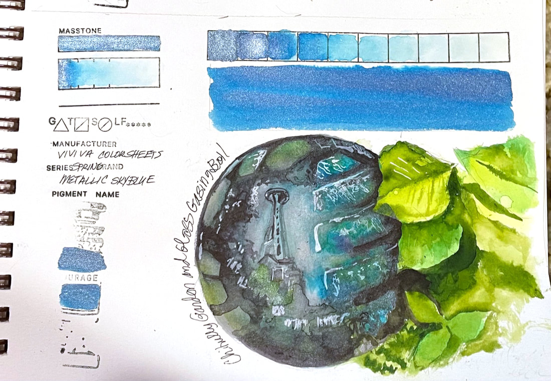 METALLIC SKY BLUEViviva's Metallic Sky Blue, the last of the Spring Collection, is again the interesting blend of iridescence and transparency. I experimented with layering Metallic Sky Blue over Slate Black, from the Viviva Colorsheets original set of colors to create this image of one of the gazing balls in the Chihully Garden and Glass exhibit at the Seattle Center. Had my watercolor skills been better, it may have been very successful, but in a quick sketch, this was a challenge outside my reach. Yet I learned a little more about painting glass along the way and this challenge is about learning, trying new colors, pushing my limits. With that in mind I would say this was a useful experiment with a fun color, Metallic Sky Blue.
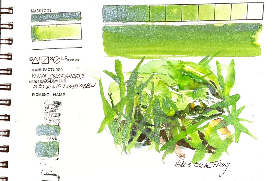 METALLIC LIGHT GREENAnother of Viviva's Metallic Colorsheets in the Spring Collection, Metallic Light green also delivers a uniquely transparent metallic color that seems to float its iridescence on top of the color while allowing for a view to the layer underneath. The result is a not too sparkly but still dewy looking yellow green that made this little frog hiding in the grass fun to paint.
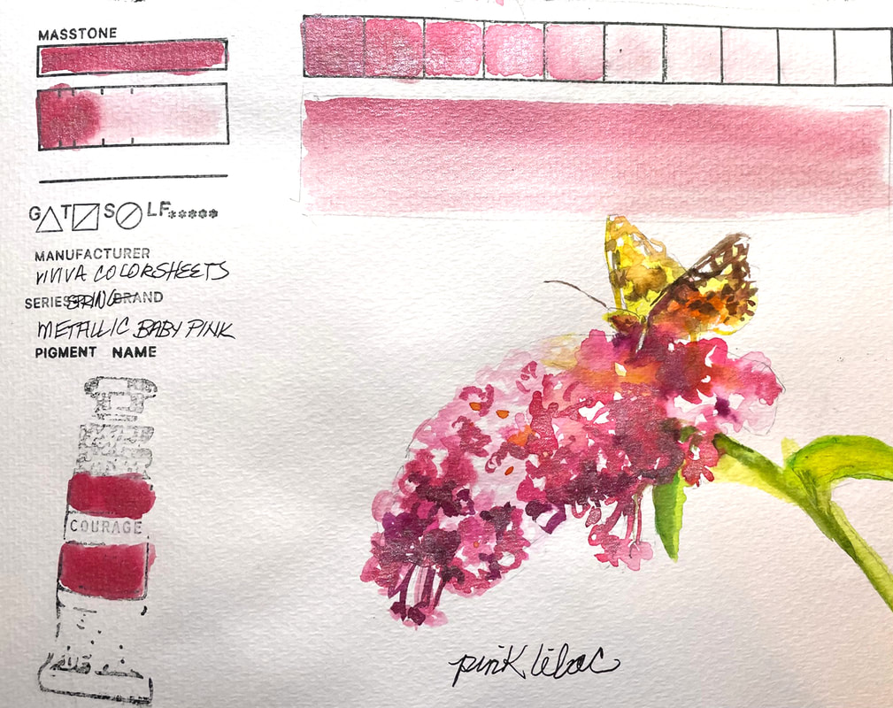 METALLIC BABY PINKViviva Colorsheets Metallic Baby Pink is a unique mix of iridescence and transparency that delivers a wide range of pinks from soft and delicate to intense nearly quinacridone rose. This was a fun one and a good excuse to paint a pink lilac.
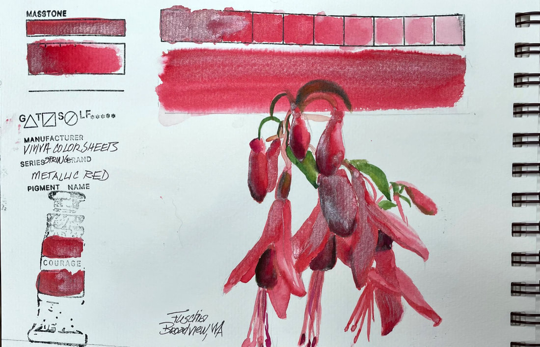 METALLIC REDThis is the first of four metallic colors in the Spring Set of Colorsheets by Viviva. I usually don't have much use for metallic colors, although they can be pretty fun decoratively speaking. Viviva's metallic colors are more transparent than others I have used. Depending on where you activate and pull paint from on the chip, there is a fairly wide range of metallic to color ratio. The metallic portions of the paint seem to float on the top with color visible from underneath which in this case worked for me. The opalescence rendered the waxy quality of the fuchsias nicely with very little effort on my part.
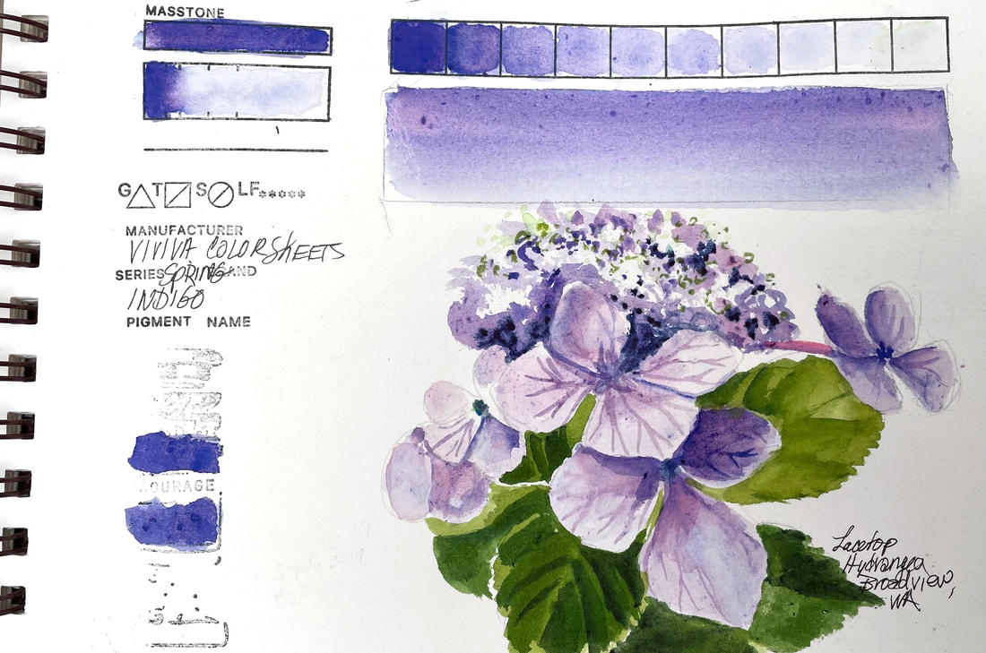 INDIGOViviva Colorsheets have some properties unlike other watercolors, whether tube, pan or stick. These dry, pigment infused sheets carry intense, transparent colors that for the most part have equivalents in other brands. But Indigo is not one of those. It has a propensity to split into several underlying pigments, depending on where your brush touches the sheet with water to activate the color. It ranges from a deep Ultramarine to violet and even a faint greyed lavender. While not what the name might indicate, this is a lovely chameleon like color that tends to grow into a hard to capture hydrangea bluish violet. It doesn't bother me that the color is difficult to nail down, knowing that, I just let it do the work. If I had depended on it being "indigo" perhaps I would be frustrated. Uncontrollable as it is, I really like it. Besides, their Midnight Blue is as Indigo as it gets and would be my fall back if I was looking for a deep dark blue to add burnt sienna to for a dark neutral. Save this beauty for special occasions.
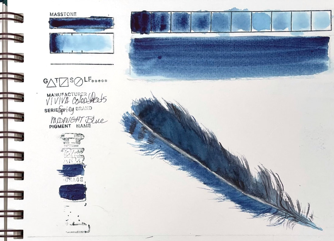 MIDNIGHT BLUEViviva's Midnight Blue from their Spring Collection is much closer to Indigo than the sheet marked Indigo. Midnight Blue is dark and moody and plays nicely with their Slate Black (similar to Payne's Grey). Just about perfect for the Stellar Jay feather that found its way to my drawing board today. (Spoiler alert: July's Nature Sketchbook Club involves not only feathers, nest and eggs, but just might include a set of colorsheets, stay tuned for more details.)
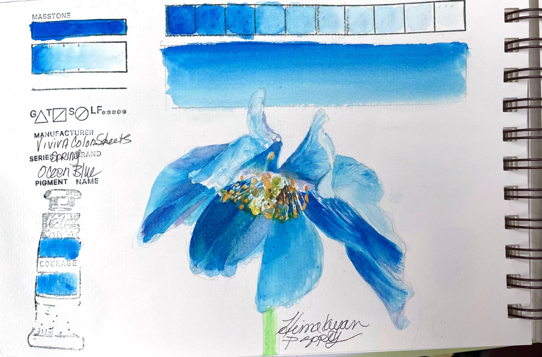 OCEAN BLUEOcean Blue, which falls somewhere between Cerulean Blue and Manganese Blue Hue, is one of the Spring Set of Colorsheets by Viviva. Lovely, transparent, vivacious blue, whose name says all of that in just a word. Oceans, and the rare blue flower, like this gorgeous Himalaya Poppy beg for Ocean Blue pigment. In all honesty, I added a bit of this brands more violet blue, which I will swatch later this week, called Indigo but has cool purplish undertones that helped me find the center of this poppy and push the petals in shadow back a bit.
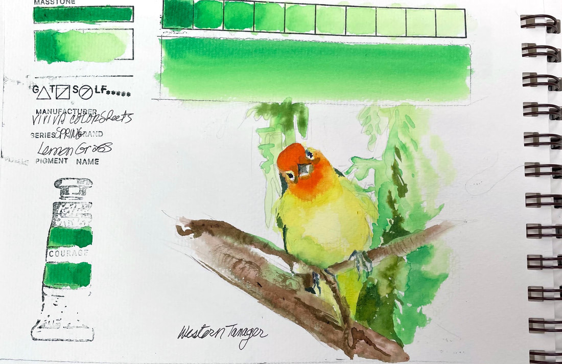 LEMONGRASSThis spring green is another of the aptly named collection "Spring" by Viviva Colorsheets. Lemongrass is soft, though brilliant if that is possible, and layers to build toward clear bright color reminiscent of a "permanent green" by other brands. My brother is an outstanding bird photographer and caught this great picture of a Western tanager this weekend. The luscious spring green foliage surrounding the perched citrusy confection turned it a slightly greener shade of yellow and a perfect subject for a test of Lemongrass.
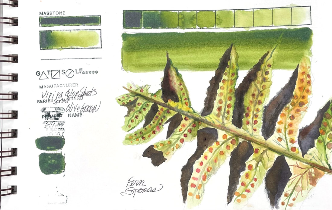
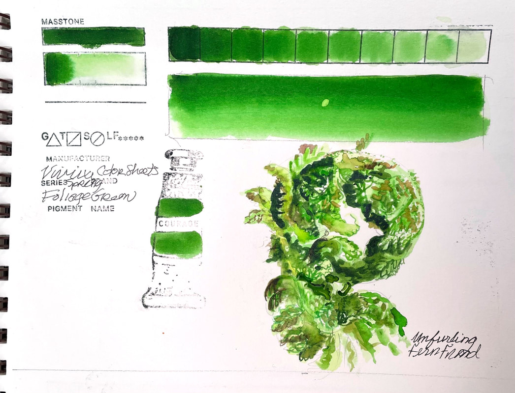
FOLIAGE GREENViviva' s Foliage Green, like other colors in their Spring Set, is a bright, clear green, transparent and intense.
Adding a little yellow or orange can bring it down to a believable "foliage" color. The unfurling fern frond was just about that bright though, so I got a chance to use this green almost straight from the tube, or in this case straight off the color sheet.
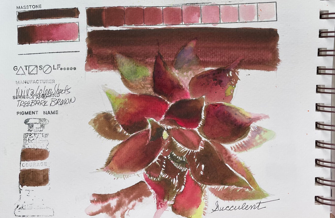
TREE BARK BROWNTree Bark Brown, from the Spring Set of Viviva Color Sheets, is an unusual color, or at least behaves unusually. I found that depending not only on the amount of water I used, but where I activated the color sheet from, I came up with different shades of brown to Bordeaux or even a dusty pink. This was not a negative in the case of the succulent I was painting as it had that range of brown to wine or pinkish areas. This meant I really only needed a green and a very watery blue to complete the palette for this one. Tree Bark Brown did not seem to be as much of a stainer as the other pigments so far. I found it fairly easy to lift compared to the others I have swatched so far.
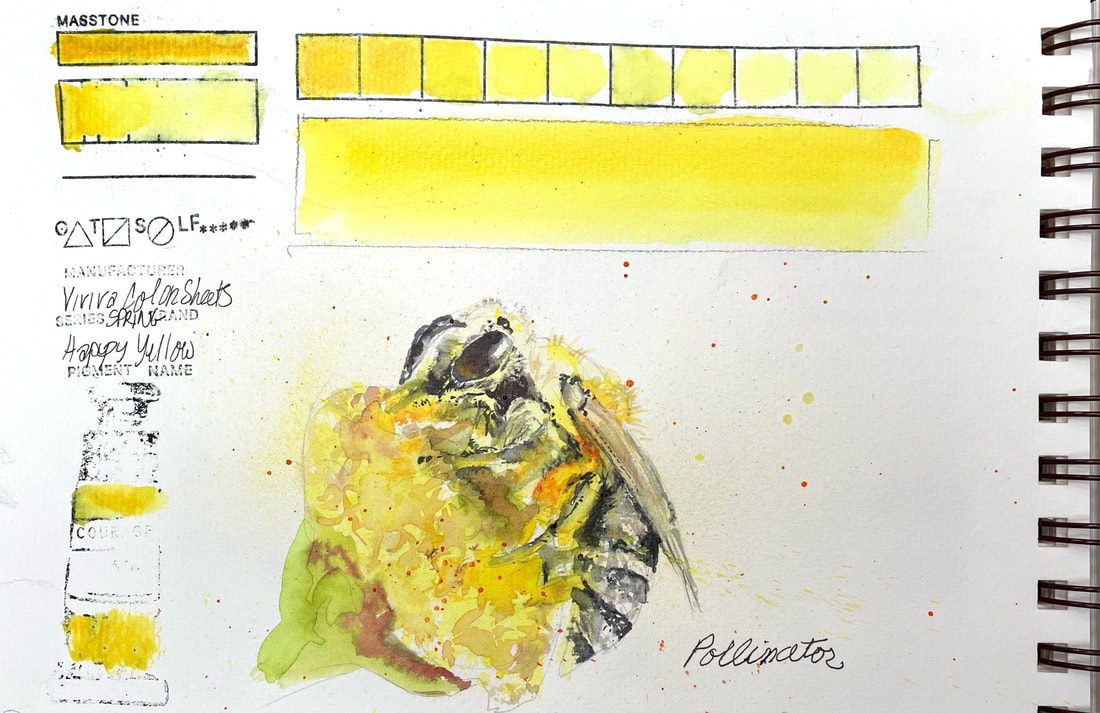 HAPPY YELLOWViviva's Happy Yellow from their Spring Collection, lands between Cadmium Yellow Light and Hansa Yellow Light. Transparent, and nearly impossible to dilute beyond a pale yellow, this one hangs in there. I accidentally carried yellow into another project thinking I had cleaned my brush well. And yet even with all that intensity, this is a delicate yellow and worked well for a pollen frenzied bee.
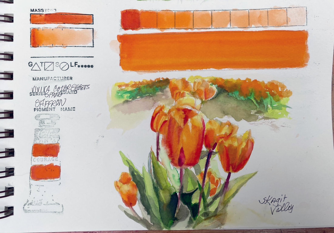 SAFFRONViviva Saffron is a juicy, transparent orange, falling somewhere between Pyrrol Orange and New Gamboge. On the rare occasion that I get to paint with this much orange, this would be a lovely choice, especially out in the field. Viviva Color sheets are highly transportable, so this one is going with me next time I head for the Skagit Valley Tulip fields.
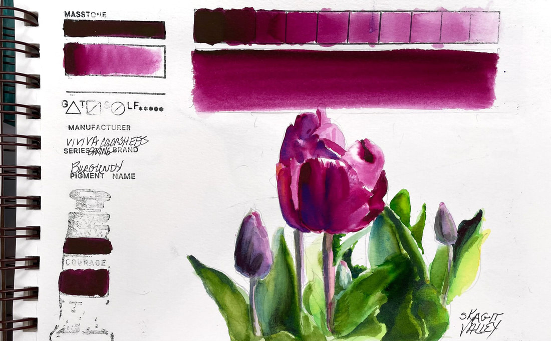
BURGUNDYBurgundy, another of Viviva's color sheets Spring Set is comparable to Daniel Smith Cobalt Violet. It is a beautiful, intense red violet. Depending on the water to pigment ratio, it can move to a red or to a more purple violet. Full strength is is close to Boudreaux bordering on black. Best color for this beauty found in a field of tulips in Skagit Valley, WA.
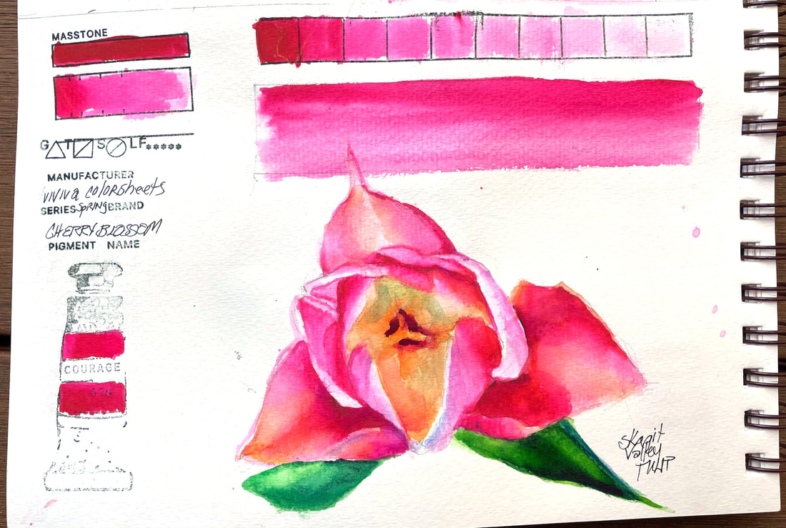
CHERRY BLOSSOMCherry Blossom, the second in my swatches from my new set of Viviva Color Sheets, this one from the "Spring Set" is quite similar to the color tested yesterday, Vivid Red, but a wee bit pinker and reminiscent of Opera Rose. Like Opera Rose, a wash of this pigment over the top of other colors gives new zing to the color it overlays.
As with Vivid Red, this is another intense, staining pigment but with a little effort can be lifted somewhat, but not back to white very easily. Over time, I am sure I will get used to the differences, like the propensity to blooms, but not until you have walked away, cheeky little tricksters. I was able to soften edges a bit easier today than the first try at my new color sheets. I do love the bright, cheery colors they produce so far. |
SOUL“I am a contemplative artist who has trouble accessing verbal skills. Finding the right words to talk about the amazing things I observe around me can be frustrating. It is much more natural for me to pick up a paintbrush, some embroidery floss or my camera when I wish to share some new discovery. The artwork I create is meant to be enjoyed on whatever level the viewer experiences it and not layered with complex meaning. Feathers, fur, flowers and the incredible variation I find in wildlife not only inspire me, but compel me to share every nuance with you. Archives
June 2023
|
 RSS Feed