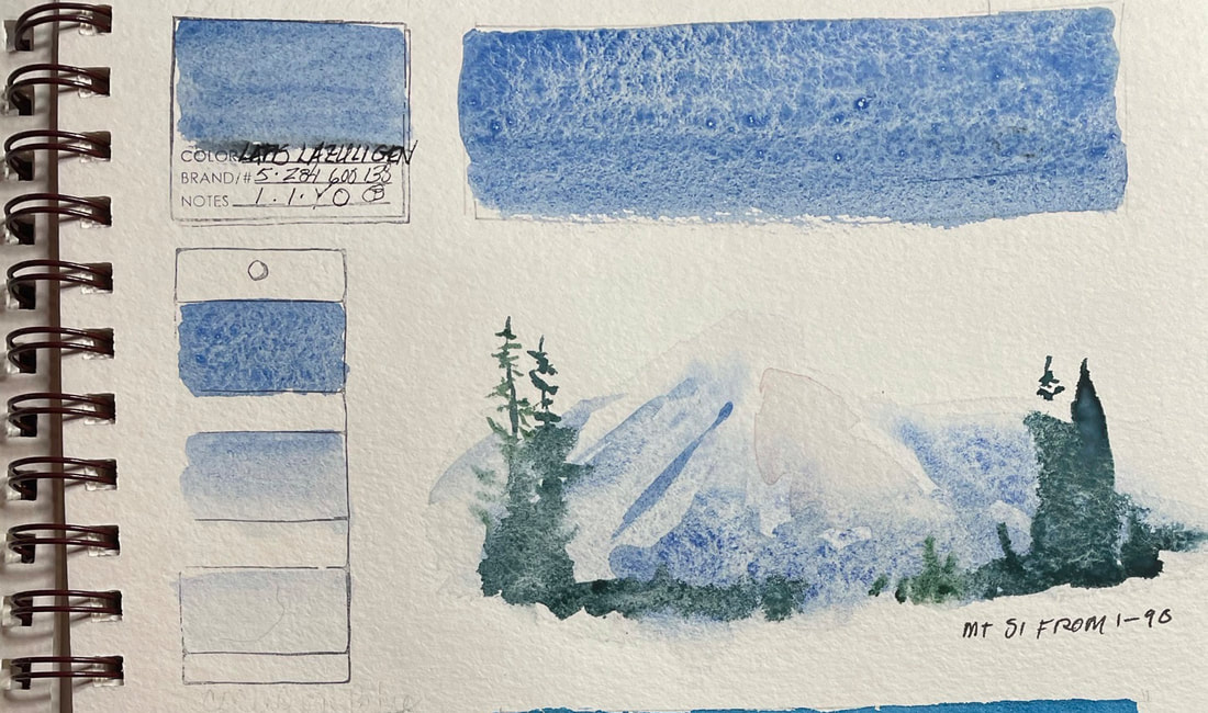
LAPIS LAZULI GENUINELapis Lazuli has been prized for its beauty and its perfection. Ancient civilizations believed that the veins of glittering pyrite (fool's gold) in the lapis were actual gold, making it even more valuable. Today as in the ancient world, extraction is difficult due to the hardness of the stone. It can only be mined during the warmest months from mines in the mountains of South America. The subtle blue grey, denim color of the this light reflective granulating pigment makes it as interesting as it is unpredictable with surprising results.
0 Comments
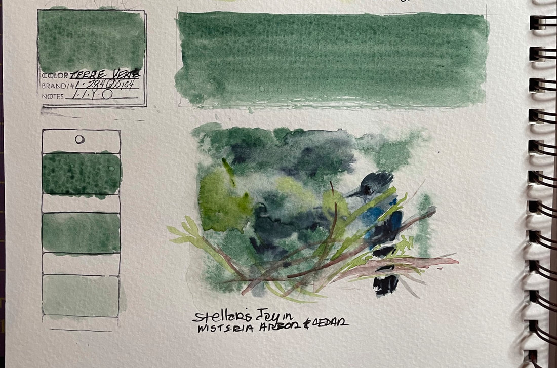
TERRE VERTETerre Verte, green earth, is a classic green that transparent and non-staining, Daniel Smith calls it "a lightfast formulation of Viridian and Raw Umber". They suggest using Terre Verte with Undersea Green and Raw Umber Violet for natural-looking landscapes. I find it to be granulating to some extent, floats nicely into a watery wash and a nice green the bluish side, excellent for rendering the evergreen forests in the Pacific Northwest.
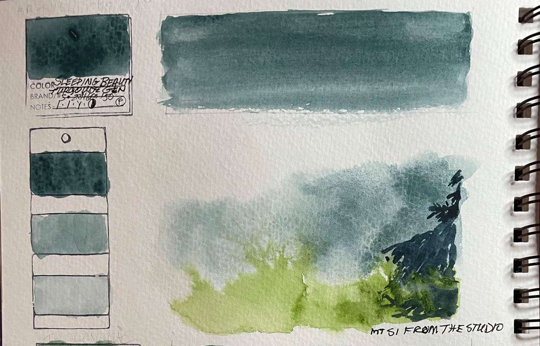
SLEEPING BEAUTY TURQUOISEDaniel Smith calls Sleeping Beauty Turquoise a "unique and vibrant blue" although I see more green than blue. The pigment is one of their "Primaktek" gemstones and is named for the location they found it in the Sleeping Beauty Mountain in Arizona.
Since 1998, Daniel Smith has been procuring and grinding a special line of pigments from gemstones. "Primatek" pigments are beautiful granulators that often break down into several other colors. They have produced high quality, luminous pigments that for the most part are lightfast. While they say Sleeping Beauty Turquoise is lightfast, I have read differing results from artists who have done their own lightfastness test. The first use of Turquoise as pigment dates back to Egyptian "blue" from the Bronze age and civilizations have found deeply spiritual qualities and meaning in the color ever since. It has been deemed precious both for the gemstones rarity as well as the difficulty refining and making the exact hue desired.
What is a "staining" Pigment? Pretty much what it sounds like, a pigment that is very strong and leaves a mark. Prussian blue is one but not as much of a brute as the Phthalo colors, Alizarin Crimson, most of the Cadmiums, Permanent Magenta, Hansa Yellow, Hooker’s Green, Indigo and Payne’s Gray, among others. Daniel Smith's Anthraquinoid Red, Perinone Orange all the Quinacridones.* Stainers flow beautiful and put down wet, mingle with other colors. As long as the are wet, staining pigments can be lifted and washed back, but once dry, they are a force to be reckoned with. Staining pigments have strong clear color, and can be used well as a first wash. But there is a drawback, if you try to glaze over a stainer with another stainer or worse yet two more, the color on top will kill the under color and flatten the top color out. *See "Caroline Buchanan: Making Sense of Staining, Sedimentary and Transparent Pigments" an article for Dan Smith here
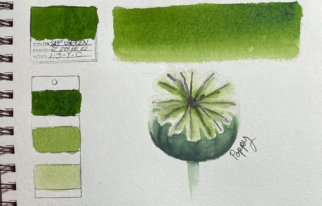
SAP GREEN
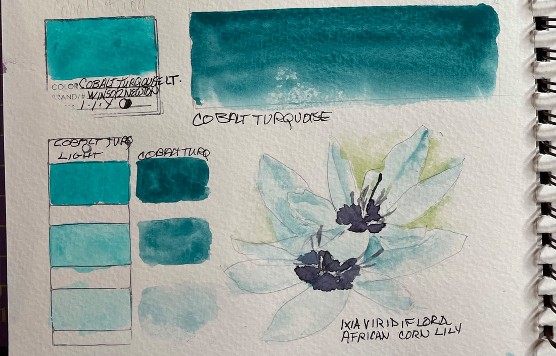
COBALT TURQUOISE Cobalt Turquoise is a non-staining teal blue that layers and granulates. Cobalt was first discovered as an element in 1755 and the first cobalt pigment to be developed was cobalt green in 1780. Cobalt Blue was developed in 1802 . During the 19th century at least two cobalt violets became available and a cobalt yellow. In the 20th century improved new cobalt greens, cerulean, and turquoise cobalt pigments were developed. Cobalt pigments are amongst the most permanent.
Cobalt Turquoise is a compound of cobalt and chromium. it is related to the chromium agent that gives emeralds their green color. Landscape and maritime painters value this ocean colored pigment for its ability to portray the sea and even eucalyptus. From: Matisse Professional Artist's Acrylics and Mediums
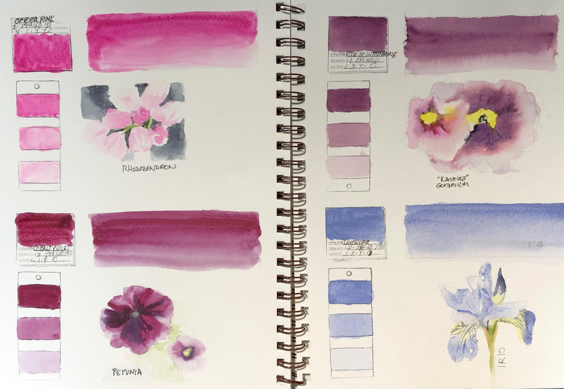
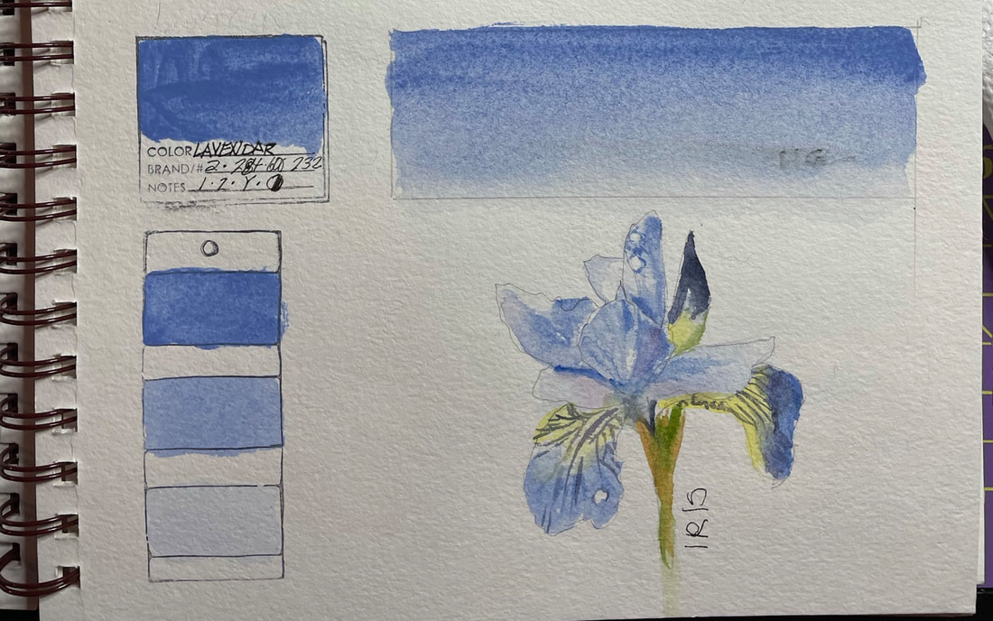
LAVENDERLavender is one of the 12 Colors of Inspiration in one of Daniel Smith's Hand Poured Half Pan Watercolor Sets. This gentle periwinkle blue is semi-transparent and a great choice for florals. I found it granulated well and was perfect for painting an iris. Some artists have found it to be a wonderful layer in shadows.
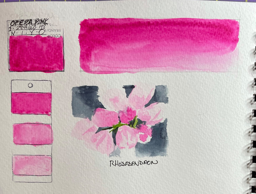
What is fugitive color? Some pigments, especially violet reds like rose, carmine, magenta or maroon, hues that rarely occur in inorganic pigments, when exposed to strong sunlight, humidity, temperature, pollution are impermanent. They will lighten, darken or change completely and should be considered temporary. Modern chemistry has made some remarkable advances within this hue group. My father, (remember, he was a chemist) worked for Dupont and spent part of his early career working to come up with a less transient red dye). So devious these spectrum standouts, a feast for the eyes and the soul, yet they should be avoided or at least only used for fun, never in a professional watercolor painting that you intend to sell. You may find conducting your own experiment to test this enlightening: Paint opera pink (or any of the others named above) in a solid swatch or row of swatches if using several colors, and then a second identical row. Cover one row up with a solid piece of watercolor p:aper or cardboard paperclipped to it. Set the test sample in a window with strong light for a few weeks or months and then take a peek at the row that has been covered up. You may be surprised at what has happened to that beautiful pink that glowed its way into your heart.
 |
SOUL“I am a contemplative artist who has trouble accessing verbal skills. Finding the right words to talk about the amazing things I observe around me can be frustrating. It is much more natural for me to pick up a paintbrush, some embroidery floss or my camera when I wish to share some new discovery. The artwork I create is meant to be enjoyed on whatever level the viewer experiences it and not layered with complex meaning. Feathers, fur, flowers and the incredible variation I find in wildlife not only inspire me, but compel me to share every nuance with you. Archives
June 2023
|
 RSS Feed