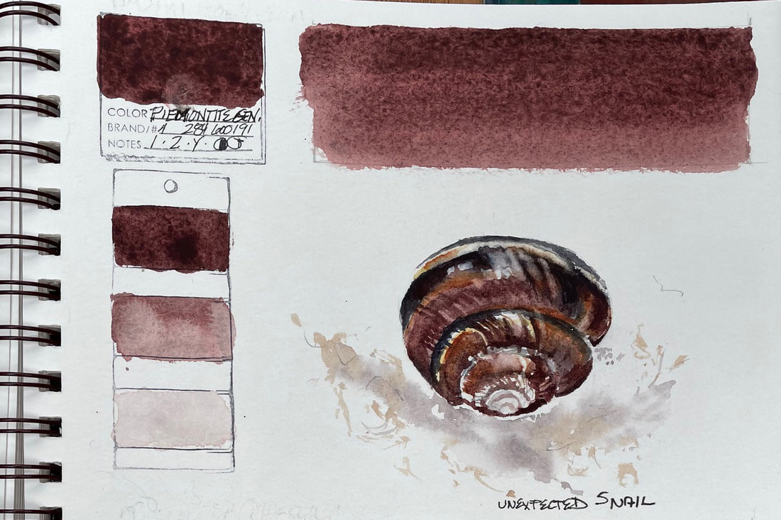
PIEMONTITE GENIUNEPiemontite Genuine is ground from a scarlet-streaked sorosilicate mineral in the monoclinic crystal system from the hills of Italy. It is one of Daniel Smith's PrimaTek watercolors. Used full strength, Piemontite is a deep ruddy violet, while a watery wash granulates to a warm violet-brown that worked beautifully for this snail shell. Piemontite adds complexity to shadows and mottled rusty surfaces.
0 Comments
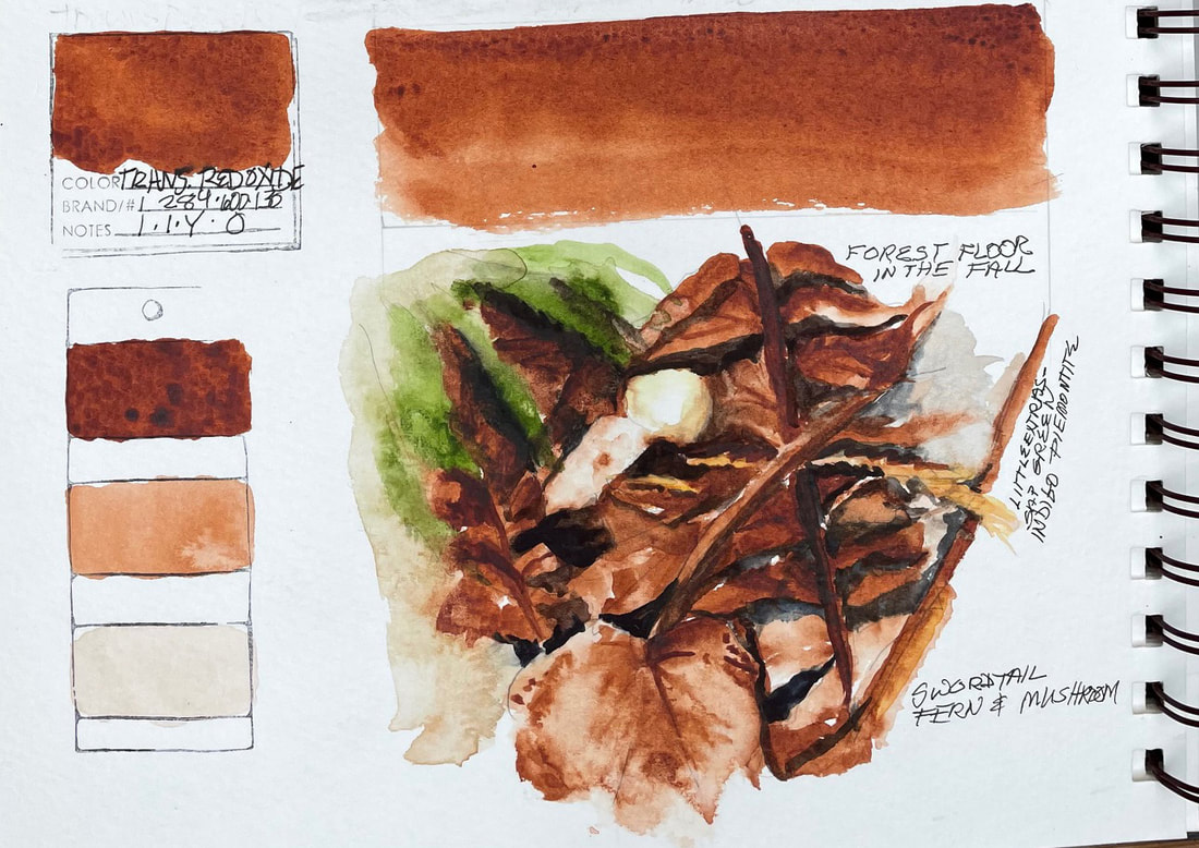
TRANSPARENT RED OXIDETransparent Red Oxide is a highly transparent burnt orange. I enjoyed working with this new discovery so much that I may substitute it for my burnt sienna as my new neutral. I love the way this pigment mingles and settles with indigo or neutral tint to create new tones of spice and rust. I found it perfect for the forest floor image rendering the autumn palette of spent swordtail fern and decaying leaves. I can almost smell the earthy perfume. Daniel Smith suggests glazing it over French Ochre for a fireside glow or to layer it over itself for a rich red ochre.
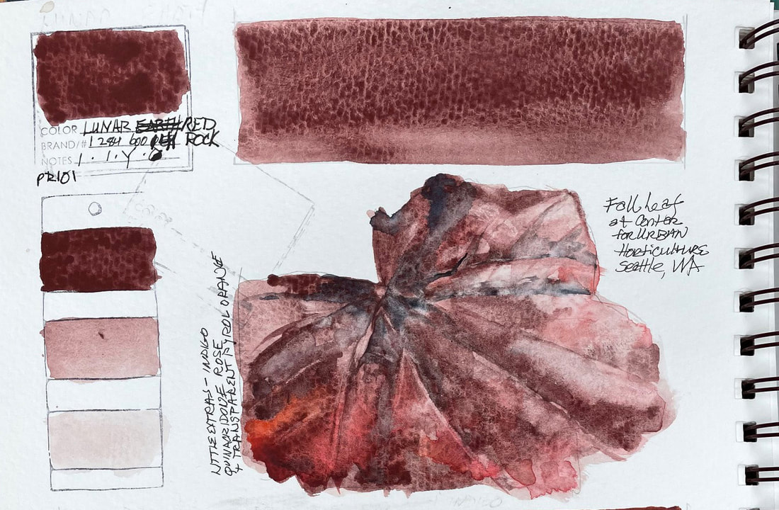
LUNAR RED ROCKLunar Red Rock is a warm burgundy that unleashes violet-red particles in granulation that travel in a watery wash.
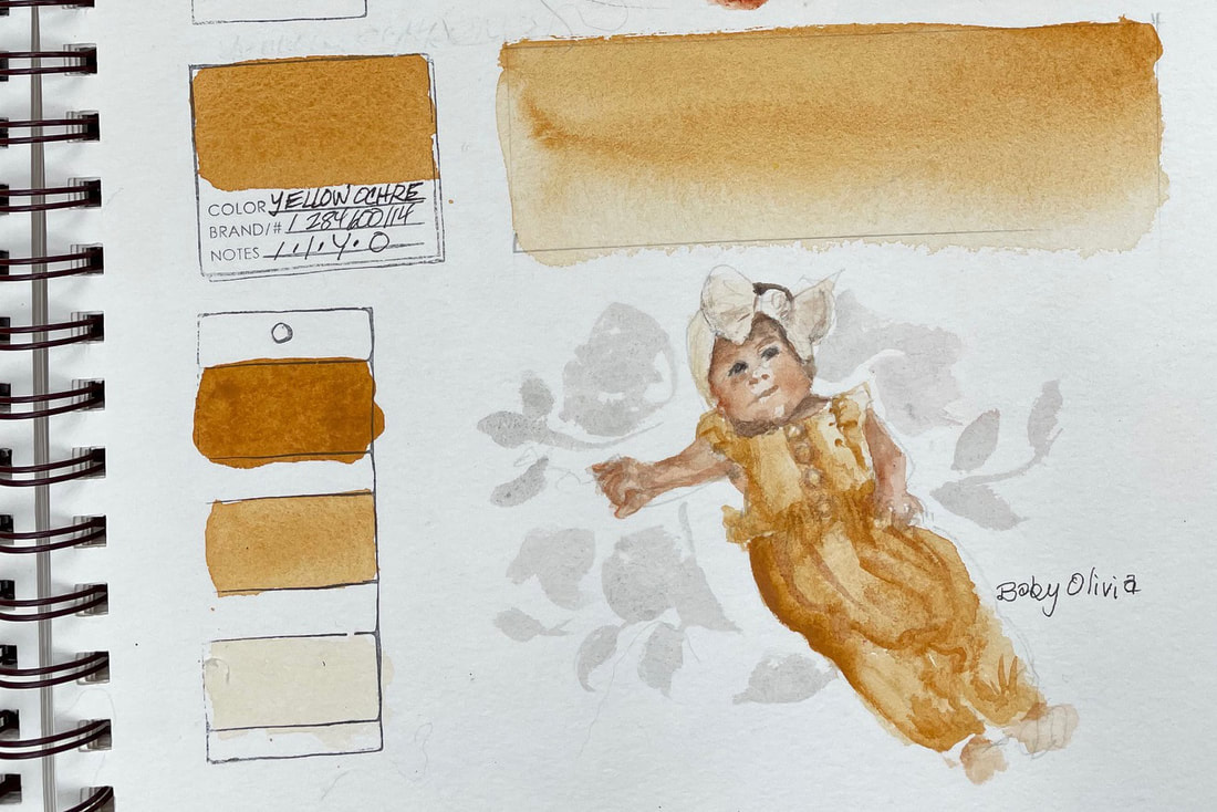
Fall leaves almost paint themselves with this pigment. Lunar Red Rock, an inorganic pigment is sedimentary, made of earth particles and a wonderful granulator. YELLOW OCHREYellow Ochre is one of my palettes staples. I use it as one of my neutrals and rarely till now used Yellow Ochre on its own. You can bet I won't soon forget how wonderful this pigment is as a warm yellow. Since it is transparent, it mixes well with others and why I have used it as a neutral and a neutralizing color. It creates beautiful warm greens added to Cerulean blue. Until the "Swatch This" Challenge, I was mistakenly under the impression this work horse was too opaque to use in successive washes. I know better now. I was very happy with the way I was able to capture the exact color of my new grand nieces outfit with just yellow ochre in various values.
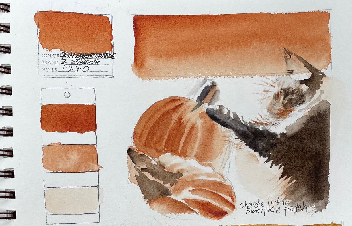
QUINACRIDONE BURNT ORANGEDANIEL SMITH Quinacridone Burnt Orange is a brilliant, orange/sienna color. They suggest adding it to French Ultramarine Blue for dramatic sky washes , something I have not yet tried. Using Quinacridone Burnt Orange to modify Sap Green achieves mossy greens. I love how vivid, clear and intense this extremely transparent pigment is. It was fun rendering my Maine Coon, Charlemagne ("Charlie") inspecting pumpkins that suddenly appeared in his domain last fall.
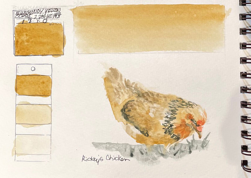
BURGUNDY YELLOW OCHREBurgundy Yellow Ochre is a warm, glowing earth color. In a light wash, it produces a clean yellow.
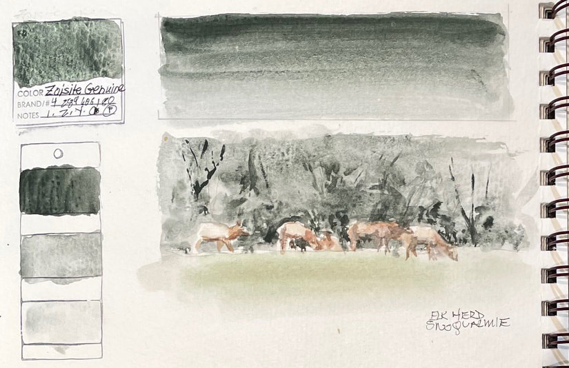
It is fortunate that Daniel Smith has found a supply of this pigment since this natural ochre was mined from a deep vein running near the Loire River in western Burgundy where the mines were closed in 1970. Burgundy Yellow Ochre layers nicely without becoming flattened or opaque as it is quite transparent. I was able to find a nice range of values and only needed a bit of a shadow color and red to paint on of my friend Rickey's chickens. ZOISITE GENUINEZoisite Genuine is one of the Daniel Smith Primatek pigments made from Zoisite, a mineral from Austria discovered in 1804.
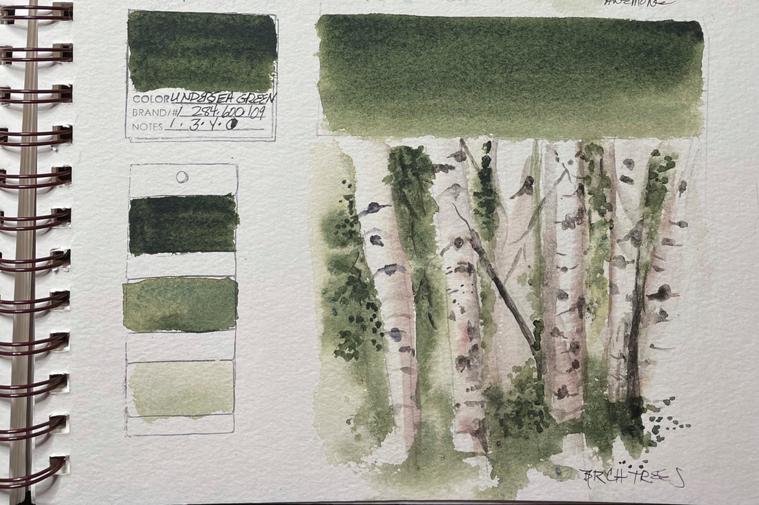
This lush conifer green is a heavy granulator with dark – almost black – bottle green particles. With a watery consistency, the effect is a gray-green with a speckled granite like surface. With maximum creamy consistency paint the surface crackles to reveal a vintage leather texture. I used Zoisite to see how it would work for the trees in the background of the meadow our local elk herd hangs out in. With little effort on my part, the pigment did all the work of capturing the dense greenery behind the herd. UNDERSEA GREENDaniel Smith calls Undersea Green an "artist’s favorite", and I can certainly see why. It is a medium to high staining pigment combining inorganic French Ultramarine, Blue which settles and granulates, with the organic and transparent Quinacridone Gold that floats on top. In its most concentrated form it is warm and a natural for forest and leafy matter. Add Moonglow, or any of the Ultramarines or Quinacridone to the mix and you get interesting passages of color. Daniel Smith suggests dry brush Undersea Green with Interference Gold.
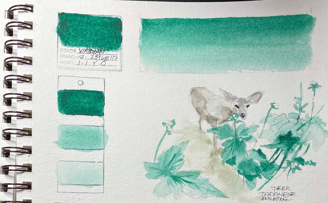
VIRDIANViridian is a very strong pigment full strength but also great for layering washes. A cool blue-green. this non-stainer is useful in mixing and creates soft edges well. Moonglow, another Daniel Smith favorite, has Veridian hidden within it.
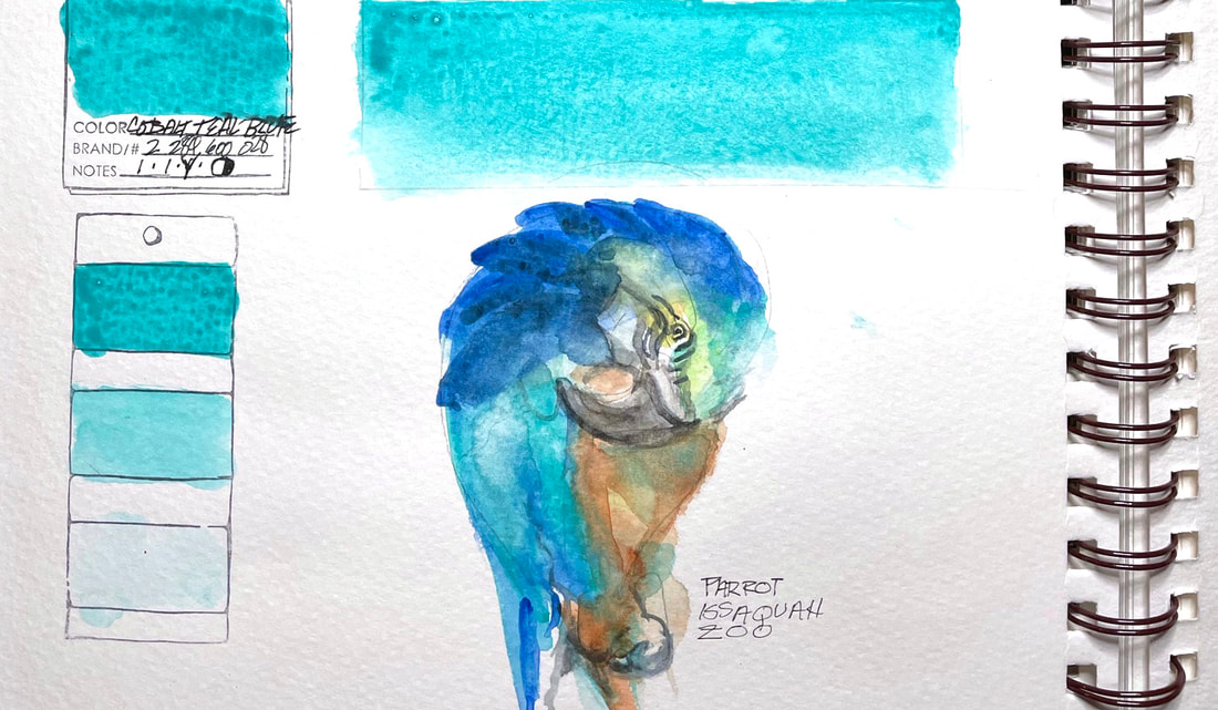
Try modifying reds and the quinacridones with it for a versatile neutral. COBALT TEAL BLUECobalt Teal Blue is standard on my palette for a good reason. This beautiful color finds its way into skies, tropical scenes and every other excuse I can find, like a parrot for instance. This pigment works equally well for patina on a copper pot or a rusty old piece of metal. An inorganic pigment, it is considered and non-staining and great for glazing methods, however it is a bit on the opaque side so layering is limited to a couple before it is covering and no longer transparent.
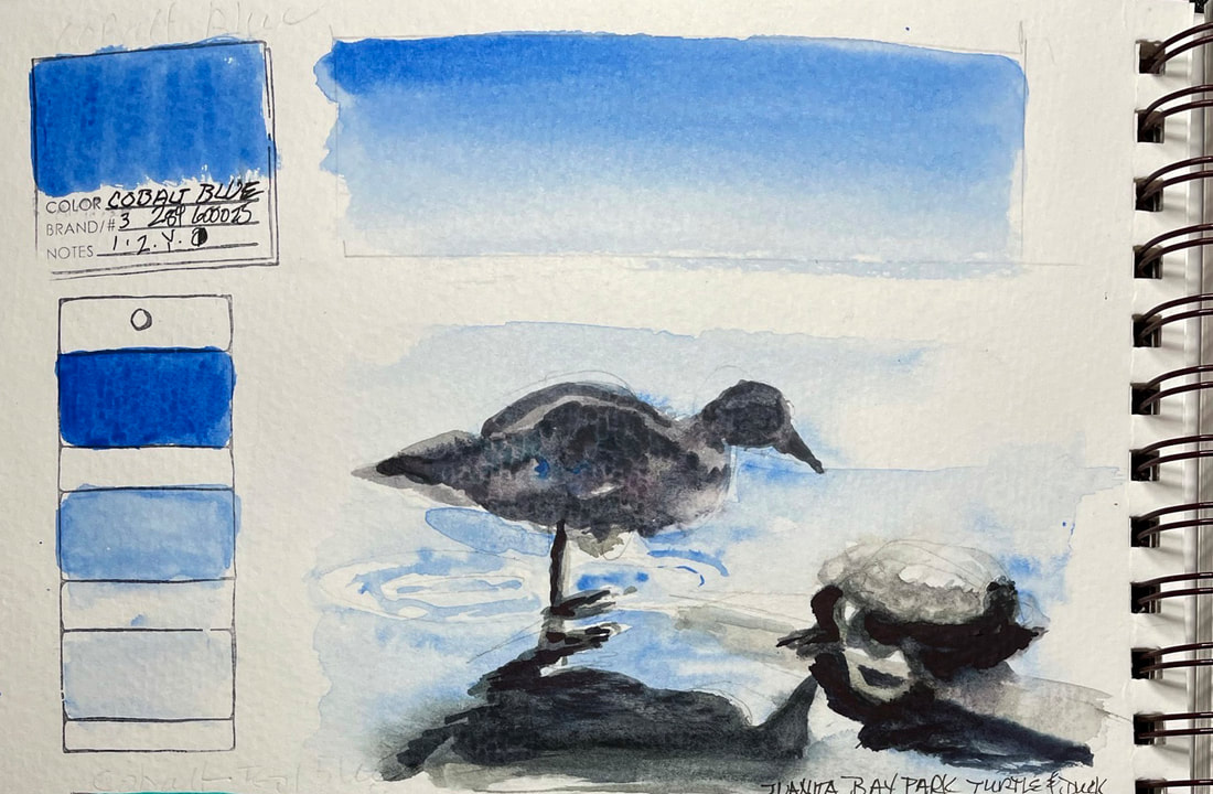
COBALT BLUECobalt Blue, an inorganic pigment, it is considered low-staining and therefore ideal for glazing. You can create soft edges and readily mix with Cobalt Blue. It is a lovely primary blue for your palette. Cobalt Blue is considered to be extremely stable and has been used for centuries in Chinese blue and white porcelain since the late eighth or early ninth century.
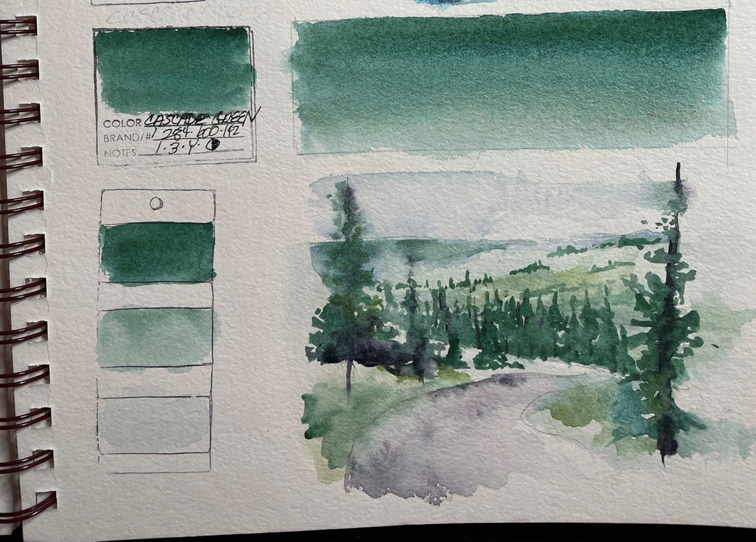
Cobalt blue was the primary blue pigment used for centuries in Chinese blue and white porcelain, beginning in the late eighth or early ninth century. The first use of Cobalt Blue as a name for paint in English was in 1777 and used in paintings by Turner, Renoir, Monet and the post impressionists. Maxfield Parish used it in his landscapes resulting in the alternate name "Parish Blue" for cobalt blue. CASCADE GREENCascade Green, aptly named for the Cascade Mountains and part of my daily view, is a forest in a tube of paint. The range of color is a landscape waiting to happen and easily covers alpine meadows, evergreens forest and the ferns, moss and lichens we in the Pacific Northwest are surrounded by. Straight from the tube it has depth and strength but the washes you can achieve are clear and beautiful. It has excellent lightfastness and is a semi-transparent granulator.
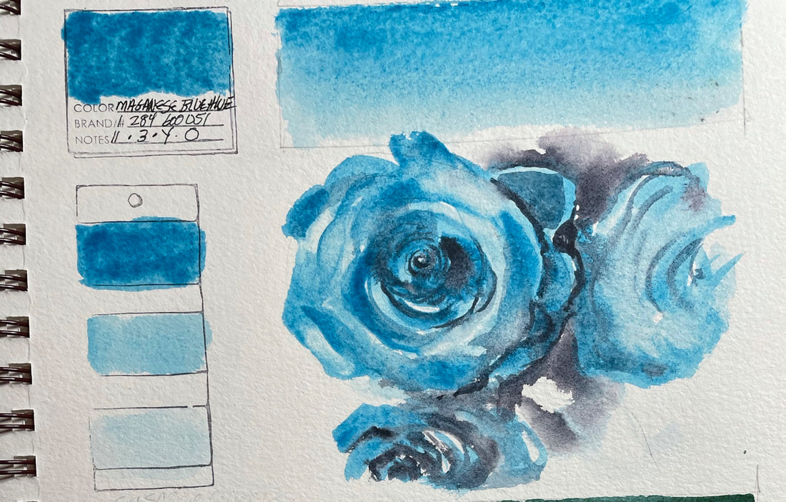
MANGANESE BLUE HUE*Manganese Blue is a turquoise blue that is a staple on my palette. It is a light hue and not as strong as cerulean blue. I Use both since each has special properties of its own. I love how it granulates. It is classified as a medium staining pigment but I find it easy to lift. Several washes will intensify the color. You can see by the painting of the gorgeous roses that were a gift from a dear friend (yes, they really are manganese blue, and smell just as lovely) I was able to get a full range of values to a point I did need to add indigo blue to get the deepest value. Manganese Blue mixes well with non-staining, semi-opaques to create a mottled texture in underlying colors.
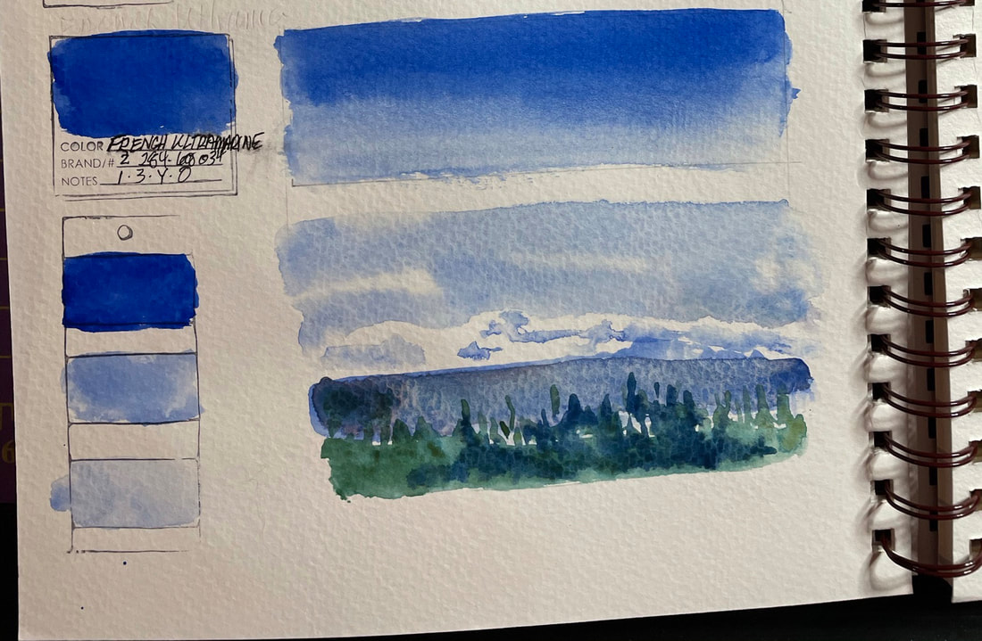
*Note: Daniel Smith advises "true Manganese Blue, discontinued from product lines due to environmental concerns and toxic by-product, has been replaced in the DANIEL SMITH line with a formulation which closely resembles it. The result is a safe, high quality lightfast pigment with the color we adore – Manganese Blue Hue." FRENCH ULTRAMARINE BLUEFrench Ultramarine blue is a staple on my palette serving as my "cool" blue. It is lightfast, transparent and medium staining. It’s a great sky pigment due to its sedimentary properties. Mixed with Quinacridone Gold, it produces beautiful greens. Neutralize it with Quinacridone Burnt Orange for a wide range of blue to brown grays. Great purples can be mixed using French Ultramarine Blue with either Quinacridone Rose or Pink.
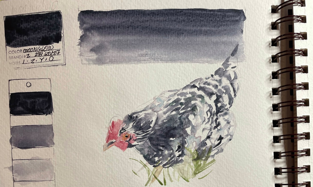
MOONGLOWMoonglow's amazing granulation is in part due to its combination of three-pigments. Anthraquinoid Red floats, Ultramarine Blue settles and Viridian grays down the resulting shadowy violet color. You might try blotting and lifting parts a wash of moonglow to expose delicate greenish blues. You have to play with this one to get the full impact of how special it is. Daniel Smith recommends a salt application in background washes for added interest. You can use Moonglow as a neutral tint as it plays well with other Daniel Smith colors. They also suggest "introducing the Luminescent Interference pigments to areas of wet, damp or dry Moonglow", something I have not attempted. I was able to get a full range of vales from one pigment and need little else to paint one of my friend Rickey's chickens
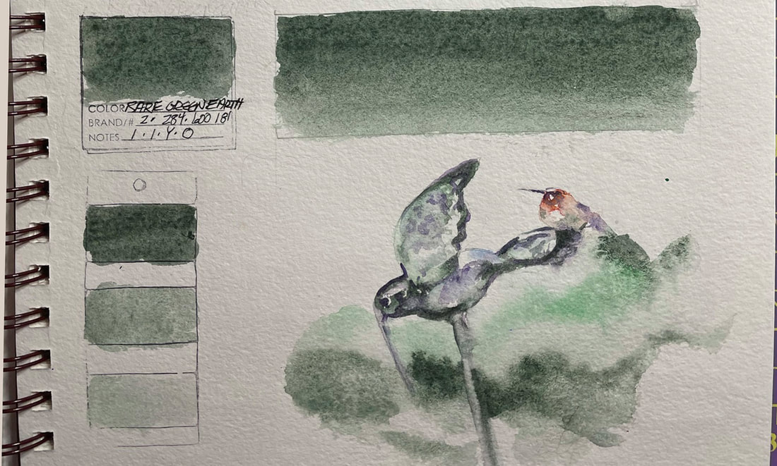
RARE GREEN EARTHRare Green Earth is a bland sort of evergreen that while useful in a landscape, really has little appeal for me other than its a quick and easy way to get the bluish grayed down green I might want in a background. It does granulate a bit and according to Daniel Smith, if mixed with Rhodonite Genuine it makes luscious, reticulating soft purples. They also say it creates lovely atmospheric shadows which I would agree. It worked for the little hummingbird who perched on a hummingbird garden steak that has lost one wing. I think he was saying "That's not how you do hummingbird"
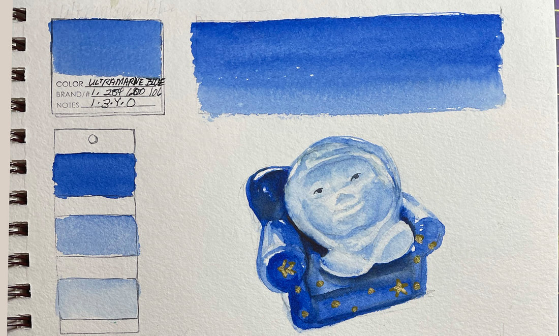
ULTRAMARINE BLUEDaniel Smith makes the claim that both their French Ultramarine and Ultramarine Blue have equal permanence, lightfastness and transparency. However, Ultramarine Blue is cooler and doesn't granulate much at all.
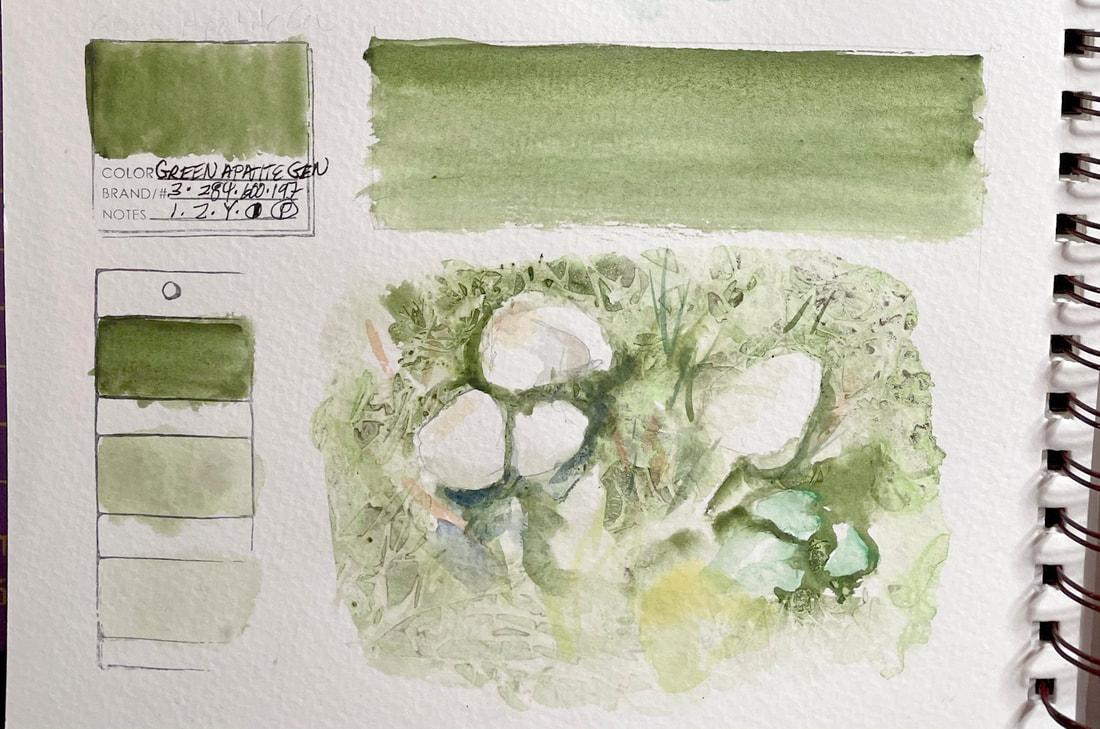
What I love about Ultramarine Blue is how it matches what my mind remembers from my crayon box about a true blue. When I ran across this photo I took of a little salt and pepper shaker my son gave me when he was a very little boy. I love that sweet little light blue globe with hands and feet and its sweet smile and the easy chair universe it sits in. Ultramarine Blue just radiates the color of my treasured gift. GREEN APATITE GENUINEGreen Apatite Genuine is one of the Daniel Smith Primatek colors. This green is a fun granulator, full of surprises. Just when you think it is done morphing from olive green to a vivid but natural green, it does something completely new and becomes almost a dark brown. Repeated washes cause it to settle and make some fascinating texture and contrast. I was able to use primarily Green Apatite Genuine to get the full range of greens and browns I needed to capture the little mushrooms I found in my lawn.
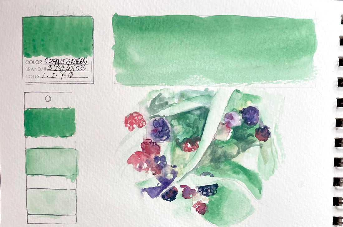
COBALT GREENCobalt Green is a warm, yellow green that mixes well producing medium grays by adding warm or cool non-staining complimentary colors. Cobalt green is low-staining and lifts easily creating soft edges. This inorganic pigment is somewhat transparent.
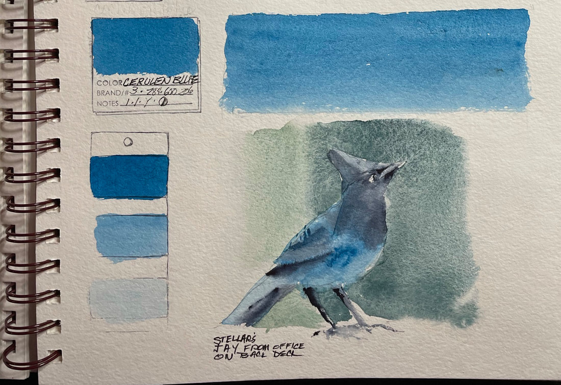
CERULEAN BLUECerulean Blue is a true blue that mixes well. It is non-staining but slightly opaque. I have this color on my palette as one of my tried and "true" blues.
|
SOUL“I am a contemplative artist who has trouble accessing verbal skills. Finding the right words to talk about the amazing things I observe around me can be frustrating. It is much more natural for me to pick up a paintbrush, some embroidery floss or my camera when I wish to share some new discovery. The artwork I create is meant to be enjoyed on whatever level the viewer experiences it and not layered with complex meaning. Feathers, fur, flowers and the incredible variation I find in wildlife not only inspire me, but compel me to share every nuance with you. Archives
July 2024
|
 RSS Feed