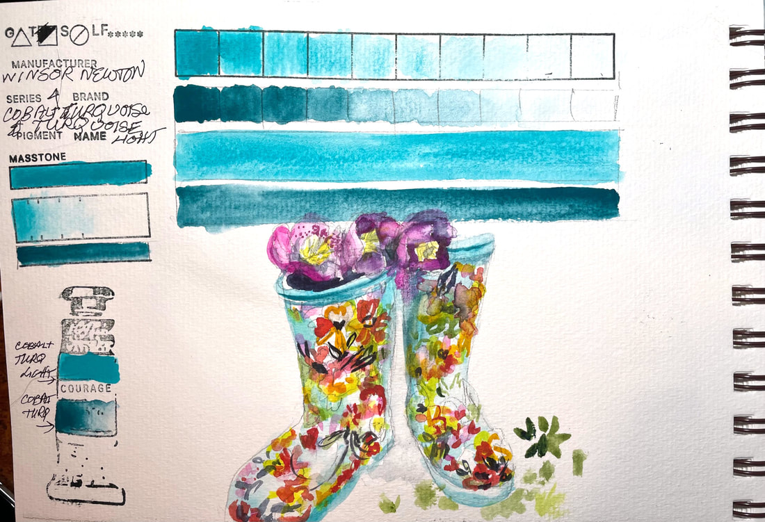
COBALT TURQUOISE & COBALT TURQUOISE LIGHTWinsor Newton's Cobalt Turquoise and Turquoise Light are sister pigments and similar enough I swatched them together.
Cobalt Turquoise is a blend of blue and green pigments named for the for the semi-precious stone, turquoise. Cobalt Turquoise Light is a paler, slightly greener color than Cobalt Turquoise. My garden boots are the same beautiful greenish blue as Cobalt Turquoise light
0 Comments
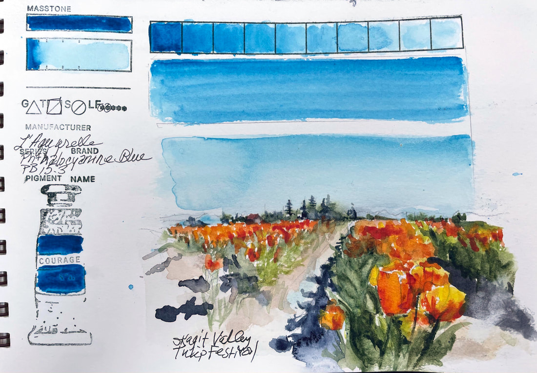
PHTHALOCYANINE BLUE L'Aquarelle by Sennlier makes this sky blue derivation of Phthalo Blue, the organic blue chemists came up with under the name of "monastal" blue. It is a highly complex organic synthesis. Even though Ultramarine Blue is considered the most important blue in a landscape painter's palette, it just cannot produce the blue of Phthalo Blue even mixed with other colors. It certainly nailed the color of the sky over the tulip fields in the Skagit Field on this particularly clear and bright day.
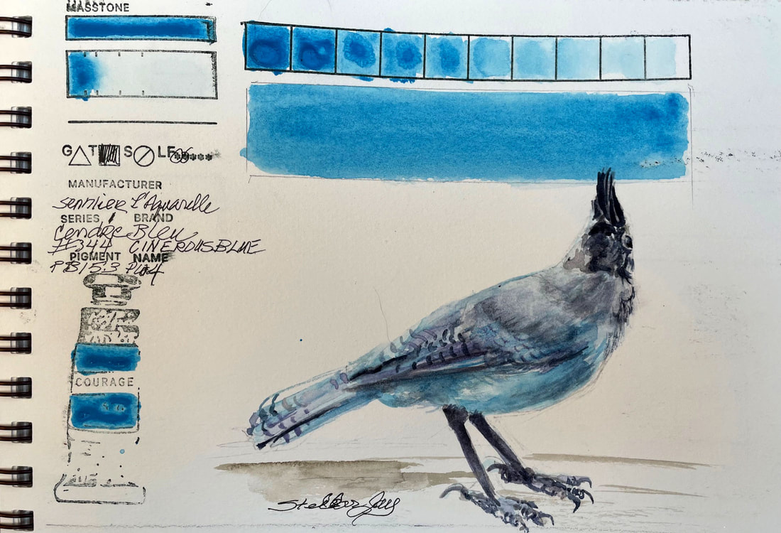
CINEREOUS BLUESennlier L'Aquarelle uses a variant of Phthalo Blue that has a bit of a greener shade. Phtahlo Blue was a pigment that chemists developed with the trade name Monstral Blue in 1935 more or less by accident while creating a dyestuff to replace Prussian Blue. This version has zinc white in it and with a honey binder, is more opaque than most Phthalo blues. It is another interesting color
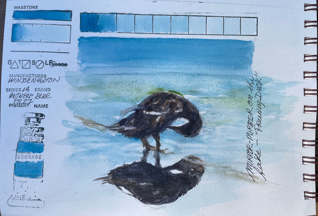
ANTWERP BLUEWinsor Newton Antwerp blue is a transparent blue color. and a softer version of Prussian Blue. It lifts well and would be a nice addition to the palette of a landscape painter for both water and sky.
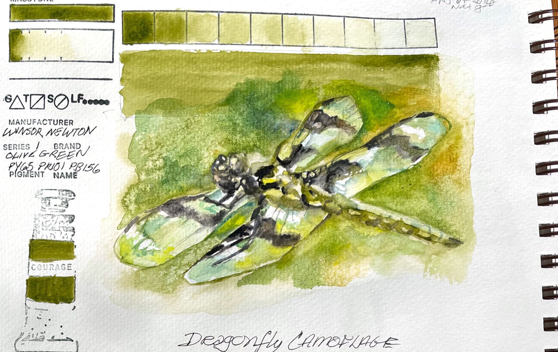
OLIVE GREENOlive green is a soft, warm, brownish green from Winsor Newton Watercolors. It is a natural for the leafy greens in landscapes and botanicals. The dragonfly in this quick sketch was so clear and see-through that the greenery around him seemed to camouflage him.
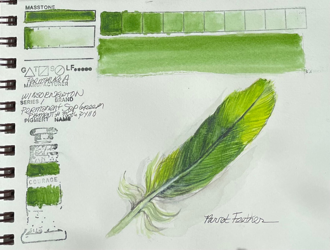
PERMANENT SAP GREENWinsor Newton Permanent Sap Green is exactly what you would expect from a high quality water color. From their website, "Sap Green Permanent is a rich mid-range green with a yellow undertone." It's chemical composition is similar to other brands of sap green, Phthalo Green or Hooker's green. According to the website "Natural Pigments" sap green was made from the unripe berries of the Buckthorn plant historically. "In medieval times the extracted colorant was reduced to heavy syrup and sold in pig bladders, not as dry pigment." It was the right choice for the parrot feather rendered here.
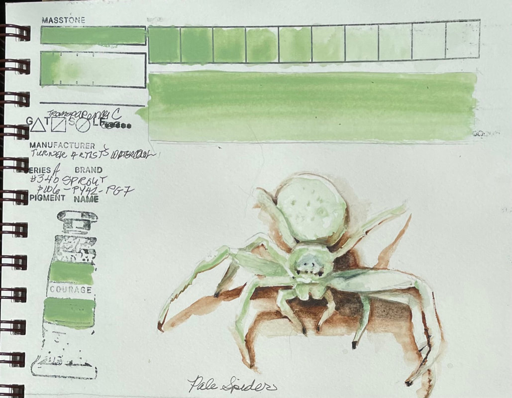
SPROUTTurner Watercolor's Sprout is certainly an interesting color. Falling somewhere between opaque and semi-opaque, the pale green washes down to nearly nothing. When you look at the pigment combination, it allows a fair insight into the reason it it what it is, a pale, cool green with a bit of phthalo green in the undertones. The chemical composition (phthalo green titanium dioxide, synthetic hydrated iron oxide, chlorinated-copper phthalocyanine), something outside my realm but easily researched, confirms my thought that the three ingredients would result in a chalky phthalo green. Fun to sculpt the little ghostly white spider I recently found in my home.
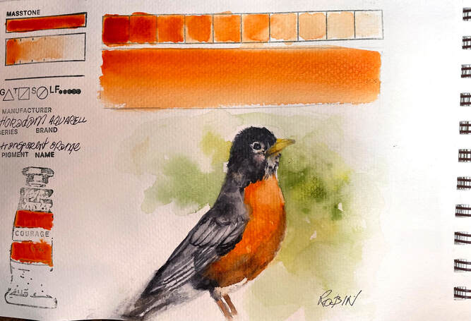
TRANSPARENT ORANGETransparent Orange is a fairly straight forward pigment by Schmincke . Their Hordam Aquarelle pigments, are created with unique pouring method that guarantees "that the first stroke of a wet brush captures the maximum pigment load". Transparent orange is an example off the beautiful uniform color, and ease of lifting, and excellent flow properties of all the quality Schmincke pigments from Germany.
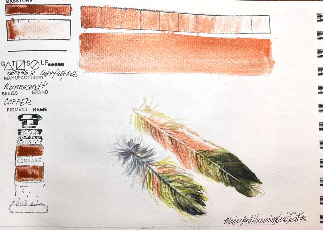
COPPERRembrandt watercolours are made in Holland and made from the purest pigments and purest gum Arabic for brilliant, colors that are uniformly consistent. Their copper is formulated with pigment-coated Mica. It has a very high lightfastness rating and is semi -opaque. I found the metallic consistency to be of high quality and the particles were suspended uniformly. This was the perfect way to capture the little hummingbird feathers I put under a microscope last night.
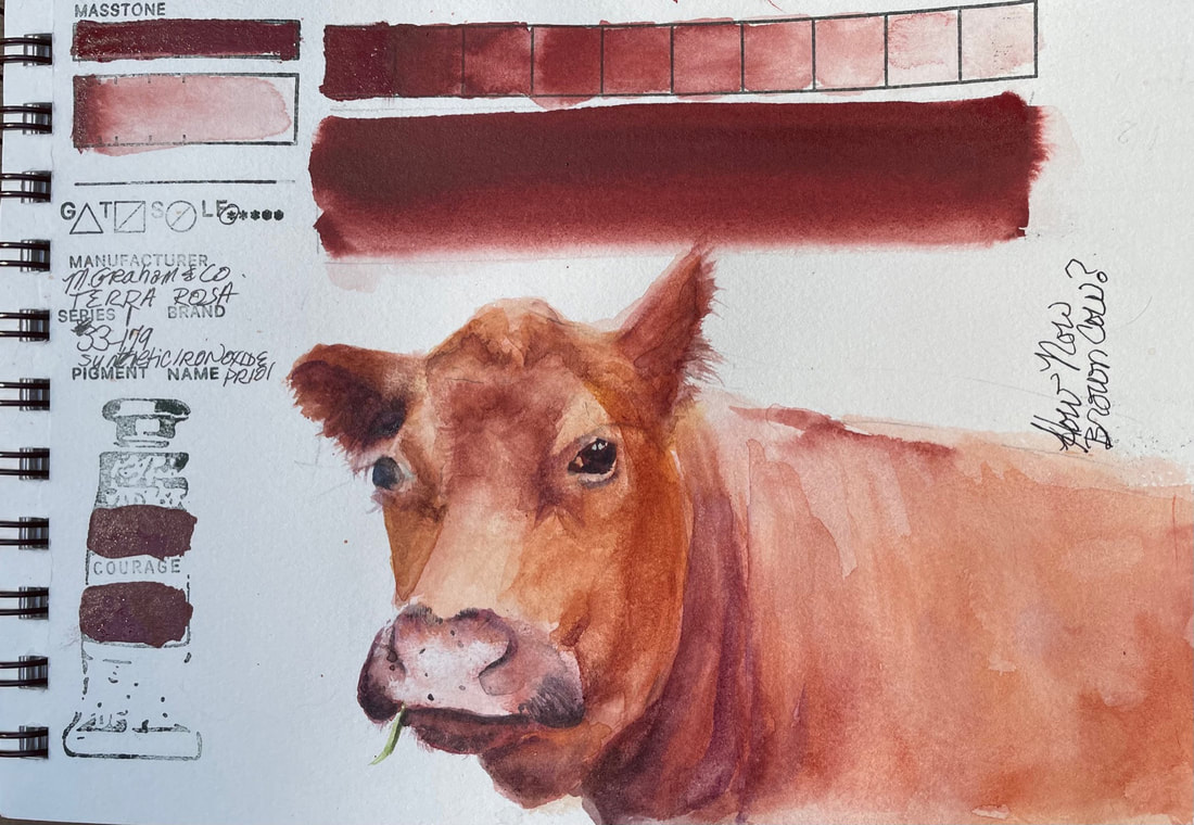
TERRA ROSATerra Rosa by M. Graham is so much like the color I swatched yesterday, another very reddish brown. This one is, like all M. Graham paints, has honey as its binder, a fact that I was forgetting until I had applied the pigment so densely on the bar marked "mass tone" that it was still sticky this morning. Fortunately it was another very warm day and my studio gets quite warm because its lots of glass. It did eventually dry. I will remember to make sure I check how much binder comes out if I grab another tube that has bee laying around awhile. The color is lovely and with a little addition of orange or purple, it offers a full range of warm brown just perfect for this beautiful free ranging cow we encounter on a drive last year.
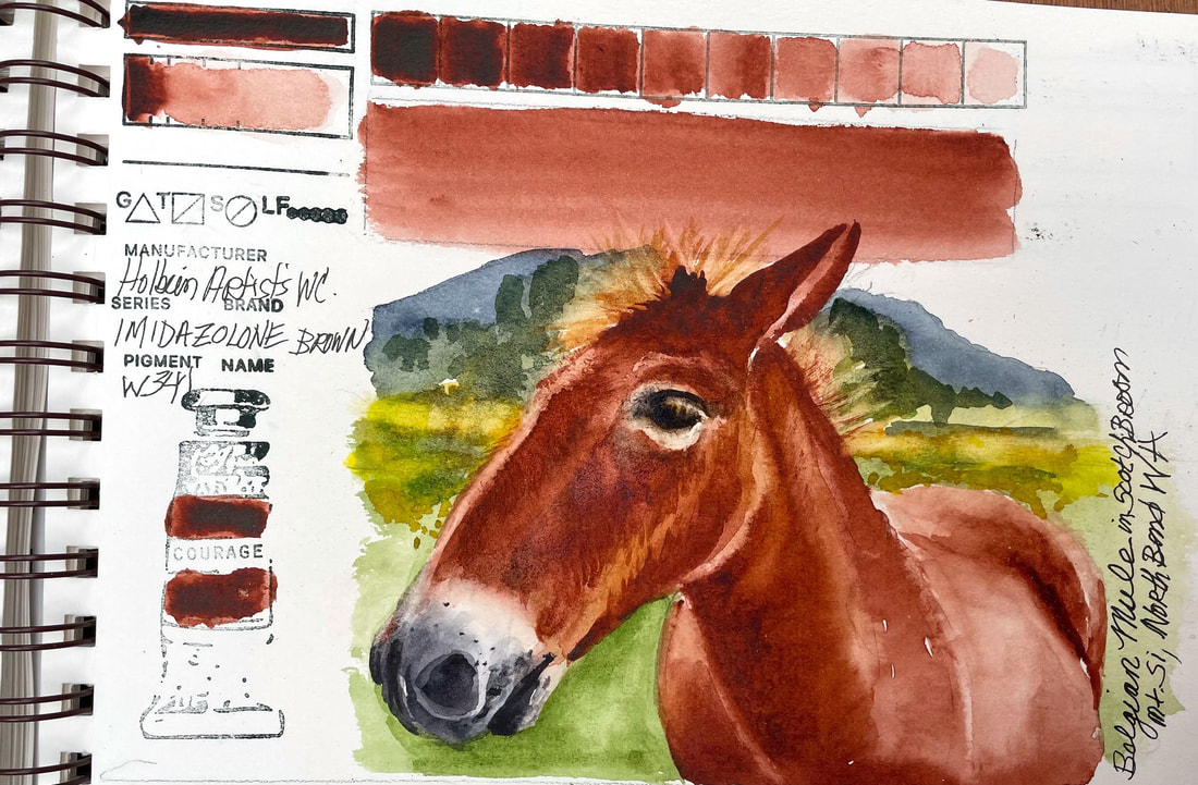
IMIDAZOLINE BROWNAnother lovely Holbein color, this brown is reminiscent of root beer straight from the tube. It is a relatively new color and not one that I am familiar with till now. There are other brands that have made Imidazoline Brown but I am unable to find out much information about its components and if it is a new synthetic version of an old organic color that is either no longer feasible to make or harmful to us or the environment. I am sure I will learn more with time. What I can say is that this brand of this pigment lays down beautiful with little effort and lifts easily. What a joy to use it to spend some time with one of the sweet Belgian Mules that used to live under Mt. Si in the meadows of scotch broom before they decided to mow it all done and put up condos. Miss this gals, seven beautiful ladies with blonde manes that shimmered in the sun.
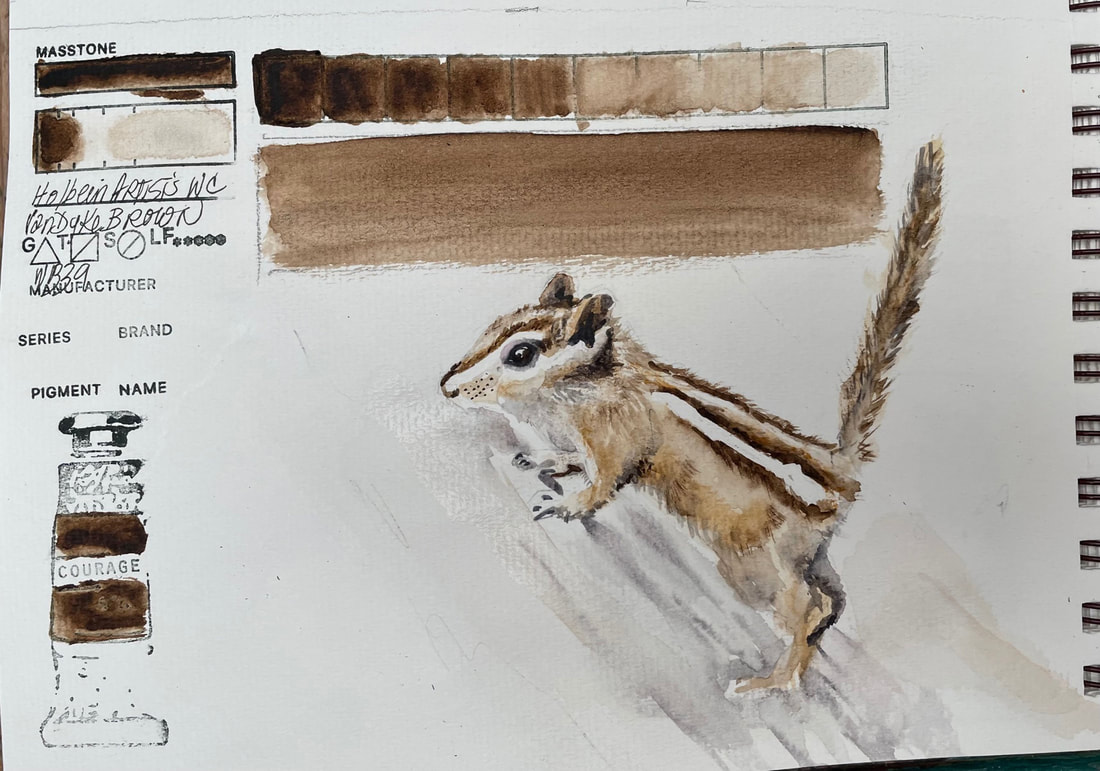
VANDYKE BROWNHolbein makes a VanDyke Brown as does Winsor Newton and both are great for creating shadows, adding depth. I noticed just now that when I swatch tested the other brand of this color, I also did so with a chipmunk as subject matter. I guess VanDyke Brown is then "Chipmunk" colored.
|
SOUL“I am a contemplative artist who has trouble accessing verbal skills. Finding the right words to talk about the amazing things I observe around me can be frustrating. It is much more natural for me to pick up a paintbrush, some embroidery floss or my camera when I wish to share some new discovery. The artwork I create is meant to be enjoyed on whatever level the viewer experiences it and not layered with complex meaning. Feathers, fur, flowers and the incredible variation I find in wildlife not only inspire me, but compel me to share every nuance with you. Archives
July 2024
|
 RSS Feed