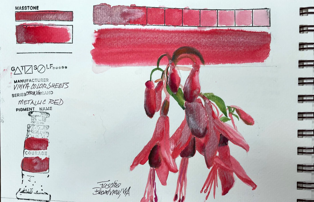
 METALLIC REDThis is the first of four metallic colors in the Spring Set of Colorsheets by Viviva. I usually don't have much use for metallic colors, although they can be pretty fun decoratively speaking. Viviva's metallic colors are more transparent than others I have used. Depending on where you activate and pull paint from on the chip, there is a fairly wide range of metallic to color ratio. The metallic portions of the paint seem to float on the top with color visible from underneath which in this case worked for me. The opalescence rendered the waxy quality of the fuchsias nicely with very little effort on my part.
0 Comments
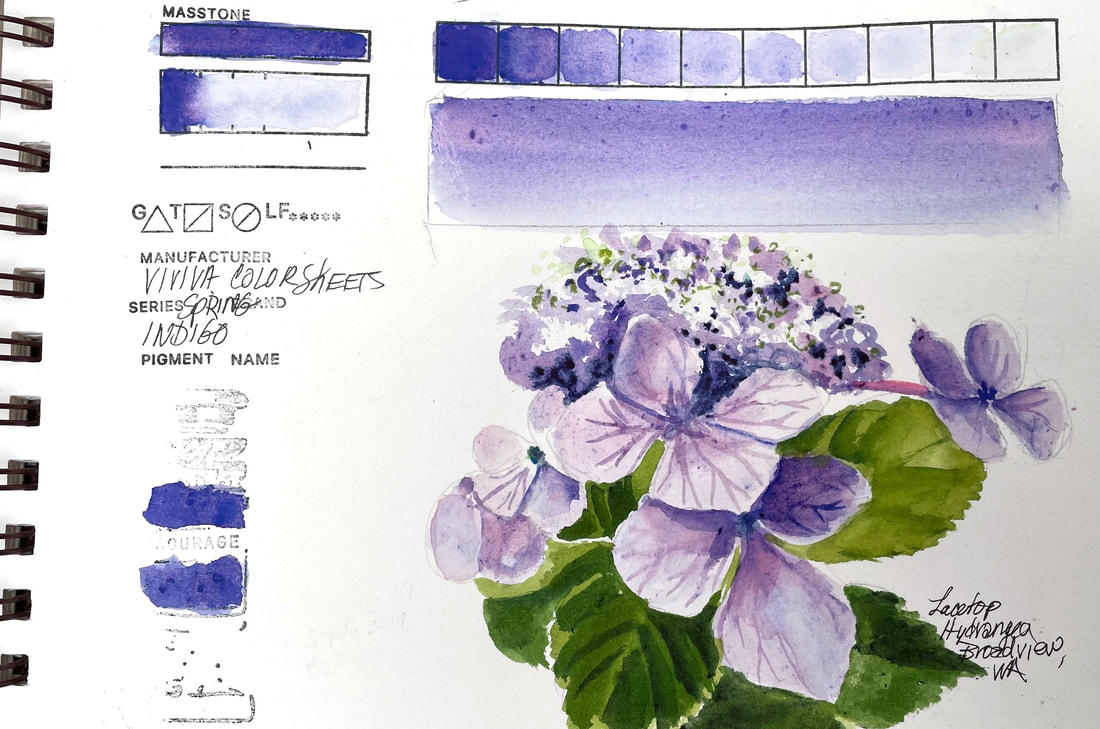 INDIGOViviva Colorsheets have some properties unlike other watercolors, whether tube, pan or stick. These dry, pigment infused sheets carry intense, transparent colors that for the most part have equivalents in other brands. But Indigo is not one of those. It has a propensity to split into several underlying pigments, depending on where your brush touches the sheet with water to activate the color. It ranges from a deep Ultramarine to violet and even a faint greyed lavender. While not what the name might indicate, this is a lovely chameleon like color that tends to grow into a hard to capture hydrangea bluish violet. It doesn't bother me that the color is difficult to nail down, knowing that, I just let it do the work. If I had depended on it being "indigo" perhaps I would be frustrated. Uncontrollable as it is, I really like it. Besides, their Midnight Blue is as Indigo as it gets and would be my fall back if I was looking for a deep dark blue to add burnt sienna to for a dark neutral. Save this beauty for special occasions.
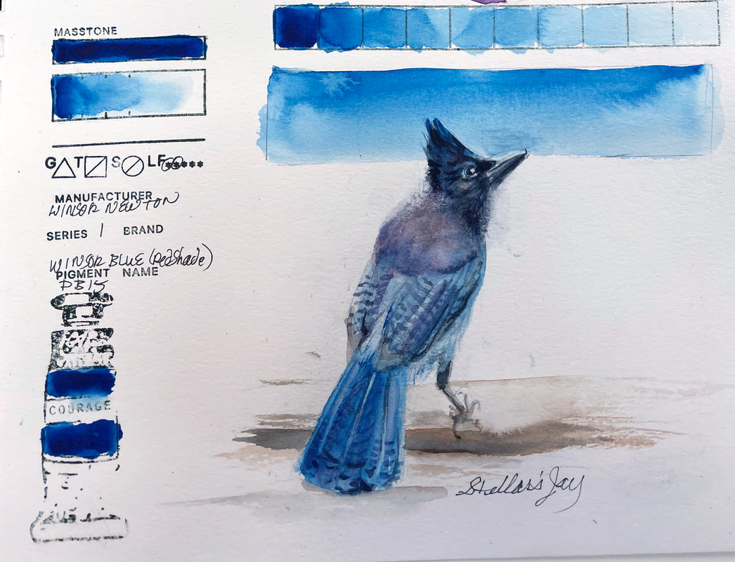
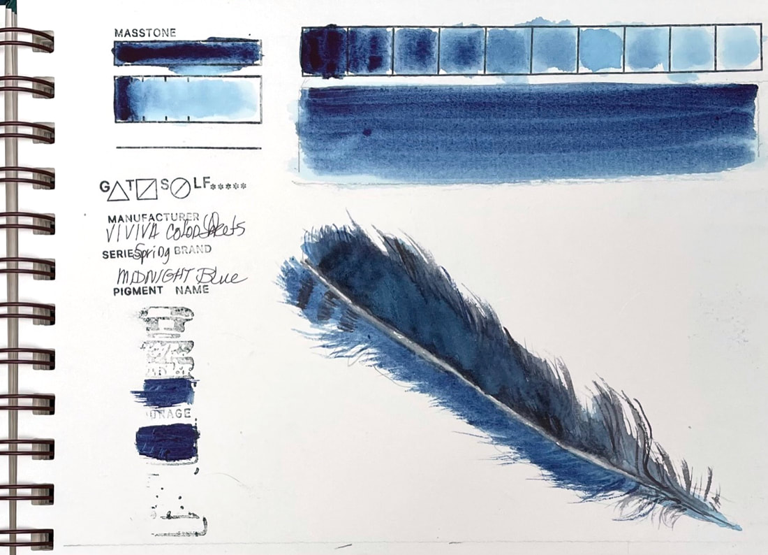 MIDNIGHT BLUEViviva's Midnight Blue from their Spring Collection is much closer to Indigo than the sheet marked Indigo. Midnight Blue is dark and moody and plays nicely with their Slate Black (similar to Payne's Grey). Just about perfect for the Stellar Jay feather that found its way to my drawing board today. (Spoiler alert: July's Nature Sketchbook Club involves not only feathers, nest and eggs, but just might include a set of colorsheets, stay tuned for more details.)
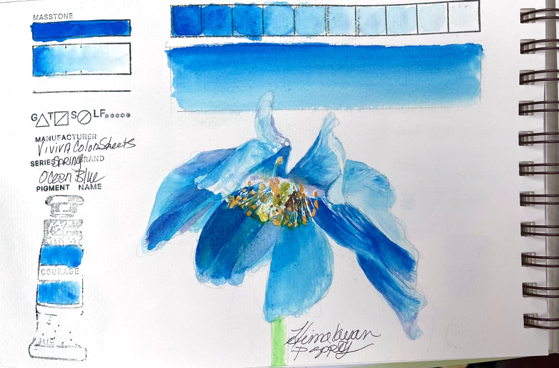 OCEAN BLUEOcean Blue, which falls somewhere between Cerulean Blue and Manganese Blue Hue, is one of the Spring Set of Colorsheets by Viviva. Lovely, transparent, vivacious blue, whose name says all of that in just a word. Oceans, and the rare blue flower, like this gorgeous Himalaya Poppy beg for Ocean Blue pigment. In all honesty, I added a bit of this brands more violet blue, which I will swatch later this week, called Indigo but has cool purplish undertones that helped me find the center of this poppy and push the petals in shadow back a bit.
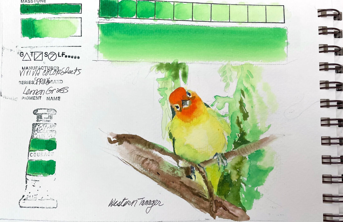 LEMONGRASSThis spring green is another of the aptly named collection "Spring" by Viviva Colorsheets. Lemongrass is soft, though brilliant if that is possible, and layers to build toward clear bright color reminiscent of a "permanent green" by other brands. My brother is an outstanding bird photographer and caught this great picture of a Western tanager this weekend. The luscious spring green foliage surrounding the perched citrusy confection turned it a slightly greener shade of yellow and a perfect subject for a test of Lemongrass.
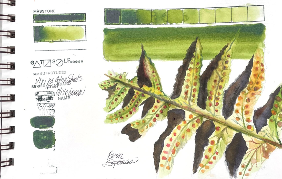
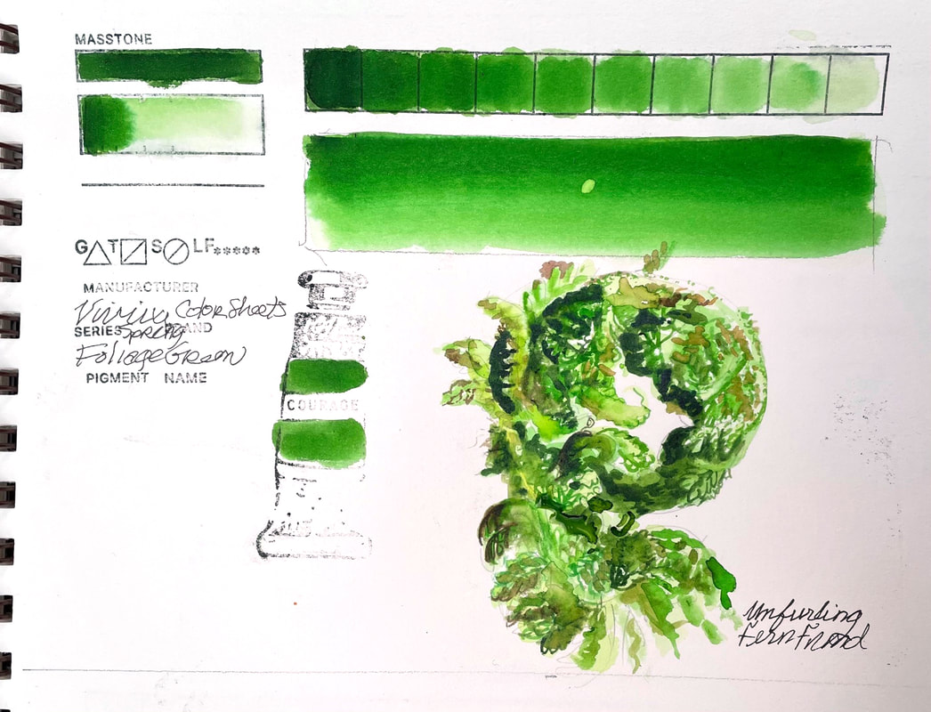
FOLIAGE GREENViviva' s Foliage Green, like other colors in their Spring Set, is a bright, clear green, transparent and intense.
Adding a little yellow or orange can bring it down to a believable "foliage" color. The unfurling fern frond was just about that bright though, so I got a chance to use this green almost straight from the tube, or in this case straight off the color sheet.
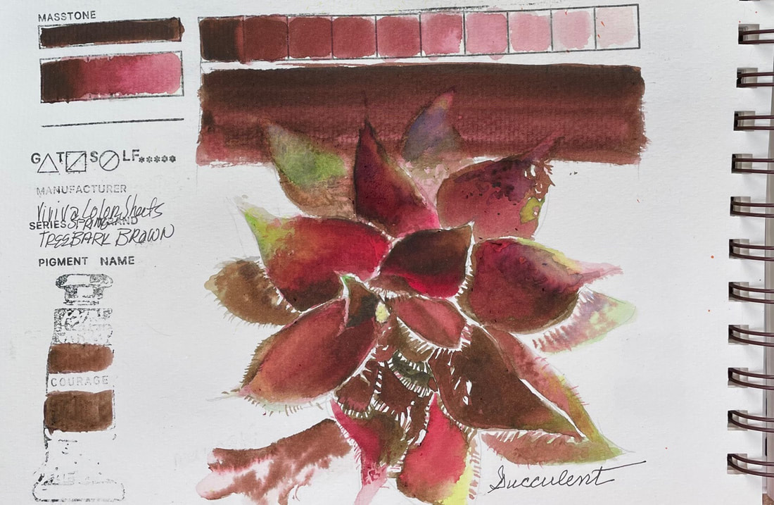
TREE BARK BROWNTree Bark Brown, from the Spring Set of Viviva Color Sheets, is an unusual color, or at least behaves unusually. I found that depending not only on the amount of water I used, but where I activated the color sheet from, I came up with different shades of brown to Bordeaux or even a dusty pink. This was not a negative in the case of the succulent I was painting as it had that range of brown to wine or pinkish areas. This meant I really only needed a green and a very watery blue to complete the palette for this one. Tree Bark Brown did not seem to be as much of a stainer as the other pigments so far. I found it fairly easy to lift compared to the others I have swatched so far.
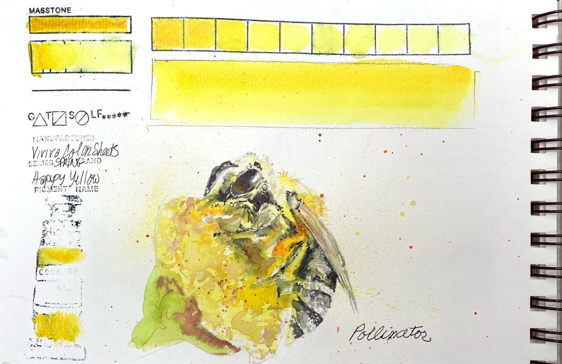 HAPPY YELLOWViviva's Happy Yellow from their Spring Collection, lands between Cadmium Yellow Light and Hansa Yellow Light. Transparent, and nearly impossible to dilute beyond a pale yellow, this one hangs in there. I accidentally carried yellow into another project thinking I had cleaned my brush well. And yet even with all that intensity, this is a delicate yellow and worked well for a pollen frenzied bee.
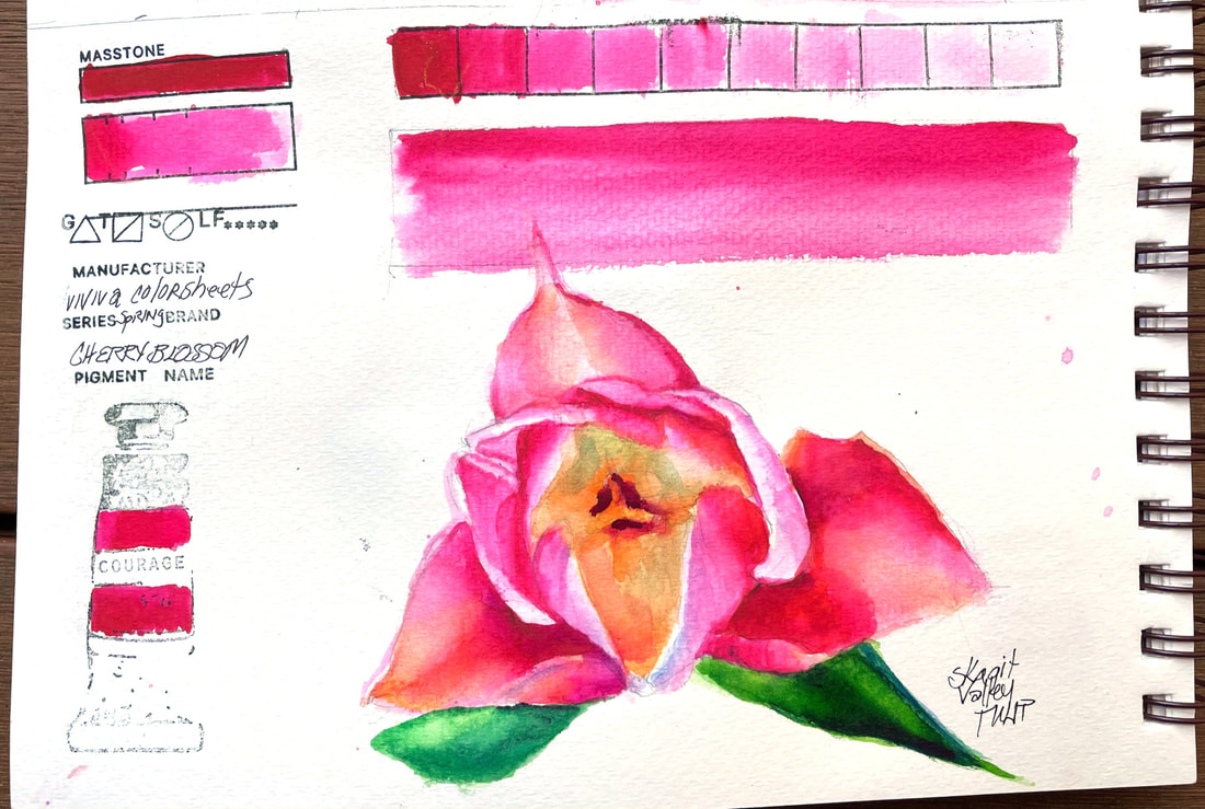
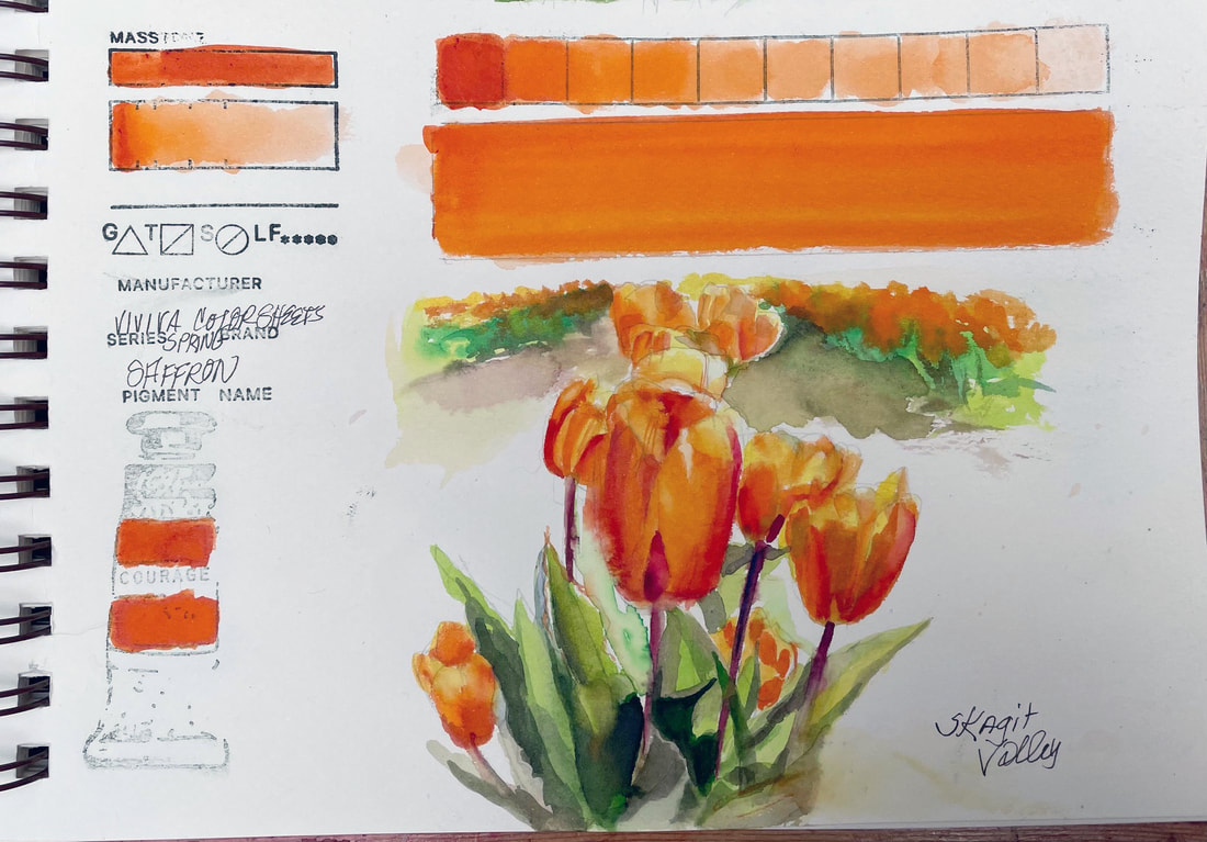 SAFFRONViviva Saffron is a juicy, transparent orange, falling somewhere between Pyrrol Orange and New Gamboge. On the rare occasion that I get to paint with this much orange, this would be a lovely choice, especially out in the field. Viviva Color sheets are highly transportable, so this one is going with me next time I head for the Skagit Valley Tulip fields.
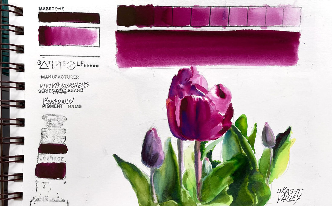
BURGUNDYBurgundy, another of Viviva's color sheets Spring Set is comparable to Daniel Smith Cobalt Violet. It is a beautiful, intense red violet. Depending on the water to pigment ratio, it can move to a red or to a more purple violet. Full strength is is close to Boudreaux bordering on black. Best color for this beauty found in a field of tulips in Skagit Valley, WA.
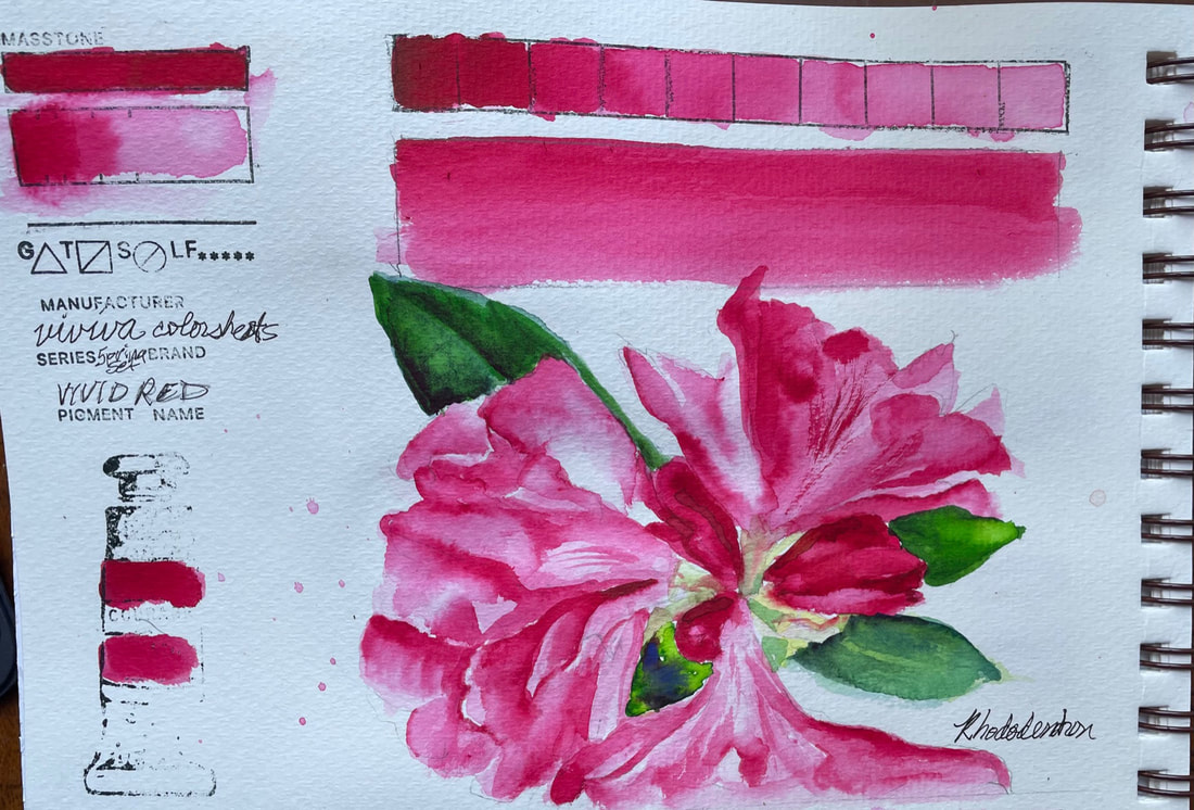
CHERRY BLOSSOMCherry Blossom, the second in my swatches from my new set of Viviva Color Sheets, this one from the "Spring Set" is quite similar to the color tested yesterday, Vivid Red, but a wee bit pinker and reminiscent of Opera Rose. Like Opera Rose, a wash of this pigment over the top of other colors gives new zing to the color it overlays.
As with Vivid Red, this is another intense, staining pigment but with a little effort can be lifted somewhat, but not back to white very easily. Over time, I am sure I will get used to the differences, like the propensity to blooms, but not until you have walked away, cheeky little tricksters. I was able to soften edges a bit easier today than the first try at my new color sheets. I do love the bright, cheery colors they produce so far.
VIVID REDVaVa Voom Viviva Vivid Red, say that three times fast. Today I began swatching the full range of Viviva colors in my hands, currently about 30. This is a brand new product for me, little pads of "color sheets" imbued with very vivid, transparent watercolor that has been baked onto the sheet and magically transforms when activated with a water brush into pigment. It then dries right back up and you can tuck the whole paper palette pad and water brush conveniently in your pocket or purse. Perfect for a sketchbook artist, right?? I choose Vivid Red to begin with because it is the color of an also new to me Rhododendron that just exploded into bright red lollipop bouquet yesterday,
I don't have much in the way of technical data for you yet, but I can say my first experience with viviva color sheets has been enjoyable. I had a bit of a learning curve to begin with as the consistency is of course quiet different than what I was used to, water to paint (chip) was hard to ascertain initially, but I was feeling more confident as the sketch moved along. I found the value range to be had excellent and the ability to layer wash over wash over wash outstanding. But inherent in their nature, and likely by design, they pigment dries in a hurry. I found it a little difficult to lift this color anyway and I imagine that is due to the intensity and its ability to stain. But after a little time playing, I found work arounds and ways to reactivate a layer to some degree to at least soften an edge that had dried before I got to it in the first pass. What is extraordinary about this set of color sheets is that I can now jump right into a watercolor sketch in my little book the minute I hit the trail. I am sure I will have more to say as I work my way through the two sets I have, but for now, kudos to Viviva Color, innovative and creative. Here is a link to their site so you can see for yourself.
WINSOR BLUE (RED SHADE)Winsor Blue, Red Shade is an intense blue, with great tinting ability and similar to Phthalo blue, with red undertones. This pigment is transparent and a stainer, although it is possible to lift the color a bit. According to their website, Winsor & Newton first launched this color in 1938 and Winsor Blue Green Shade a few years later.
The phthalocyanine family of colors were first chemically synthesized late in the 1920's. Winsor Blue, created to replace Prussian blue, has many of the same properties, including its intensity. It mixes very well with other colors, here I used it with Turner Artist Color's Purple Gromwell and I would caution that as with other Phthalo Blues and Prussian Blue, Winsor Blue does want to dominate. Blue is always one of my favorite colors and this one is no exception.
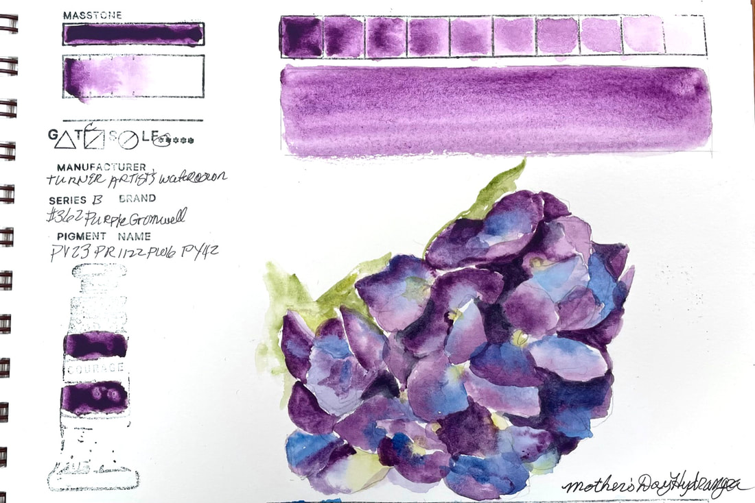
PURPLE GROMWELLTurner Artist's Watercolor Purple Gromwell is a mixture of four pigments, and most likely, for that reason, I have not found any one comparable color in other brands. It is a lovely red violet that moves toward a bluer purple and blends beautifully with blues. This color was the perfect option for the hydrangea my daughter and grandchildren sent me today for mother's day. It filled my heart to receive and painting it just added to the joy.
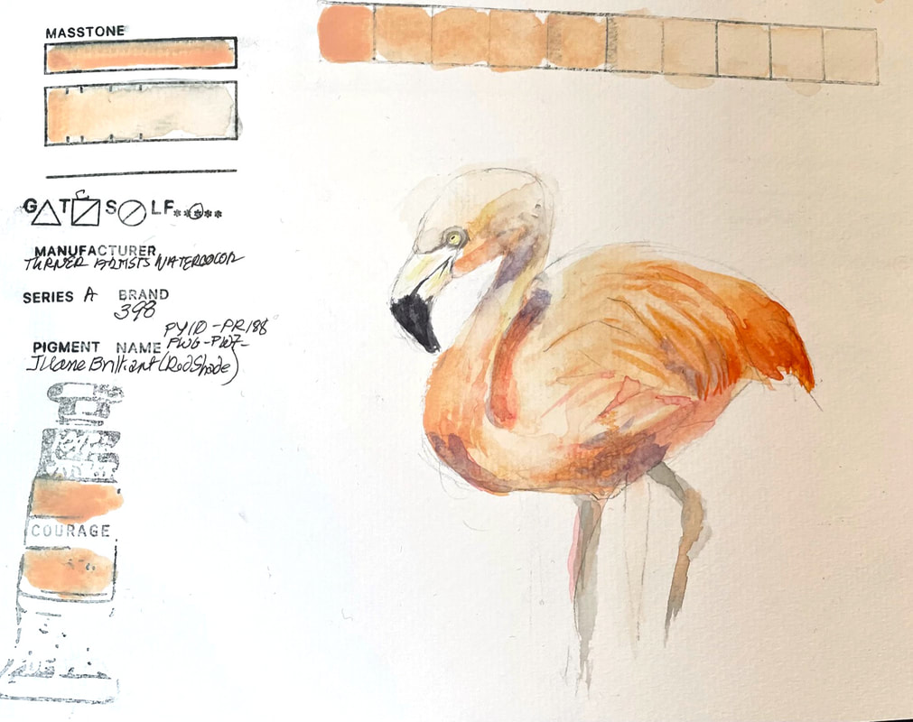
JAUNE BRILLIANT (RED SHADE)Turner Artist's Watercolor Brand Juane Brilliant is an opaque salmon-ish shade that is lovely for a painting of flamingoes, at least the paler variety. Their website mentions that the mixture of pigments used to get to this color includes both titanium and zinc white which I guess is what is making Juane Brilliant almost chalky in it's strongest mix of pigment to water. Interesting color.
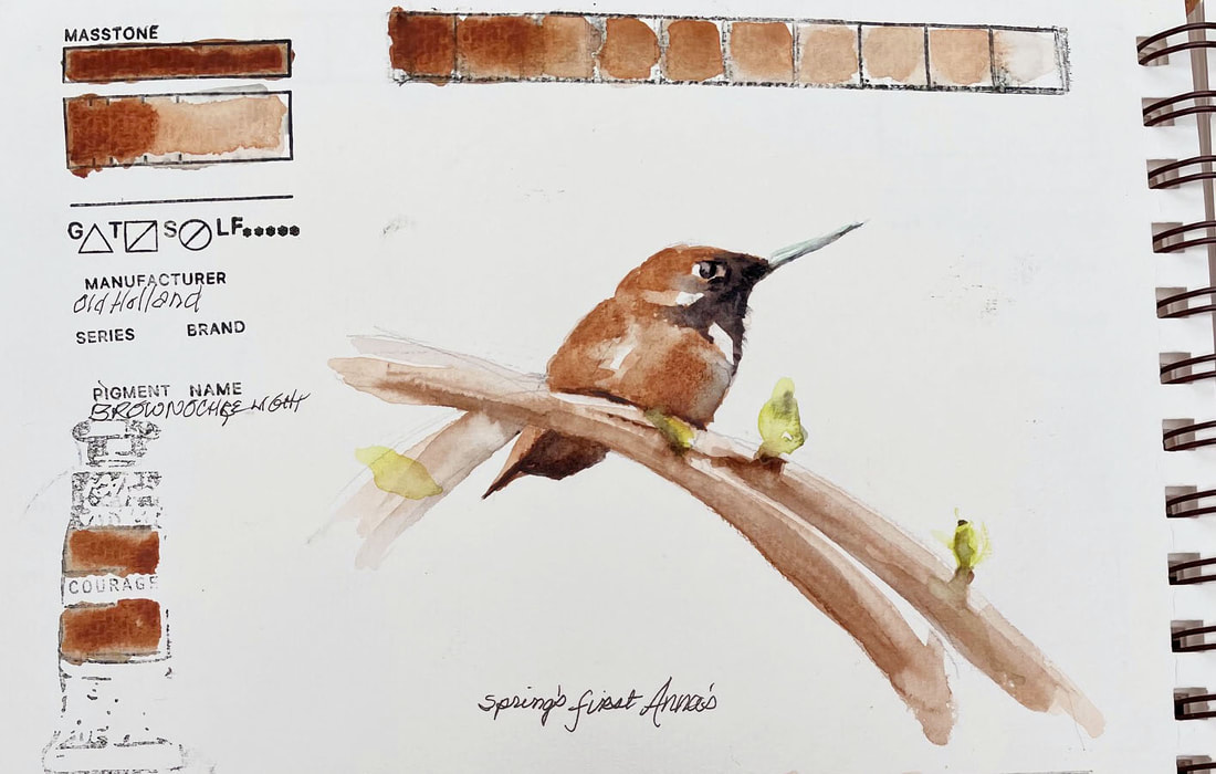
BROWN OCHRE LIGHTOld Holland Brown Ochre Light lands somewhere between Yellow Ochre and Burnt Sienna and is slightly transparent. It lifts and layers well but does granulate as much as it lays down a bit blotchy. My tube is of Brown Ochre Light is fairly old and may be the cause of the "separation" not granulation that I was experiencing.
|
SOUL“I am a contemplative artist who has trouble accessing verbal skills. Finding the right words to talk about the amazing things I observe around me can be frustrating. It is much more natural for me to pick up a paintbrush, some embroidery floss or my camera when I wish to share some new discovery. The artwork I create is meant to be enjoyed on whatever level the viewer experiences it and not layered with complex meaning. Feathers, fur, flowers and the incredible variation I find in wildlife not only inspire me, but compel me to share every nuance with you. Archives
July 2024
|
 RSS Feed