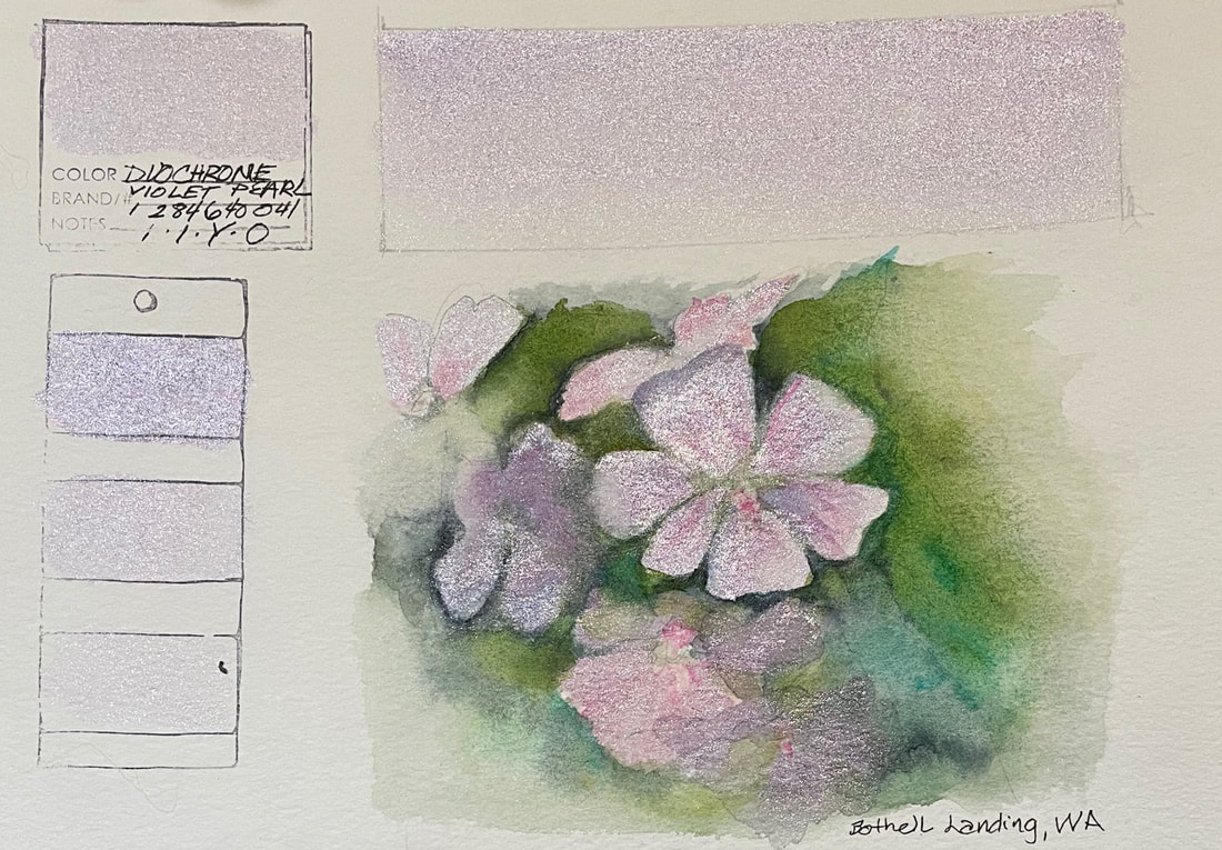
DUOCHROME VIOLET PEARLDuochrome Violet Pearl lands somewhere between shimmery greyed lavender and a cool violet silver. As one of Daniel Smith's Luminescent Watercolors, this pigment is better used over black or at the least, a dark wash under it. I struggled to find a reason to use this glimmering pale purple, but it almost works on the dainty little flowers here.
The pigment iridizes because its made of particles of mica whose thin particles are coated with reflective metal oxides making the viewers perspective a key component in the outcome. They are only marginally photogenic, but in the case of this quick sketch, you can get the gist of how reflective they are. While it was a fun experiment, it was a challenge, but then that is the point of this.
0 Comments
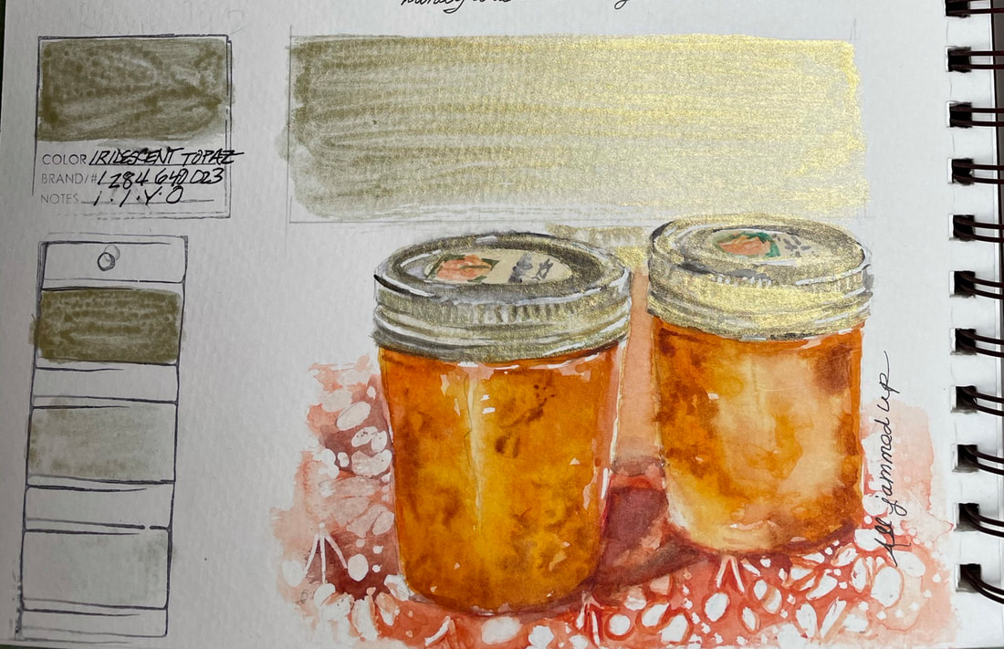
IRIDESCENT TOPAZIridescent Topaz is a pale greenish yellow-gold and of course one of Daniel Smiths Iridescent watercolors. Like the others in that line, it is made from mica pigment. The thin transparent particles of mica are coated with highly reflective metal oxides which shimmer and shine nicely when the light hits them from certain angles. I love that I was able to paint the metallic rims and lids of the peach preserves I photographed last summer after a canning session. The light had made a glorious stained glass display out of simple jam and painting them today was every bit as enjoyable with this Luminescent Watercolor as it was to make the jam, photograph and of course eat it.
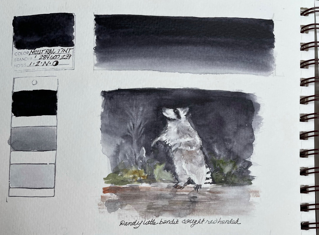
NEUTRAL TINTNeutral Tint is the exact right thing to use for a rich dark shadow or to darken a neutral. This pigment will darken transparently without muddying the color underneath or in a layer. The granulation it lends a textured subject is an added benefit. While I will always make my blacks to suit the palette and my subject, usually with Indigo and Burnt Sienna or French Ultramarine Blue and Burnt Sienna, but for a quick solution, this was just the ticket and with much more spontaneity and little fear of adding too much of anything.
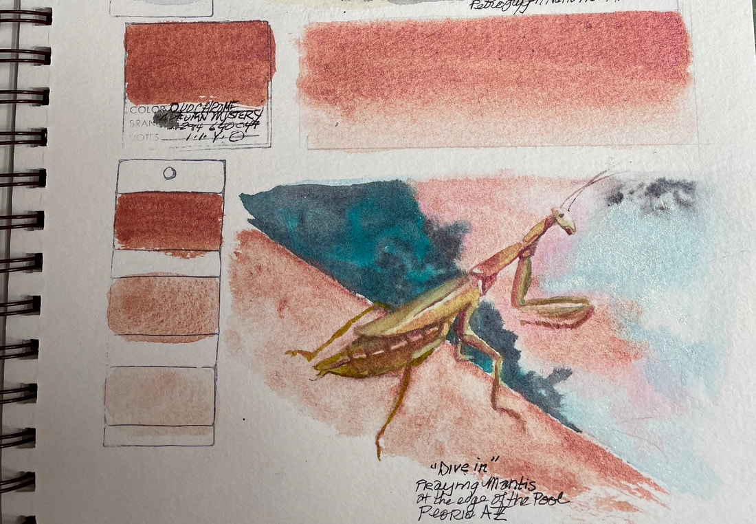
This "dandy little bandit" pops right out of the darkness with neutral tint washes. Lifting out branches and background information that is in a little bit of light was also quite easy with Neutral Tint. Daniel Smith made this color at the request of artists/teachers, Teresa Goesling and Cindy Briggs who were looking for a color that students could use to successfully darken a color without making mud. I'd say Daniel Smith got this right for sure. DUOCHROME AUTUMN MYSTERYDuochrome Autumn Mystery has by its very nature an earthy rust tone at first glance the then shifts to a coppery metallic. It is one of Daniel Smith's Luminescent Watercolors and while not a pigment I would normally need, it was an interesting experiment and useful for capturing the amazing colors of sky reflected in a pool one Arizona evening. The coral skyscape, the terra cotta colored poolside deck and the salmon colored praying mantis formed a beautiful palette that would have been effectively painted with other pigments, but they would not have been metallic. The granulation and the fact that depending on the angle the viewer has with respect to the surface of the paint combine to create a uniquely interesting read on what the color actually is. One minute it appears to be a coral with earth undertones and the next it seems to sparkle like the sunset's reflection on watery ripples in the pool.
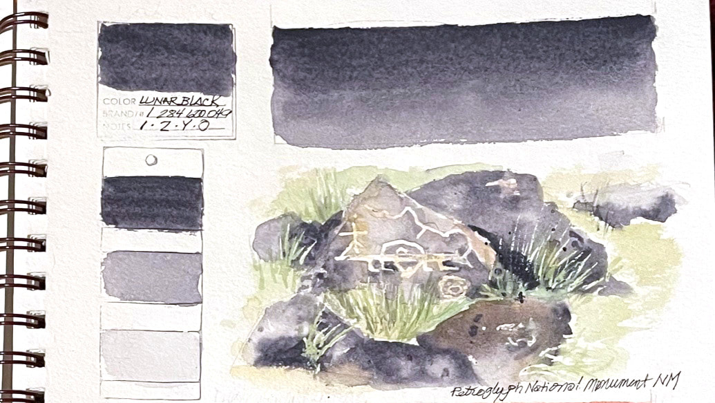
Duochrome Autumn Mystery would be much better utilized on black paper or a dark wash of another color, but was fun to play with here. LUNAR BLACKUnique properties make Lunar Black, a transparent, full value range pigment with granulating particles that attract and repel each other. When it dries, a Lunar Black wash looks like a marbled moonscape. Mottled, granite like texture is fun to achieve and unpredictable. Lunar Black can be successfully glazed. Lunar Black combines beautifully with all your favorites. It is an inorganic neutral black and unique to Daniel Smith.
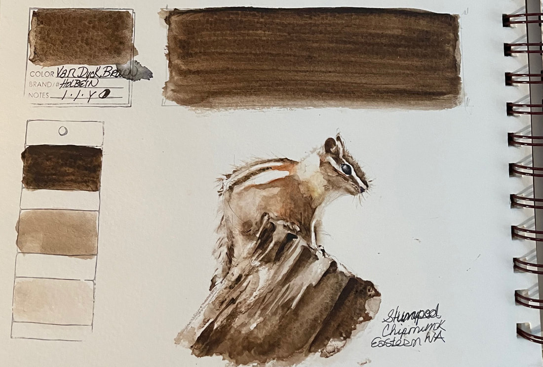
I chose this image to paint with Lunar Black knowing how it paints rocks almost by itself, if you can let it do what it wants to do and walk away instead of reworking and overworking. VAN DYKE BROWNVan Dyke Brown, a Windsor Newton Watercolor named after the Flemish painter Anthony van Dyck, who used it in many of his paintings. Permanent, lightfast and transparent, this rich dark brown can vary greatly between brands. Winsor Newton's version is made from bituminous earth or a black pigment mixed with calcined natural iron oxide. I love the range of value I was able to find by varying the water to paint ratio.
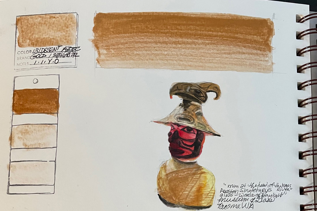
IRIDESCENT AZTEC GOLDIridescent Aztec Gold, another of Daniel Smith's Luminescent colors, is a metallic, earthy, warm gold. The Iridescent watercolors, reflect light, and their transparent quality adds sparkle and shine. So am I converted yet? As the description on the Daniel Smith website elaborates, there are plenty of examples in nature that shimmer and reflect light, but I haven't many opportunities to use these pigments. They are best on black paper or over dark colors. I have to admit, this one was a lot of fun. I was fortunate to see the Preston Singletary exhibit a while ago at the Tacoma Museum of Glass . In particular, the exhibit named the "World of Daylight", where this glass sculpture stood, was incredible. And to be able to come anywhere close to capturing the metallic and colored glass hues may not have been possible without Iridescent Aztec Gold.
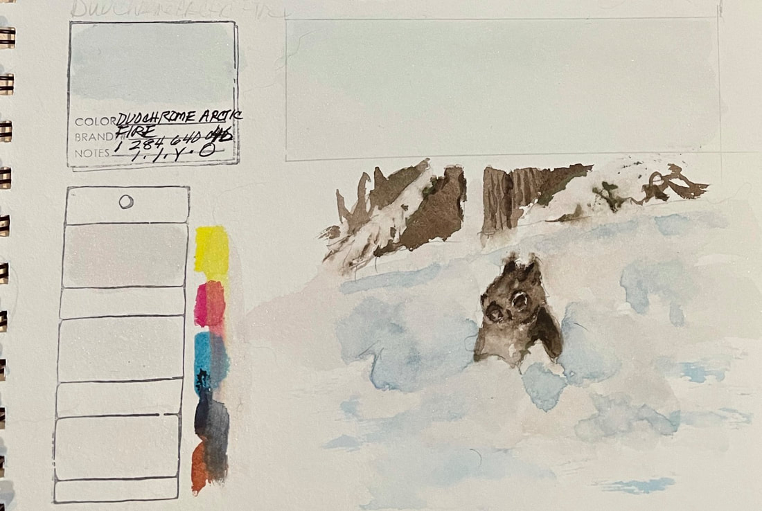
DUOCHROME ARCTIC FIREDuochrome Arctic Fire shows up best over black paper or at least, darker watercolor, so you cannot really see the color in this photograph. It has turquoise or teal glint that shifts toward violet. This is one of Daniel Smith's Luminescent Watercolors and as such has two distinct colors that it alternates between depending on how the light reflects. Again I need to say, I am no sure this is a color I would generally use, even with Daniel Smith's description in defense of luminescence found in nature. I can see that if someone was painting on black paper or was after a particular effect, they might love this color, and I have to say, while it challenged me, I feel Duochrome Arctic Fire rendered snow well. This little squirrel provided a few hours of entertainment watching him pop up from the middle of a snow bank, Make a few snowballs and then do a nose dive into another snow bank only to reappear a few feet further down the way.
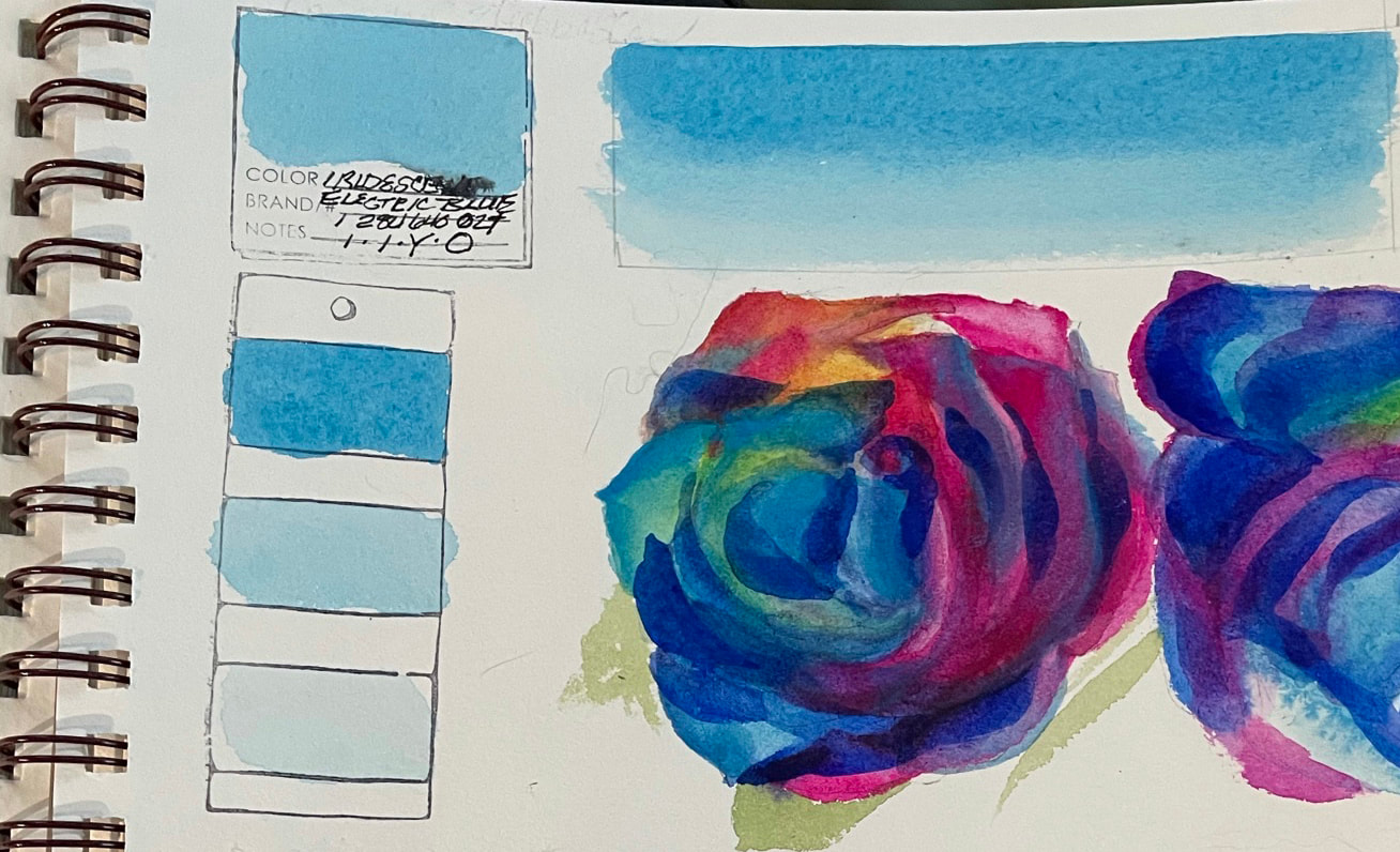
IRIDESCENT ELECTRIC BLUEIridescent Electric Blue, one of Daniel Smith's Luminescent pigments, the strongest of them and a strong peacock blue color. It is a shimmery and shiny as the other Luminescent Watercolors, reflecting light, causing it to scatter, because they are "made from mica pigment, thin transparent particles coated with highly reflective metal oxides" according to Daniel Smith.
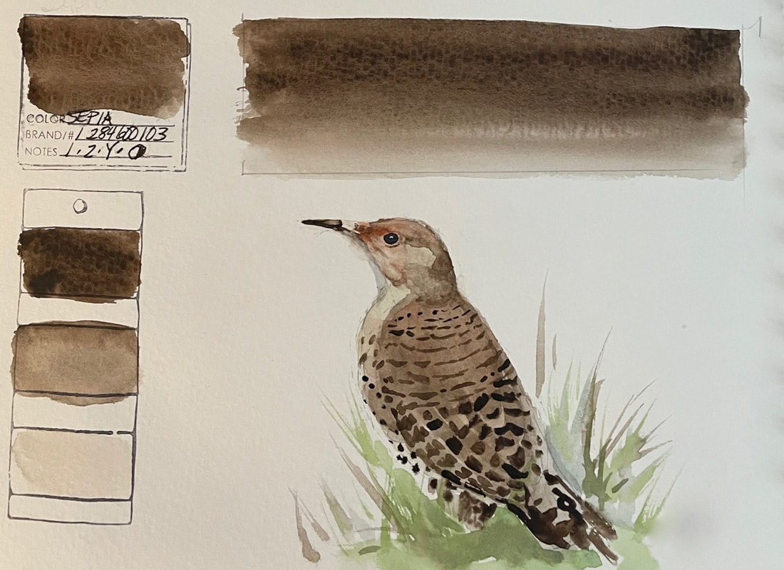
Truthfully, I will probably not find many reasons to use iridescent colors but they are fun to play with. This painting was definitely not successful, in fact I am embarrassed to post it here, but then, this is a challenge, and I said I would learn to get past the self criticism and not worry how these turn out so much as learn from the mistakes and the playtime. And oh, by the way, those roses really were all those wild colors. They were a birthday gift from my grand babies. One of my favorite gifts of all time. SEPIASepia is one of my favorites. It is a lovely warm neutral and useful for the natural subjects I often paint. It is low staining and lightfast. Loaded in a milk to creamy consistency on a brush it lays down a deep rich dark tone. Sepia dilutes to a soft mushroom hue. Wet into wet it travels smoothly, transitioning from darkest dark to palest parchment and everything in between. Sepia was the perfect pigment for this flicker. I was fortunate to get half a dozen or so very close pictures of this flicker who was so interested in something on the ground he never seemed to notice me. Odd, since every flicker I have ever encountered has taken flight instantly upon being noticed, hence our family name for them, "Chicken Flickers".
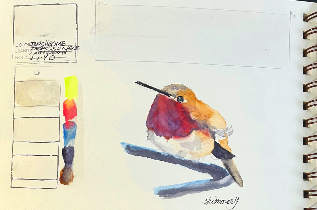
DUOCHROME TROPIC SUNRISEDuochrome Tropic Sunrise, like the rest of the Luminescent Watercolors by Daniel Smith, shows its colors best over black paper or darker watercolor. Duochrome Tropic Sunrise shifts from reflective green to red. I said it a couple of days ago and I'll repeat it here, this is a challenge for sure, I was not convinced I'd be able to find a good application for this one. As you can see (or actually, in this case, not see, since it doesn't photograph well here), this color doesn't do much applied on white paper. I tested the over some fairly strong pigments to see how it affect them, and that didn't photograph very well either, but applied to the neck feathers of this little hummingbird, it worked like a charm. Just like the Daniel Smith description of the Luminescent Watercolors says: "they add that touch of special color found in nature that regular colors cannot match. They’re made from mica pigment, thin transparent particles coated with highly reflective metal oxides."
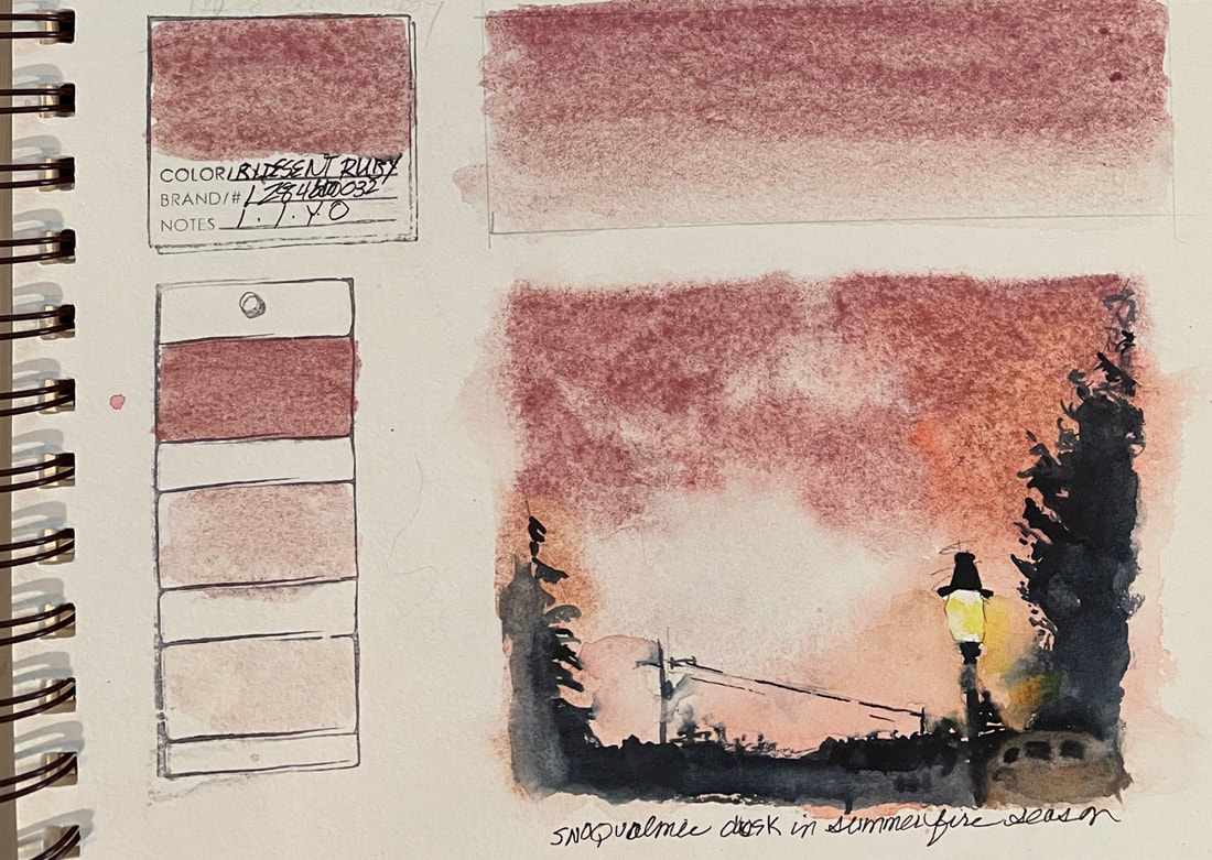
IRIDESCENT RUBYIridescent Ruby a soft metallic pink, is part of the DANIEL SMITH Luminescent Watercolors collection. It reflects light, causing it to scatter. Just like a couple of days ago when I tried Duochrome Cabo Blue, I started out wondering why I might use this color at all, considering the fact that I paint mostly things from nature. But to Daniel Smith's point in their sales pitch for this color, nature does have "optical surprises" that show up in bird feathers, insects, fish and shells. The Luminescent colors, with their sparkly, shimmering transparency, create snow, ice, slug trails and dew. I found the color underlying all that shimmer very appropriate for the dusky sunset during one of our summer fires storms. The copper sky and the streetlights that pierced through all the smoke were captured well with this heavy granulator. While it may not be one of my "go to" colors, this was fun. and yes, a challenge for sure.
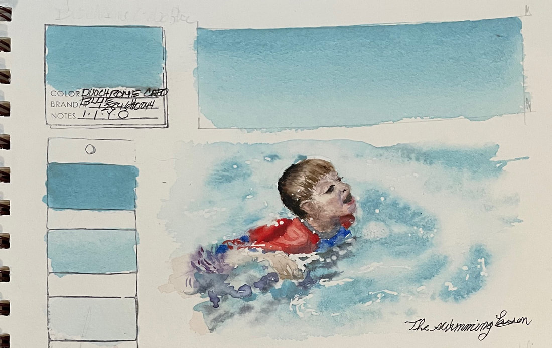
DUOCHROME CABO BLUEDuochrome Cabo Blue is a reflective color made of mica and part of Daniel Smith's Luminescent Watercolors. It shifts from blue to metallic gold, finishing with a shimmering metallic blue. This line of pigments alternates between two distinct colors and depends on reflective light. I was not sure I would ever have to use this color for anything but Daniel Smith sells the colors as useful for the optical phenomenon that you do see in nature. Bird's feathers, shells, some flowers do have sparkle and shimmer. But as a watercolor artist, we learn ways to make things look sparkly and shiny without shimmering paint.
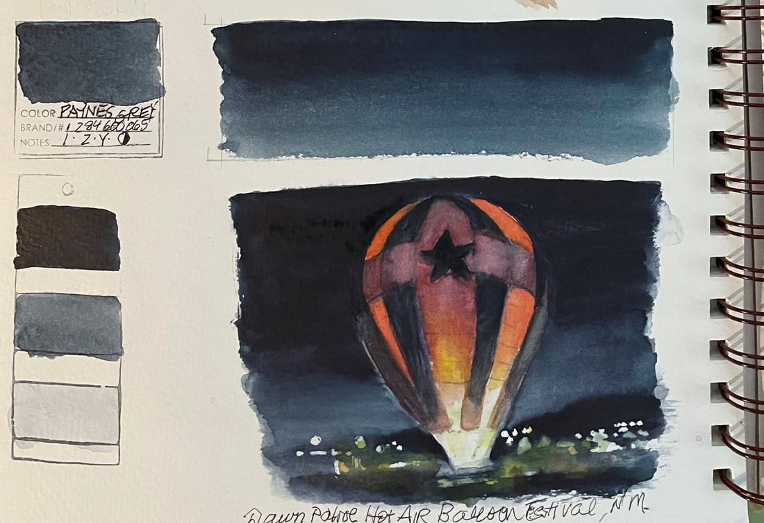
I call this the Swatch Test Challenge for a reason, I am forcing myself not only into a daily habit, but to try new things and experiment. This little painting of my grandson during a swimming lesson was a good candidate. Sparkling blue water in a sunlight Arizona backyard pool. I think it worked surprisingly well, and was fascinating to watch when I dropped an fully loaded brush of Cabo Blue into a wet wash of water. It glazes over other colors rendering them glistening without flattening out the color. Luminescent glow is a new tool I now have at the ready. PAYNES GRAYPayne's Gray is a lovely teal blue gray bordering on steely. A full range of values can be manipulated from washes and lifting. It is lightfast and mildly staining, Payne’s Gray is just the ticket for night skies and was fun to test in this example of a "Dawn Patrol" at the Balloon Festival in New Mexico. Daniel Smith suggests using this pigment instead of Indigo, except where yellow is involved and I would agree. It does hit the yellow end of the spectrum in comparison and probably why I see teal in it. Payne’s Gray helps create stormy clouds and skies. Rocks and granite boulders and other landscape features and their shadows, can be quickly sketched with thin washes and dropping in more concentrated brush loads of pigment.
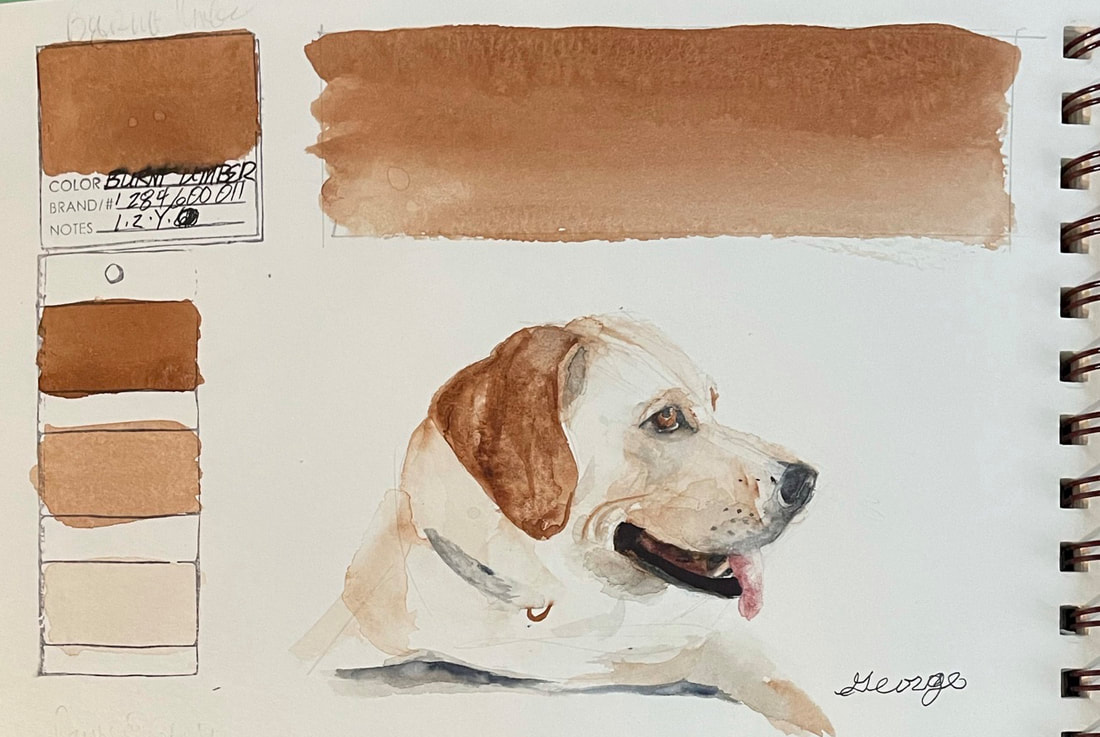
BURNT UMBERBurnt Umber is a rich dark brown earthy pigment that lends a semi- or semi-opaque staple to a palette. Since it is low-staining it can readily be lifted varying its value rendering a full range of possibilities. It mixes well with other colors. Daniel Smith suggests warming Burnt Umber with a little Alizarin Crimson or cooling it with blue to add even more possibilities to your neutrals.
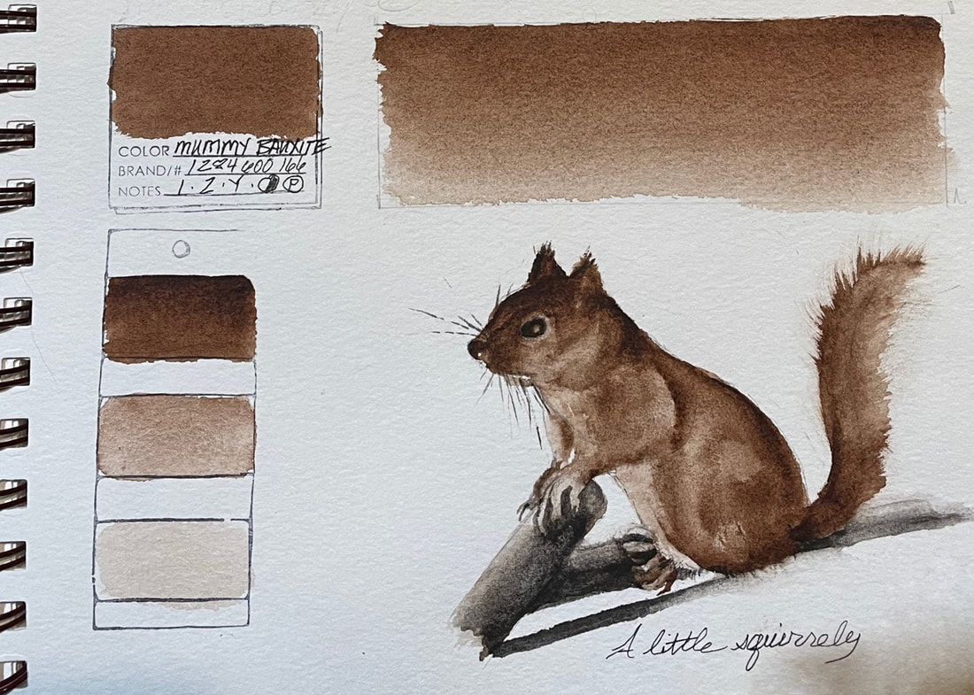
MUMMY BAUXITEMummy Bauxite is a warm spicy earth color that granulates with lovely visual texture and a rusty tone.
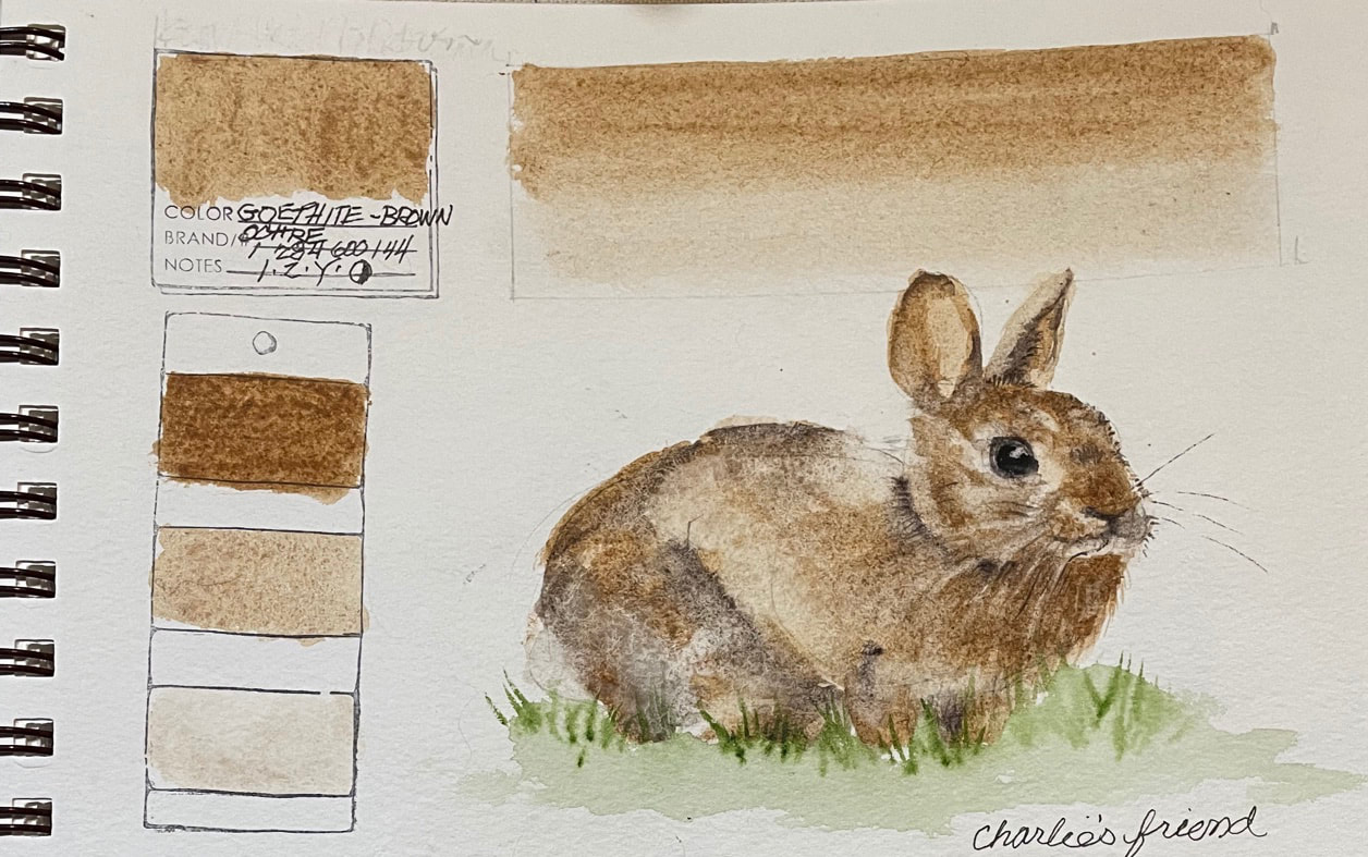
Mummy was a very popular organic pigment in the 18th and 19th centuries, that was thought to have been made from ground Egyptian mummies. This iron rich pigment, unlike the old world color, is extremely lightfast, and low-staining. I found Mummy Bauxite to lift beautiful, layer well and granulate interestingly. GOETHITE BROWN OCHREGoethite Brown Ochre is named after Johann Wolfgang Goethe, the German philosopher, poet and mineralogist. Daniel Smith's unusually pure pigment found in iron deposits is mined in Russia, south of Moscow. Goethite Brown Ochre is a dark tea color when mixed in a thick creamy consistency but in watery application it is a warm tan with lots of interesting granulation. As with most earth pigments, it is lightfast and permanent. Goethite Brown Ochre was the perfect way to paint my Maine Coon cat "Charlemagne's" (Charlie) friend, Bunny.
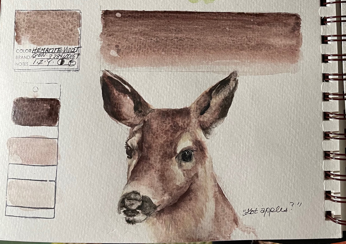
HEMATITE VIOLET GENUINEHematite Violet Genuine is one of Daniel Smith's PrimaTek series pigments ground from Hematite stones. I love the brown boarding on violet washes and deep granulation this pigment brings to the table. I could see it in rocky landscapes or as a way to render wood. Used in a thick wash, Hematite, which comes from a silvery-black mineral consisting of iron oxide, has heavy particles that will settle into a fascinating granulating pattern. When used as a watery wash, it creates a reddish umbery violet. Hematite Violet mixes well with other pigments and low staining and semi transparent. It was fun to paint one of our favorite visitors with Hematite Violet Genuine.
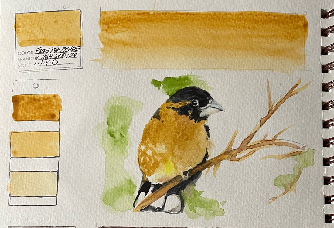
FRENCH OCHREFrench Ochre is a warm color yellow earth color that is extremely lightfast and non-staining. Its transparence allows for the ability to glaze it over other colors to add a soft. The Daniel Smith site suggests mixing "French Ochre with Red Scarlet to achieve a melon hue".
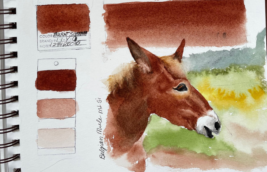
BURNT SIENNABurnt Sienna is always on my palette and one of my favorite colors. Transparent and maybe a bit slow to wake up but once I have watered it well and let it come to life, Burnt Sienna is the warm earth hue of choice for my neutral mixes adding beautiful layers to other colors without staining them and without loss of transparency or intensity.
The herd of Belgian Mules in a field near my home have luxurious coats of burnt sienna fur that begged a quick study. |
SOUL“I am a contemplative artist who has trouble accessing verbal skills. Finding the right words to talk about the amazing things I observe around me can be frustrating. It is much more natural for me to pick up a paintbrush, some embroidery floss or my camera when I wish to share some new discovery. The artwork I create is meant to be enjoyed on whatever level the viewer experiences it and not layered with complex meaning. Feathers, fur, flowers and the incredible variation I find in wildlife not only inspire me, but compel me to share every nuance with you. Archives
July 2024
|
 RSS Feed