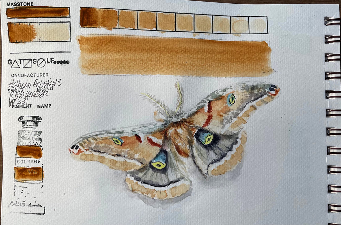
RAW UMBERHolbein Watercolor is a brand with a long reputation. Originally introduced in the early 1920’s, Holbein Artist Watercolor is a transparent watercolor that handles differently than other brands and more like Japanese Watercolors. Their website says that it is more finely ground than any other watercolor and not produced with ox-gall. They follow that statement up with a pretty strong claim about its being the reason for the fine handling quality of their pigments. And after playing for an afternoon with Raw Umber, I'd say they back it up well. This one at least was lovely to work with, layered beautifully, is transparent and a very consistent pigment.
0 Comments
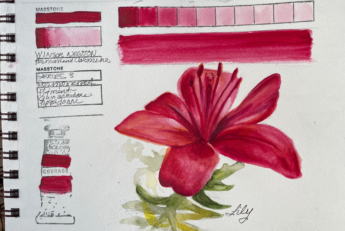
PERMANENT CARMINEWinsor Newton's Permanent Carmine is a jewel like pigment that layers beautifully. It builds to a deep ruby red after beginning as a baby soft pink. "In Antiquity, Carmine was made from thousands of crushed kermes insects." according to the Winsor Newton Website.
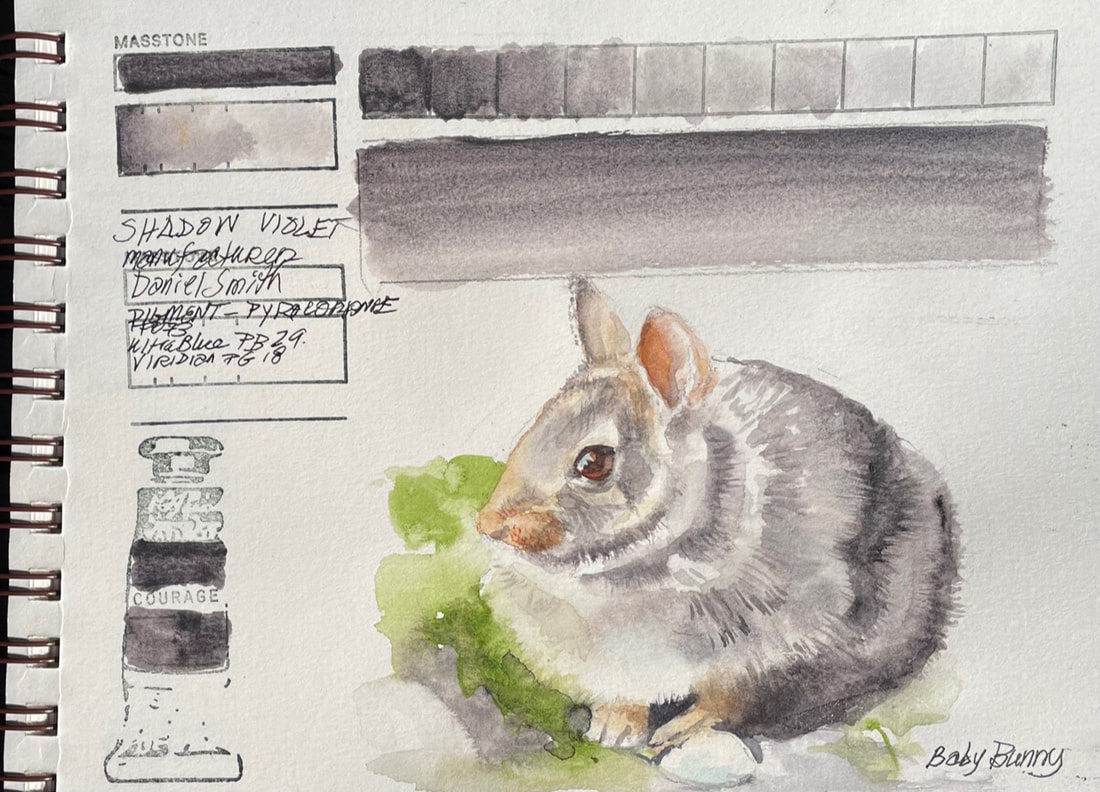
SHADOW VIOLETDaniel Smith's Shadow Violet is a complicated pigment that on the surface appears a smooth gray-mauve. On closer examination it displays a fascinating granulation, especially when applied in more than a light wash. In mass tone, Shadow Violet is a deep warm violet , shifting to a warm glow in thin applications. Shadow Violet's transparency makes it a great for glazing. I needed little else to paint this little bunny.
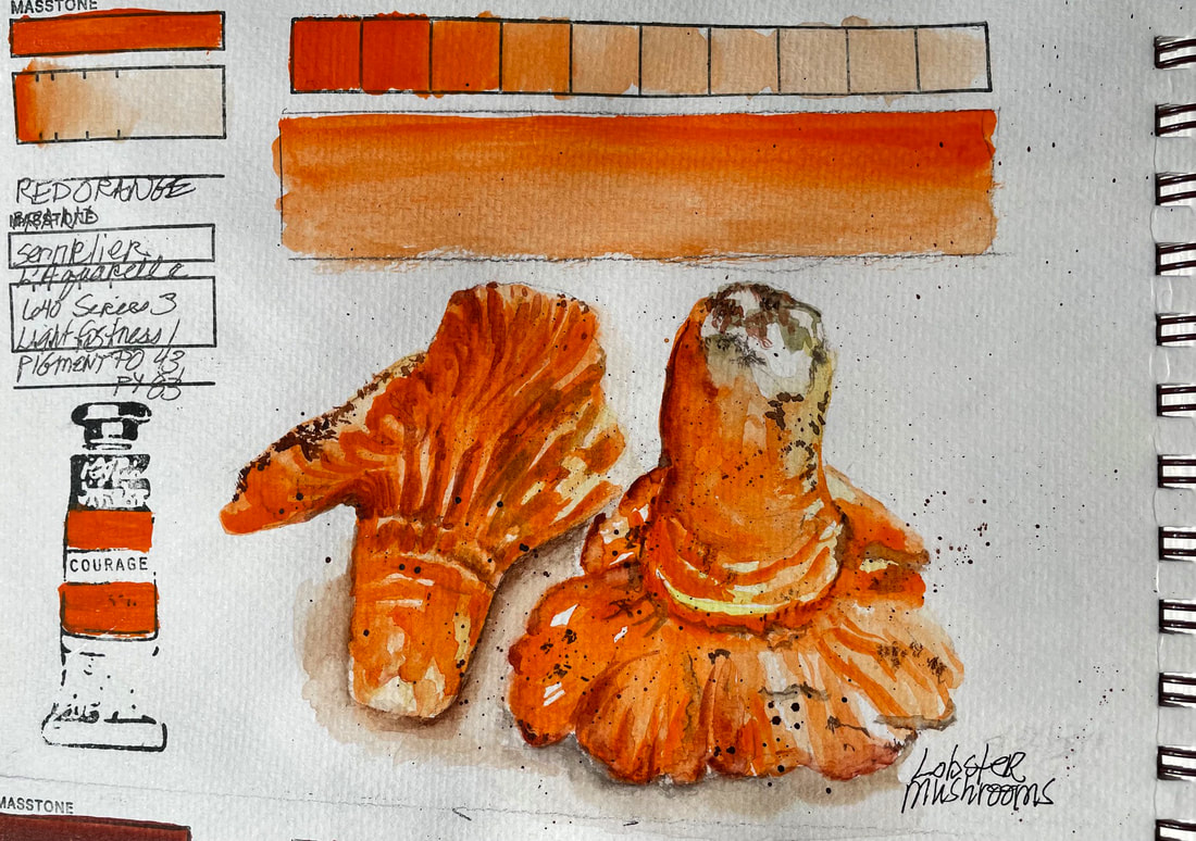
RED ORANGESennlier L'aguarelle Watercolors, made with honey as their binder, are a very different experience to paint with. The pigments feel somehow more luxurious than those with other binders, but perhaps it is my imagination. Add to the unfamiliarity of the paint and its consistency, the fact that it is extremely hot here in the Pacific Northwest at the moment and paint dries super fast. I love the color, and the consistency is a treat. I will paint on a cooler day next time.
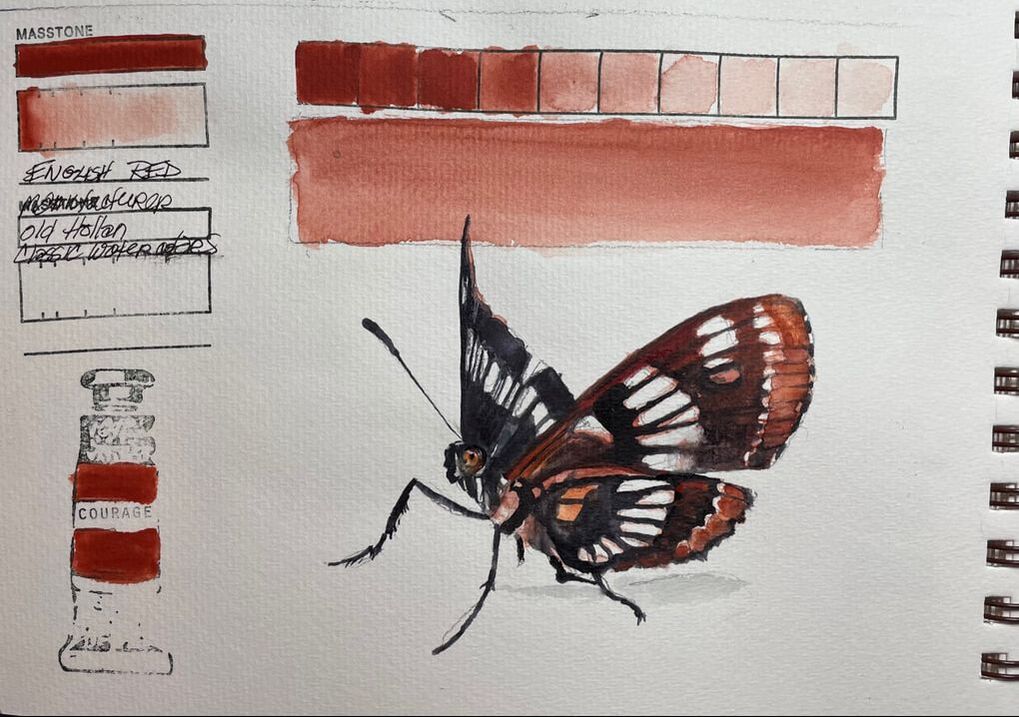
ENGLISH RED Old Holland English Red is unique in several ways. Semi-opaque to opaque, rich earthy reddish brown, this pigment doesn't wash down easily. It's consistency is hard to report on as my tube is very old and I may not be getting a good representation of what it is really like to work with. But the color was lovely mixed with black and worked well for this Mourning Cloak Butterfly.
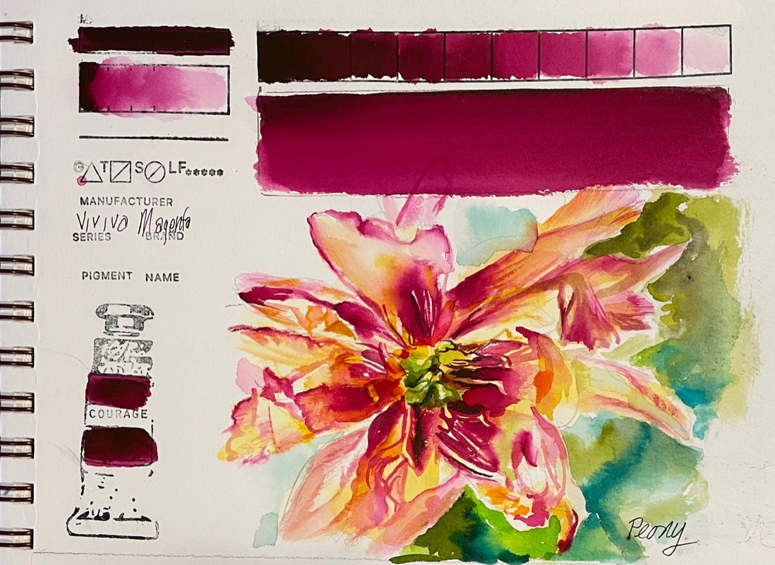 MAGENTAWell we have made it to the end of the full palette of Viviva Colorsheets. And fitting that the last color I tried, Magenta, is so beautiful. This red violet is warm for a magenta and is magic mixed with their yellow ochre. I found it the perfect combo for to capture the end of this peonies radiant bloom. The two colors lit the delicate shimmering petals from the inside out and replicated the torchlike essence of its passing beauty.
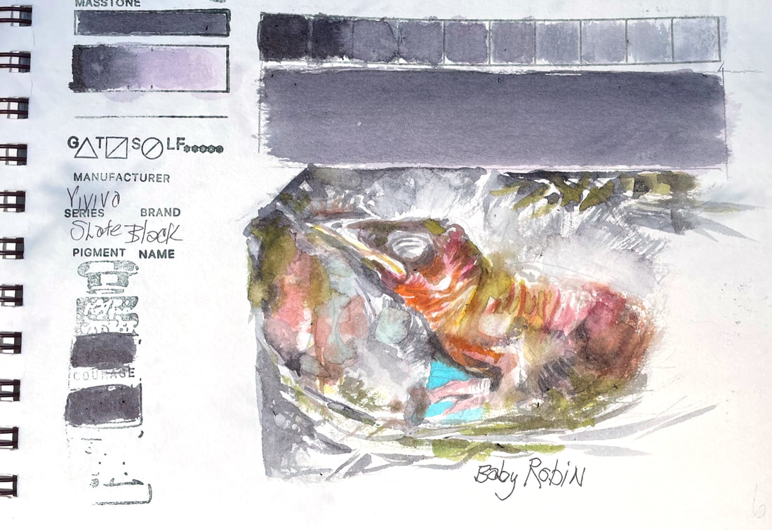 SLATE BLACKI needed this Viviva Colorsheet neutral today. Slate Black is dark charcoal on the cool side of gray and neutralizes any color mixed with. I have a close eye on a robin's nest that is well within my view on my way to the garage and while I try not to disturb mother robin, I just can't help peeking. This amazing process from laying the brilliant blue eggs to the hatch of little wrinkled fuzzy babies is a sight to behold. I feel honored to be a witness to the daily miracles of this robin family. Having Slate Black in my arsenal of colors today was exactly what I needed to help express all the colors, wrinkles and bird beginnings happening in that nest.
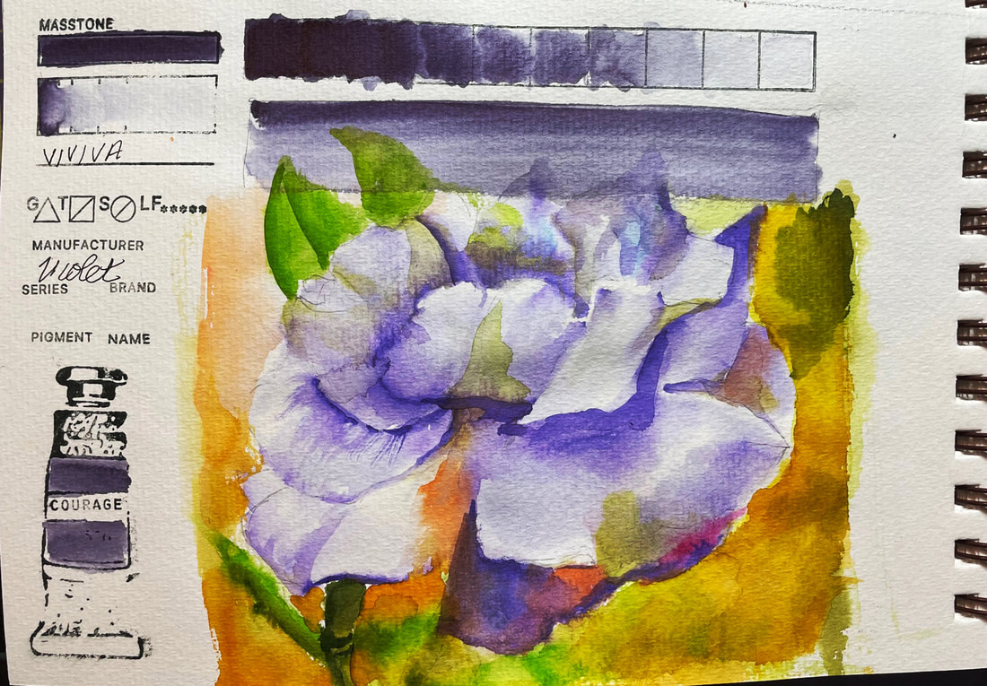 VIOLETViolet one of the Viviva Colorsheets purples, is a unique color. It has a bit of a randomness in the way it lays down, depending on the location of the dip you make onto the sheet with your water laden brush. Often it is truly violet, but in some situations it reports back as an amethyst or dusky gray. The inconsistency doesn't bother me, it adds interest, but it is difficult to control. In the case of this rose, and through no fault of the paint, but entirely the fault of the artist, I lost control in a big way. When I first began this challenge I committed to posting whatever I painted each day. I am posting this, and I am trying to be okay with putting it out there for all to see. I am still learning and I hope I never stop.
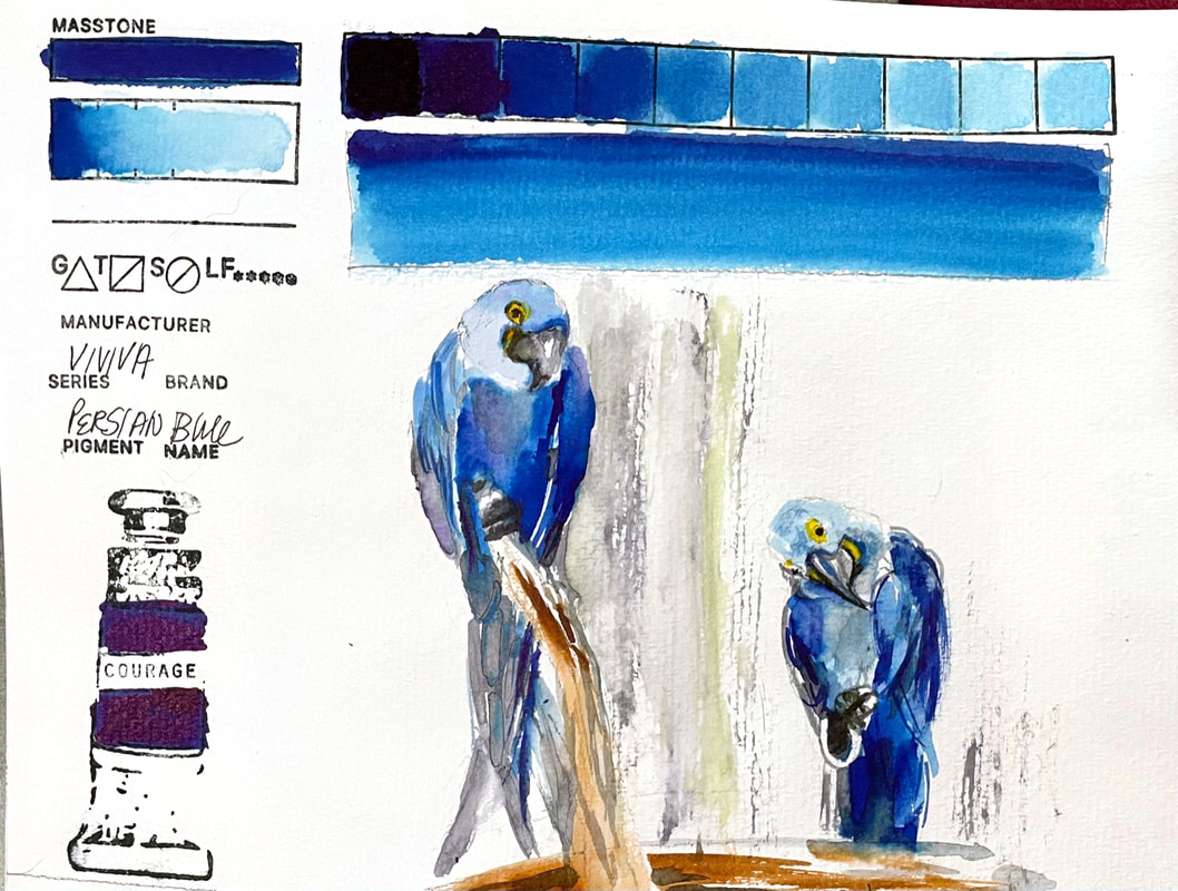 PERSIAN BLUEViviva Colorsheets provides a basic blue, akin to Ultramarine blue here with their Persian Blue. Another strong, transparent color, this blue fills the gap where a cooler blue is needed. What a fun way to get to paint the Hyacinth Macaw from our local Issaquah Zoo. Their plumage is a clear bright, cobalt blue with gray undersides and the strong yellow markings of their bare skin around the eyes is striking against the Persian Blue I used here. Their 45 inch wingspan and 3 foot long body make for an impressive presence of blueness.
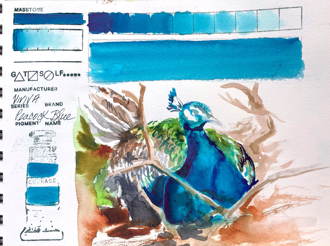 PEACOCK BLUEViviva makes this gorgeous blue colorsheet that is close to cerulean blue and the warmer blue version of their original set of colors. They have cool range blues as well but this follows up the blue green viridian nicely. And just because of its name, I had to use it for the peacock my grandson and I found at the local zoo laying way back in the bushes in a nice cool place.
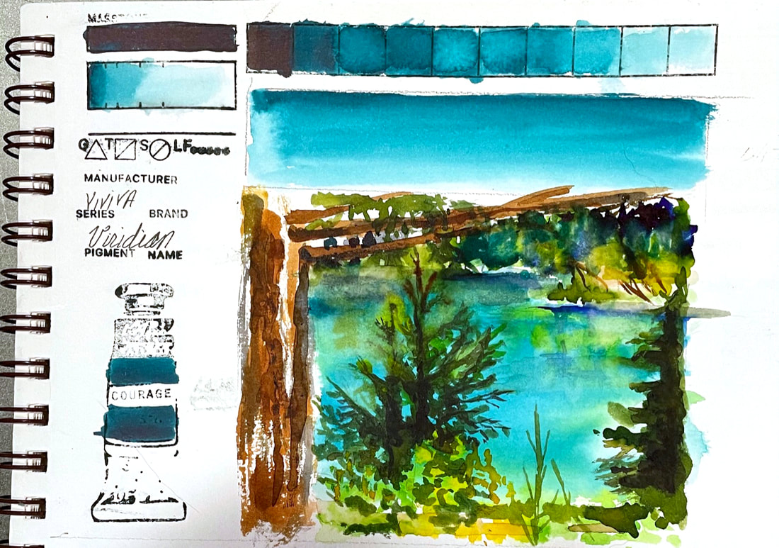 VIRIDIANViviva Colorsheets Viridian is a lovely turquoise bluish green that is strong and staining. I don't normally paint landscapes, but this scene from a trip east of the mountains to Cle Elum Washington had such strong colors that I really wanted to try to capture that gorgeous turquoise water.
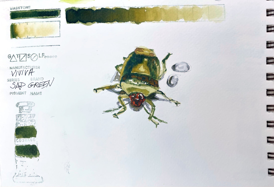 SAP GREENViviva's Sap Green lives in the neighborhood with Green Gold, Olive Green and some of the earth tones in my estimation. A versatile warm and earthy green, this would fill many buckets if you needed one green and were in the field. True to the Viviva form of delivering intense saturated color, I was able to use very little else and still indicate the spectrum of greens this little bug was adorned with. I suspect this guy is some sort of a stink bug, although he did not match any of the dozens of images a general Google search netted. I found dozens rampantly devouring my lilacs. When I brought freshly cut blossoms into the sink to wash them off they beetles scattered all over the kitchen. Lesson learned, I now do the rinsing in the garage sink.
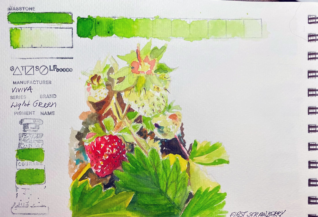 LIGHT GREENViviva Colorsheets Original set has a couple of greens, in both cool and warm directions. This clear and bright spring green is versatile and my favorite for the range it provides. There other greens are the extreme of warm or cool, this one rides happily down the middle.
I was able to get a very pale, brand new strawberry green out of Light Green and with the addition of a little bit of yellow, was happy with the way I was able to render image today of the fresh discovery of the first strawberries of the summer out in my garden today. 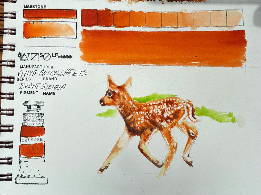 BURNT SIENNAViviva Colorsheets Burnt Sienna is much like Quinacridone Burnt Orange and is bright and transparent and while probably not the staple on my palette like other brands, it is a interesting and useful. Used on its own it has a wide range of values and although I have not tested it mixed with other colors, I would assume it would work well as a neutralizer.
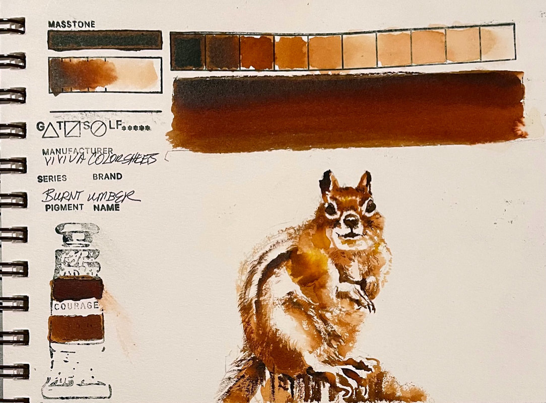 BURNT UMBERViviva Colorsheets Burnt Umber much like most brands of Burnt Umber, has it unique characteristics, this one being warmer and redder than some other brands. There just does not seem to be a lot of consistency, one brand to the next to what constitutes burnt umber, or for that matter burnt sienna. In this case, burnt umber is inching closer to what other brands might call burnt sienna. Nonetheless, this is a beautiful warm brown and its transparency and range of values makes it a nice addition to a nature sketchbook palette.
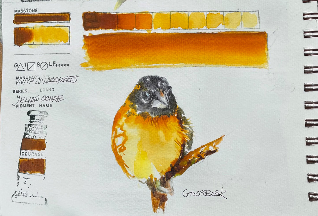 YELLOW OCHREViviva Colorsheets' Yellow Ochre is much closer to a very transparent warm yellow like New Gamboge. It has much less resemblance to most yellow ochre's in that they often only semi-transparent if not opaque. This yellow ochre does ride in the range of raw siennas and ochre with the addition of a warm orange component and the added benefit of the ability to wash way down to a very bright clear yellow. This Yellow Ochre and yesterday's Chrome Yellow with the different characteristics they exhibit remind me of the characteristic differences in the Evening Grosbeak and the Grosbeak, cleaner, cooler, brighter yellow, or warmer, more burnt orange yellow.
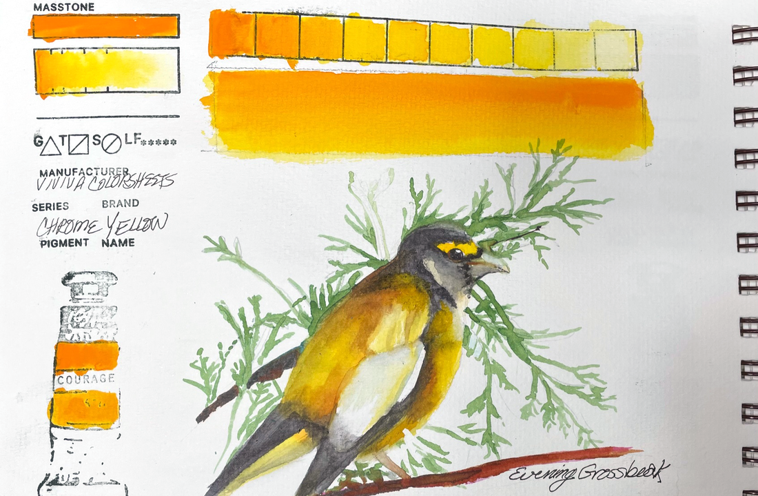 CHROME YELLOWViviva's Chrome Yellow Colorsheet is reminiscent of New Gamboge and a lovely portion of their 16 Color Palette. It is transparent, vibrant and a stainer. It does lift with some effort but the yellow ghost it leaves does not go unnoticed. Just plan for that and it will be your best friend for a warm yellow when you are out in the field.
Every year, for a couple of days in May, we get a great visitation from a number of Evening Grosbeaks. What a lovely, sunshine yellow treat. 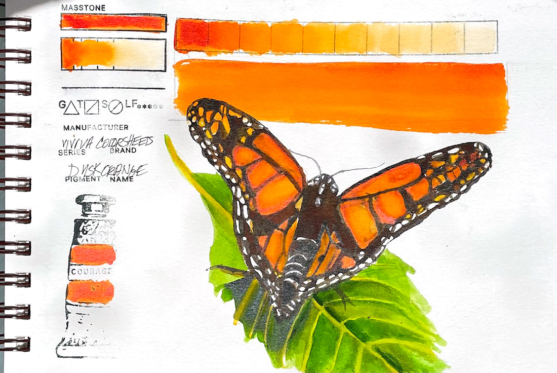 DUSK ORANGEDusk Orange by Viviva in their "Original" Colorsheets Set is the yellow end of the spectrum when it comes to the reds and oranges in their sets. It is, then, a nice compliment to their offering and necessary to allow for a full range of color in a set that can be taken on a hike at a moments notice. This orange was exactly what I needed to make this little butterfly take flight.
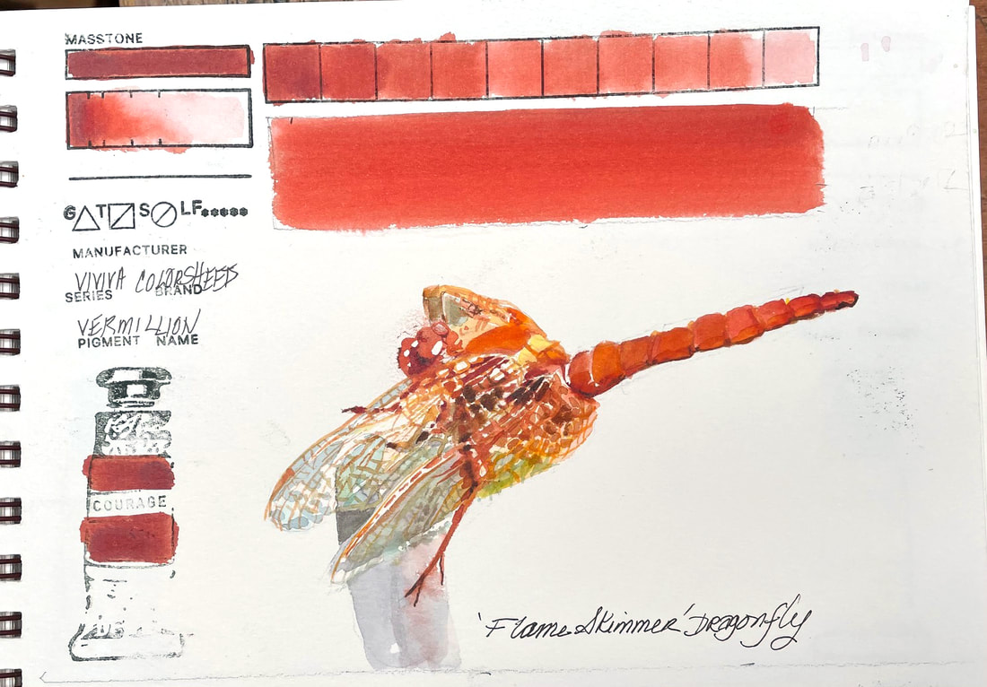 VERMILLIONFalling somewhere between Transparent Pyrrol Orange and Perinone Orange, this warm reddish orange pigment infused sheet from the Original Set of Viviva Colorsheets is stunning. A few years ago, a flaming orange dragon fly choose to land on my care antennae, and "hung out" with my granddaughters, daughter-in-law and I as a sort of gift after the recent passing of my daughter-in-laws father. That special visit has remained in our hearts and minds ever since. Painting the messenger today brought back many of the same emotions.
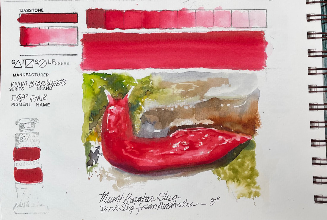 DEEP PINKViviva Colorsheet, Deep Pink is fairly similar to their Crimson, maybe just a tiny it more blue but not much. But like I said yesterday, I love red and this is beautiful. And yes, there really is a deep pink slug. Of course it is found in Australia, like many other very interesting, and sometimes deadly critters. This one, the Mount Kaputar Pink Slug, is about 8" long.
|
SOUL“I am a contemplative artist who has trouble accessing verbal skills. Finding the right words to talk about the amazing things I observe around me can be frustrating. It is much more natural for me to pick up a paintbrush, some embroidery floss or my camera when I wish to share some new discovery. The artwork I create is meant to be enjoyed on whatever level the viewer experiences it and not layered with complex meaning. Feathers, fur, flowers and the incredible variation I find in wildlife not only inspire me, but compel me to share every nuance with you. Archives
July 2024
|
 RSS Feed