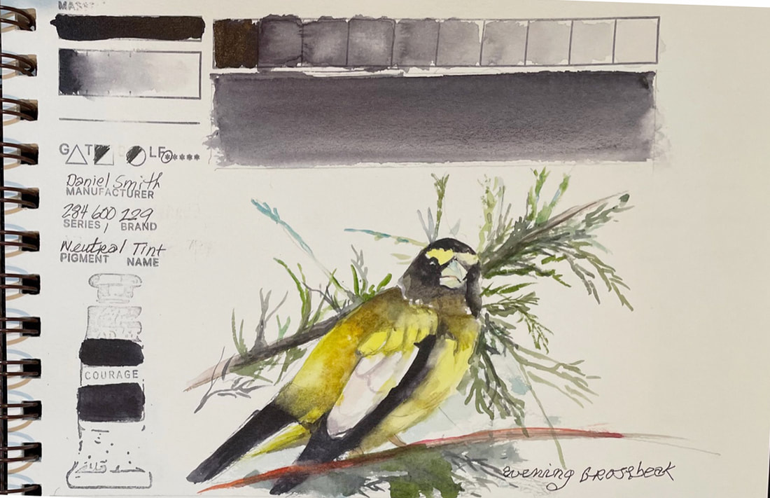
NEUTRAL TINTDaniel Smith's Neutral Tint, created for artists and teachers, Theresa Goesling and Cindy Briggs from MakeEveryDayAPainting.com when they asked Daniel Smith to come up with a dark watercolor pigment that even beginning artists could use to darken a pigment without muddying it. Its addition to a color doesn't affect its transparency. In fact, the combination of this rich dark neutral and most other colors results in a "glowing dark". I used neutral tint with Hansa Yellow Light to create the shadows on the wings of this Evening Grosbeak. Adding Neutral Tint to Quinacridone Gold created a gentle warmth to the dark areas, both in the yellow and black feathers. It took little more than a few light washes of Manganese Blue and the limited palette gave me all the color I needed.
0 Comments
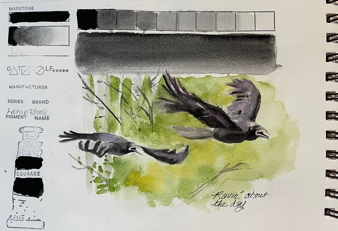
LAMP BLACKLamp Black, made from burned mineral oil and tar is opaque, high staining and black as black gets. It is described on the Daniel Smith website as "classic black velvet", which is a great visual of the quality and personality of this cool pigment. They recommend mixing it with burnt sienna to warm it up. I mingled a little quinacridone purple and cobalt blue in some of the lighter, watery washes of the ravens wings where they were catching the light of the sky above the. But there was little need of additional colors thanks to Lamp Blacks huge value range.
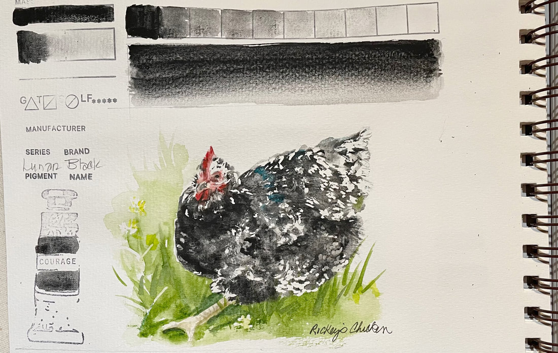
LUNAR BLACKLunar Black is transparent, yet has an wide value range and its pigment particles granulate in the most amazing ways.
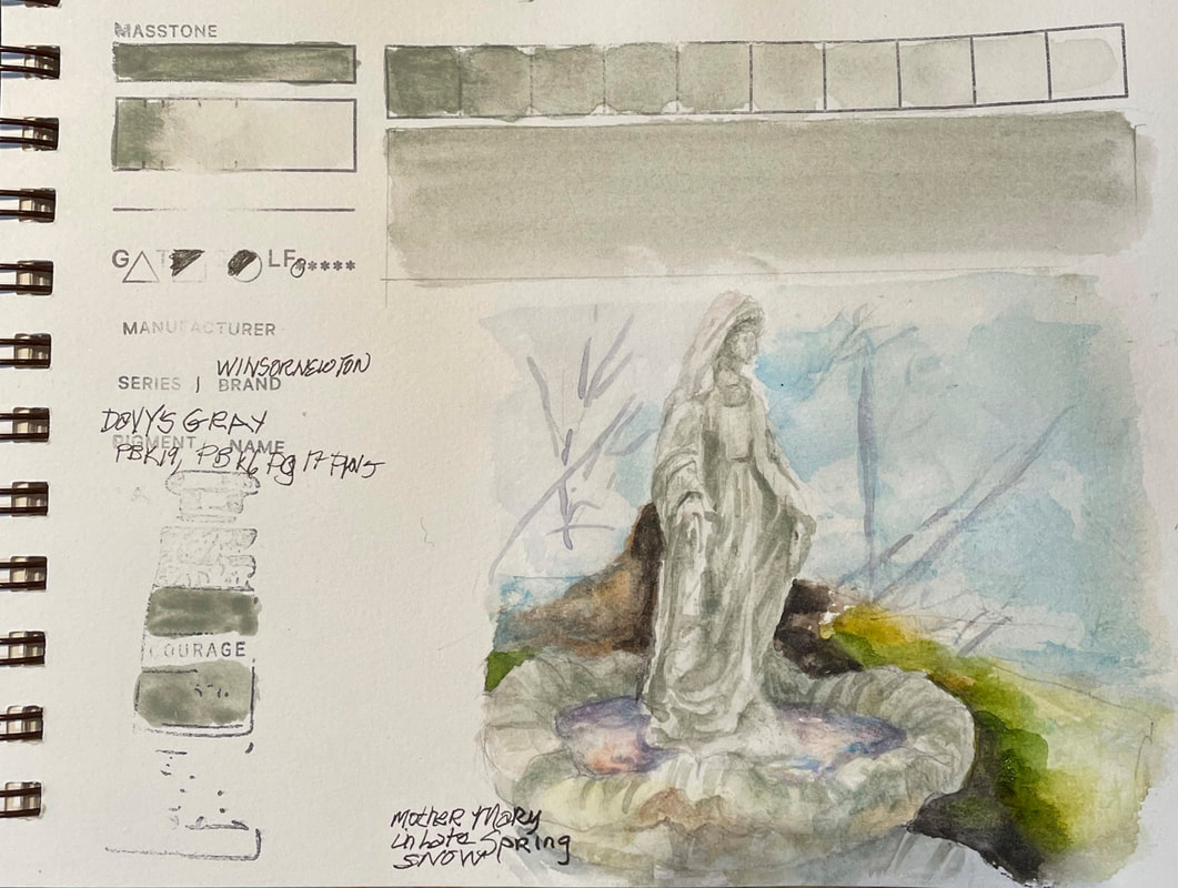
Lunar Black has a mottled texture but glazes well. Drop Lunar Black into a semi wet wash and stand back to watch how it plays with other colors and previous layers. This pigment is a DANIEL SMITH exclusive whose unique properties make it one of my new favorites. DAVY'S GRAYWinsor Newton Davy's Gray is a soft grey color "developed by Winsor & Newton for the 19th century English artist Henry Davy, a pupil of famous water-colourist J S Cotman" according to the Winsor Newton website. This warm gray lifted nicely, and while a wide range of value was not as easy as other gray colors, it did layer and add intensity with subsequent washes. Davy's gray is a wonderful for representing weathered statuary as this fountain in my garden. The Virgin Mary stood in an icy puddle after a late spring snowfall. The beautiful sunrise reflected in that frigid pool was breathtaking. This gray helped convey that special moment.
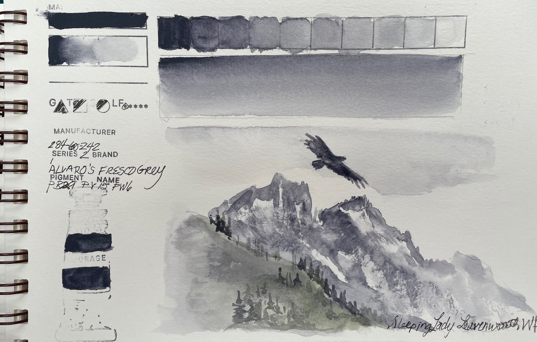
ALVARO'S FRESCO GRAY Alvaro's Fresco Gray is the cool version of yesterday's gray and at the risk of sounding like I am repeating myself, this after all the second of two grays for Alvaro Castagnet, renowned Master Artist and a part of Daniel Smith's Signature Series. There are six greys in all that were released in 2019, each created with a renowned artist in mind. His Fresco Gray is quite different from yesterday's Caliente, beyond the obvious opposition in color temperature. Alvaro's Fresco Gray is a deep indigo straight from the tube and washes to a misty grey. It is a granulator, unlike its Caliente sibling. They both mix well with other colors, I added a deep undersea green into it to create this Pacific Northwest atmospheric image of The Sleeping Lady in Leavenworth, Washington.
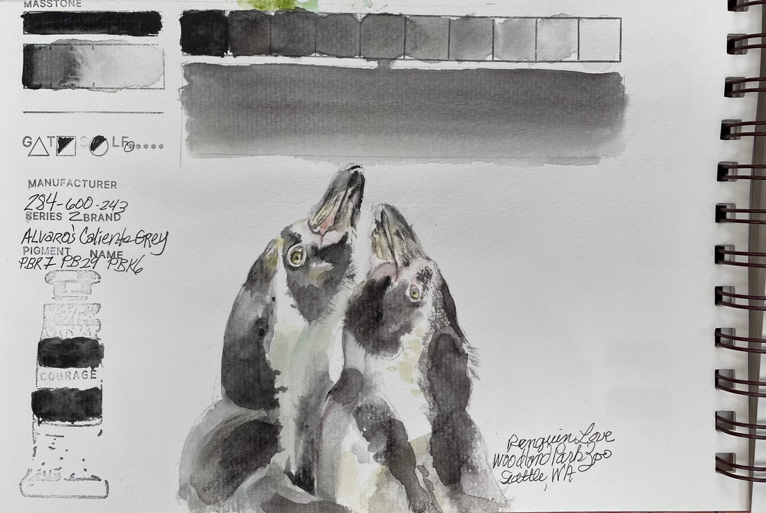
ALVARO'S CALIENTE GRAYAlvaro's Caliente Gray, part of Daniel Smith's Signature Series is one of the six greys released in 2019, each created with a renowned artist in mind. This warm gray is one of two that Alvaro Castagnet was behind. It is an energetic and warm velvety grey. I used only a couple other colors to for this fun image of two penguins at the Woodland Park Zoo. It mixed beautifully with Manganese Blue Hue to cool down the shadows and Rich Green Gold to warm them up. Alavaro's Caliente Gray was so perfect on own, that I needed only a slight very watery wash to move the warmth one direction or another. This is a semi-transparent but non-granulating gray and so far, even though this is only day one of "why do I need so many grays and blacks", I may already be swayed a little.
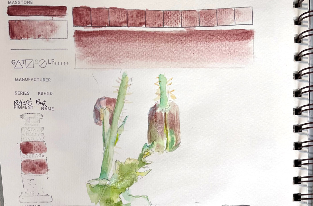
POTTERS PINKPotter’s Pink is a favorite of botanical artists with an historical use in English Watercolor paintings of the 18th and 19th centuries. It is a muted, delicate and neutral granulator, the last of granulators in my collection of paints. This one is useful when the bright intense colors used in more modern watercolors need a balancing act.
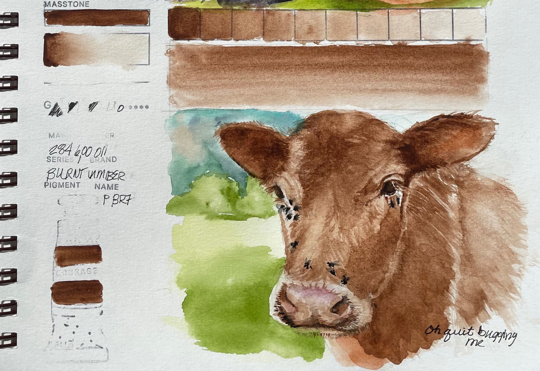
BURNT UMBERBurnt Umber, again! I have now accidentally painted both Burnt Umber and Raw Umber Violet twice. Burnt Umber is
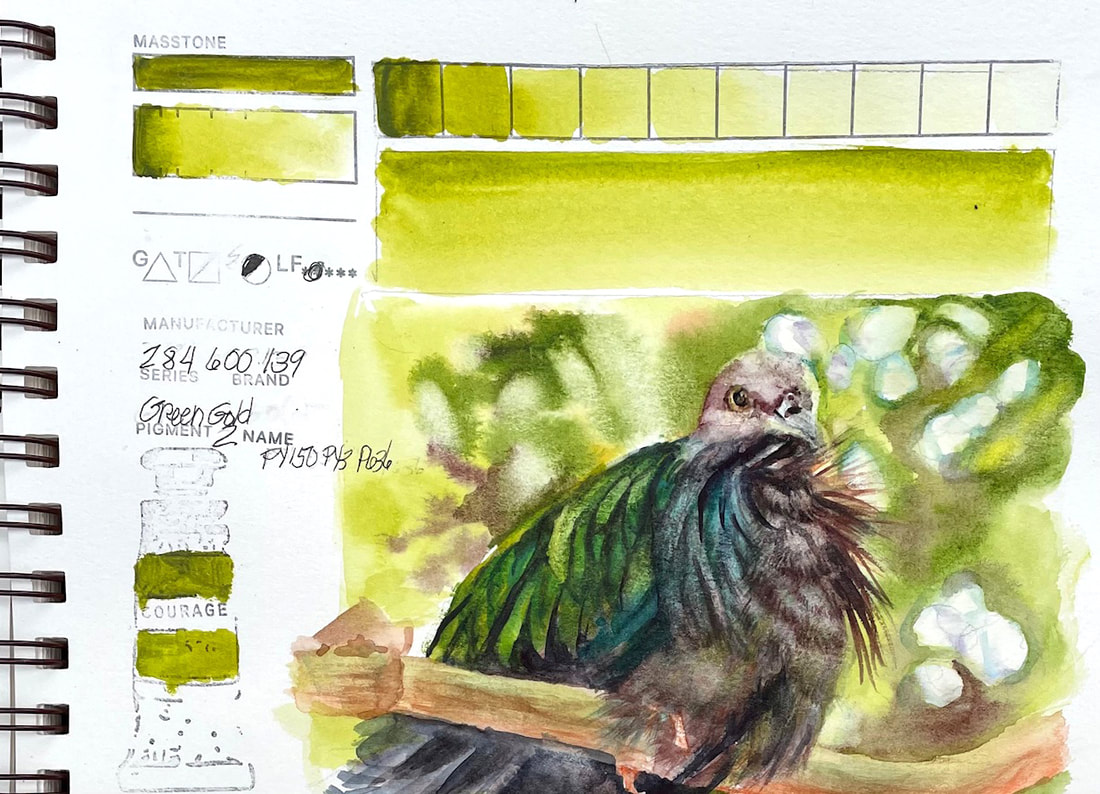
semi-transparent, but that can also mean semi-opaque and that is what I found here. It is low-staining though, and I was able to lift areas in the dark patches that got dense. How now, brown cow? This poor guy was covered with flies, makes me want to blink. And, I have run out of granulating watercolors. My original challenge was to use all my granulators in test swatches and quick sketches. While the intention has morphed a bit, the habit is well ingrained 78 days in. I plan to continue my daily practice, challenging myself in new ways. There are a couple of new tubes of paint on my work table, and I can't resist test driving them, that will fill the next few days. Next up . . . . . . I have been wondering about the grays and blacks I have in my collection of pigments, and rarely use since I mix my dark neutrals. What does one do with a tube of gray paint??? Well, let's just see! GREEN GOLDGreen Gold is a brightener, adding yellowish springy green when applied in thin washes. It moves toward and olive green used thicker and is a beautiful addition to your palette if botanicals are your passion.
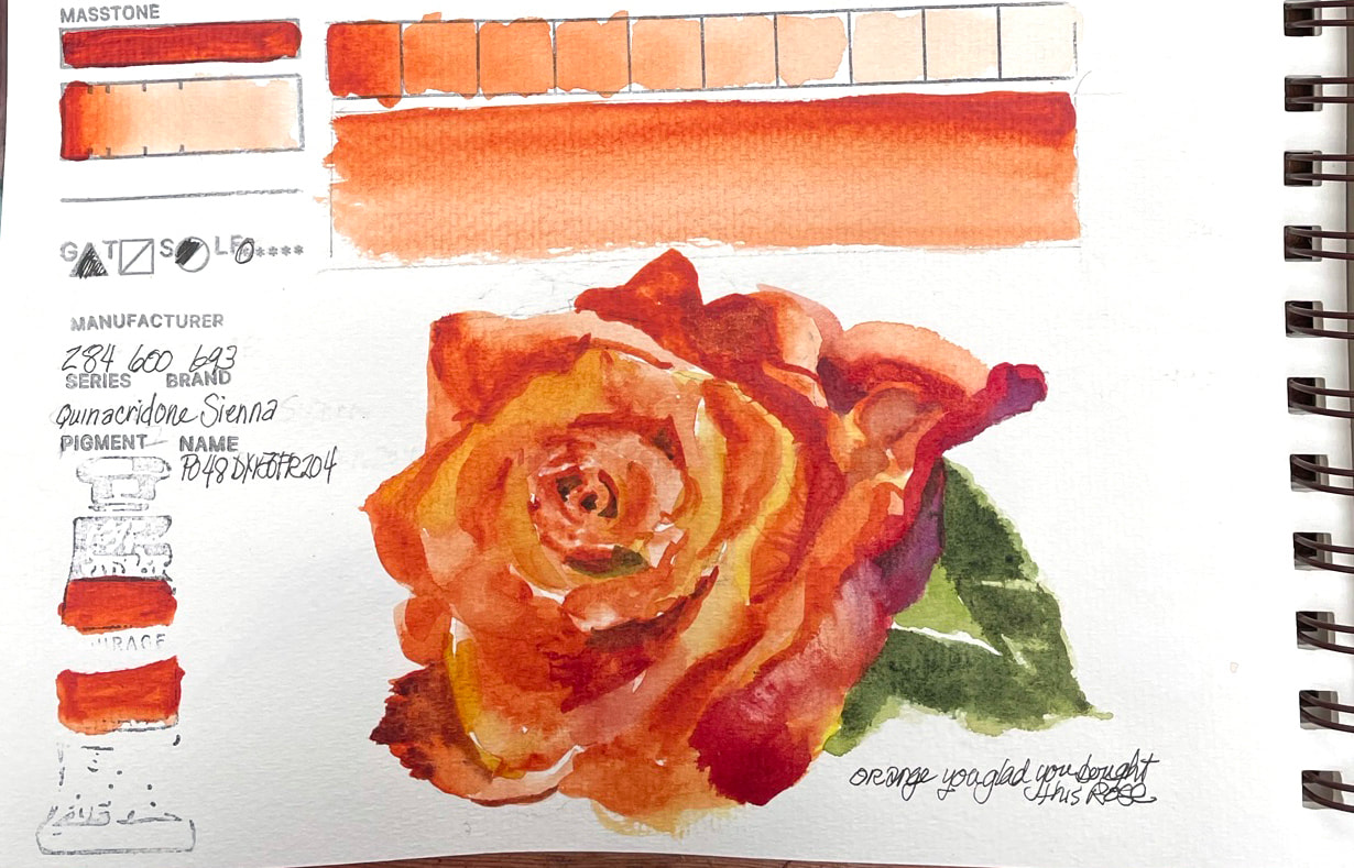
A trip to the Woodland Park zoo with my grandson involved the discovery of this amazing bird, the Nicobar Pigeon, whose feathers in certain light, just happen to be "green gold". Throw in some cobalt teal blue, indigo and umber violet and you are well on your way to capturing those iridescent green feathers this guy flaunts. QUINDACRIDONE SIENNAQuinacridone Sienna is described on the Daniel Smith website as "finer than any Burnt Sienna" and I have to agree. I was amazed by the beauty and glazing properties of this gorgeous pigment. I love quinacridone Gold which has a similar knack for jazzing up other colors when used as a light wash over a layer. What excited me was its possibilities and how it may fill my gappy space between New Gamboge and Transparent Pyrrol Orange. It does not seem to get muddy, or at least in my little quick sketch where I was trying to see what it could do by throwing colors at it that may have made other oranges give up. It didn't, it hung in there and was lovely under other colors as well. Granulates, is transparent and a clear, bright and intense pigment. Guess I should have purchased a bigger tube.
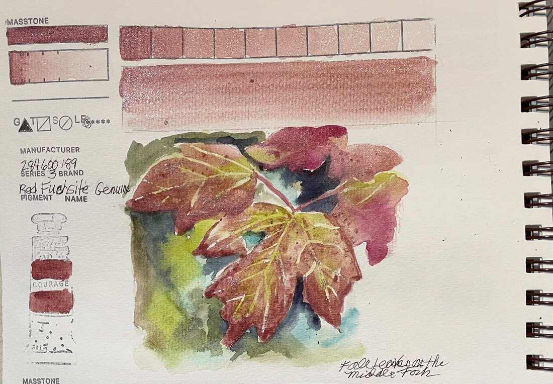
RED FUCHSITE GENUINERed Fuchsite Genuine, another of Daniel Smith's Primatek Series of pigments, and in case you are wondering, it's pronounced with a long "o" as in books and looks and not a long "u" and twisted up to sound like the flowering plant, fuschia, So "Fooksight" is how it is said and it is named for the German Mineralogist Johann Nepomuk von Fuchs.
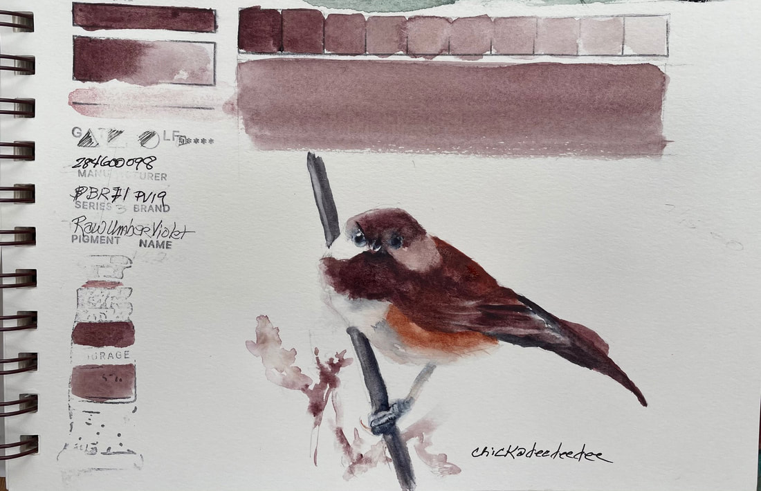
There, now we can talk about it without blushing, Fuchsite is found in the mountains of Brazil and is a treasured gemstone. I was surprised to find that this soft, dusky rose resulted in a sparkly iridescent sheen once it granulated leaving a very different cast than what I expected, but lovely and fitting in this case. RAW UMBER VIOLETRaw Umber Violet is still all the things it was two days ago. If you feel like you were just here, it is because I did just paint with it.
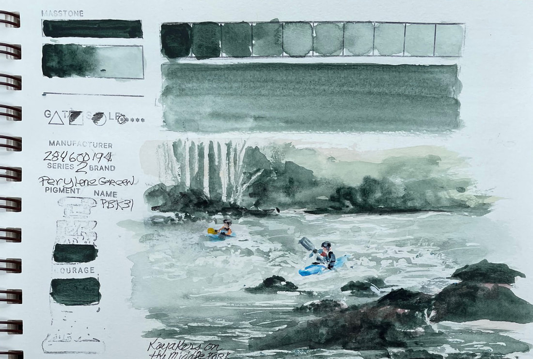
This is how it goes, you buy a new sketchbook, and you have to get over the fear of messing it up. Be brave, just paint, right? And then it happens, a painting goes terribly awry, or you misspell something, or spill a big blotch of ink in the middle of a page. Much like a new car, for me, I can't seem to go more than a few days without a rock chip in my windshield. So yes, new sketchbook, and I messed up the third page. I grabbed the same color I had used two days ago and starting this painting. So, rather than rip the page out, I am going to be brave and just roll with. Maybe the next new sketchbook I will do what I have threatened to with a new car and just throw a rock (or pebble) at the windshield before I drive off the lot and be done with it, (or mess up a page intentionally in the case of the sketchbook). And if you aren't afraid of new sketchbook, or willing to work through it, join me in my upcoming class: PERYLENE GREENPerylene Green comes out of the tube almost black but just add water, and you have a gorgeous blue green Pacific Northwest landscape. It is perfect for our rainy, sometimes dismal landscape and handy for shadow, water or plant life. It is somewhat transparent, glazes well but does not granulate. Can't think of a better choice for the kayakers playing on the Middle Fork below my house.
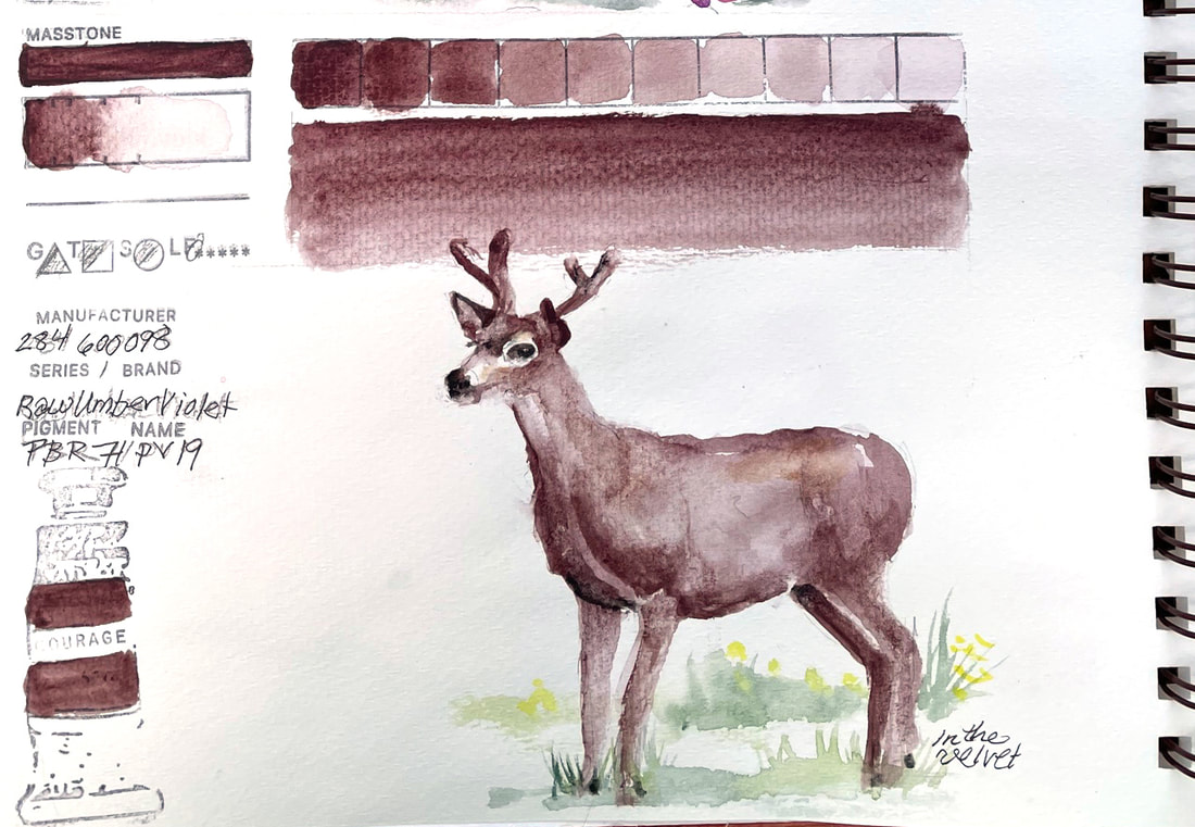
RAW UMBER VIOLETRaw Umber Violet is exclusive to Daniel Smith and blends Raw Umber with Quinacridone Violet with the result being a pinkish burgundy brown. I suppose I could mix this myself, but to have a tube is sure convenient. I found it to be fairly staining and a groovy granulator. Worked well for this young buck in the velvet visiting my front yard.
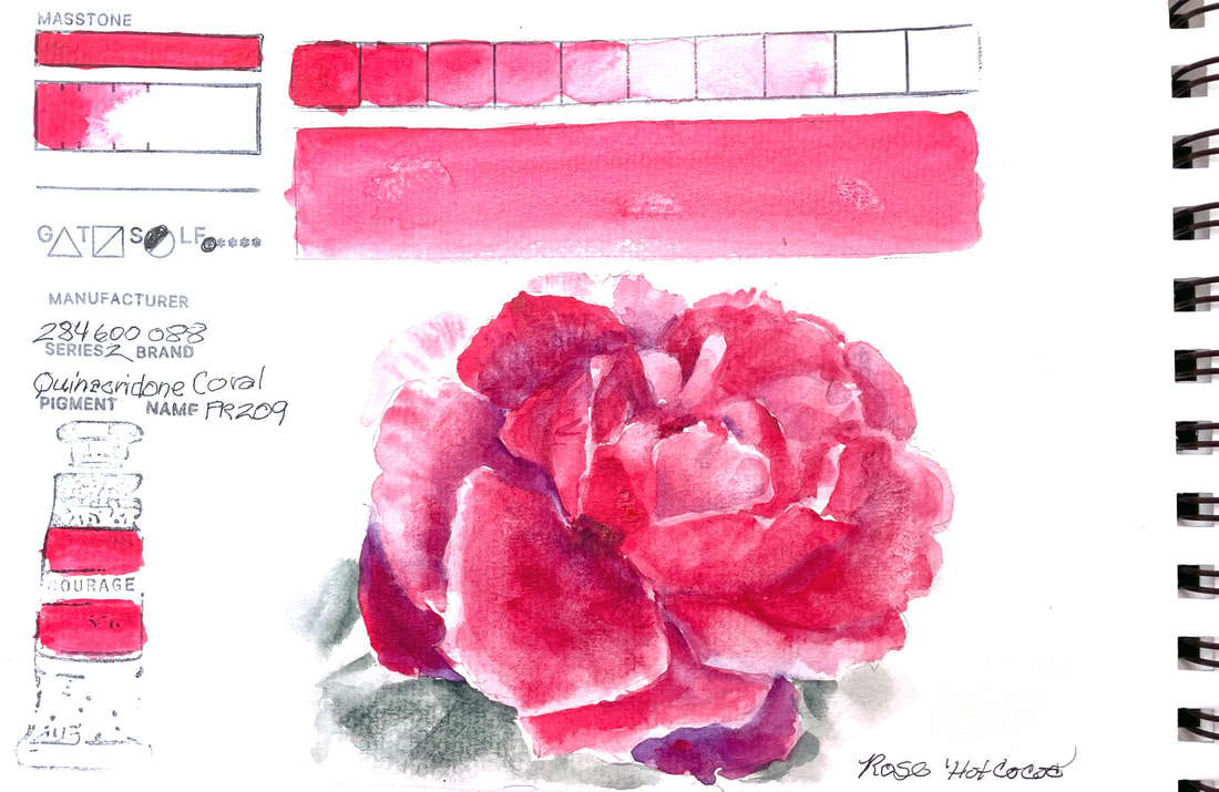
QUINACRIDONE CORALI love the Quinacridone colors, vivid, intense, spectacular in everyway. Some of them permanently reside on my palette, Quinacridone Gold, Rose and Purple, for instance. But this one is a brand new color for me, and one I purchased specifically for Botanical art. I was not disappointed, this one is another lovely addition to my stash and perfect for my "Hot Cocoa" Rose.
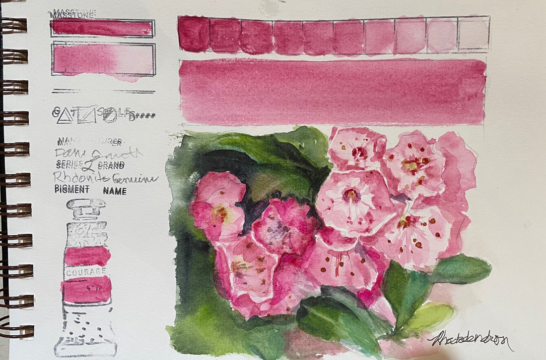
RHODONITE GENUINERhodonite Genuine is one of the Daniel Smith Primatek watercolors and made from crystallizing rose-red stone used in jewelry making. The value range is wide and it makes a soft, transparent pink perfect for florals. This is a non-granulating pigment and the first non-granulating in my "Swatch This" Challenge. It is a low staining color and lifts well.
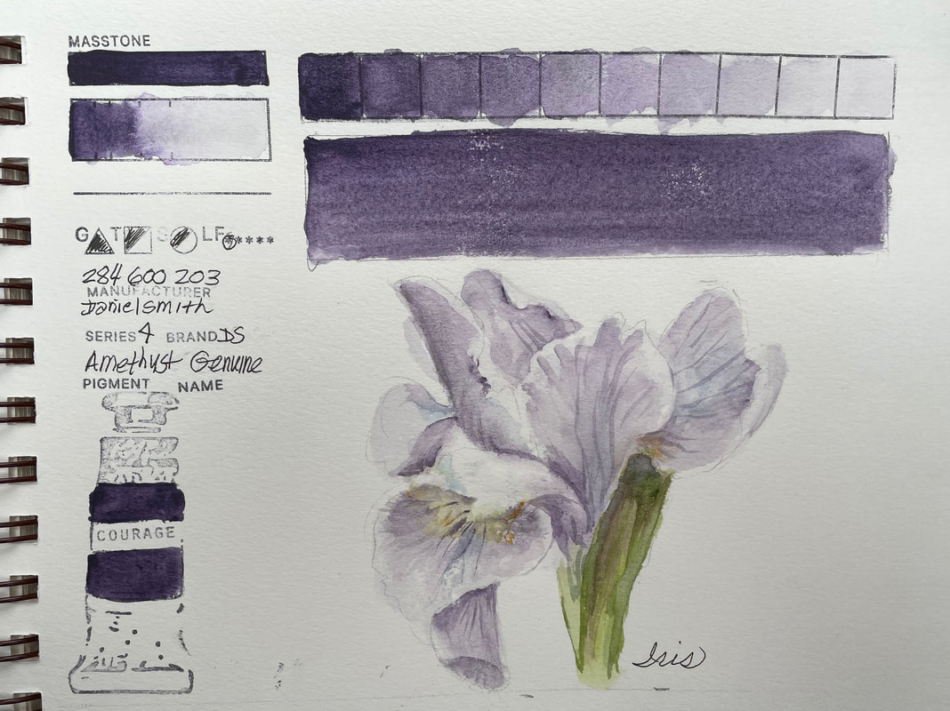
AMETHYST GENUINEAmethyst Genuine, one of the Daniel Smith Primatek Series, is, of course, ground amethyst in a tube. Straight out, it is nearly black. It runs the full value spectrum from darkest dark to a delicate pale lavender in the exact color of one of my favorite Iris. Even though it granulates beautifully, it also holds together in a smooth pale wash. I love my purples and my amethyst so I guess it was bound to happen, love at first swatch.
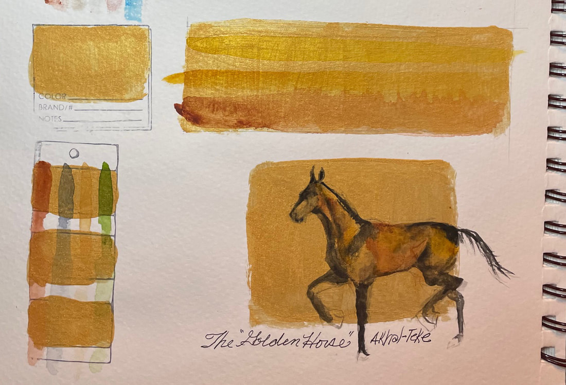
GOLD WATERCOLOR GROUNDMy brand new sketchbook arrived yesterday as did a number of new watercolors to fill some of the holes in my hoard of paints. So while this post is the last from the now full first sketchbook, I hope to continue to day 72 of this challenge with out missing a beat in a brand new book and with a few new and interesting challenges.
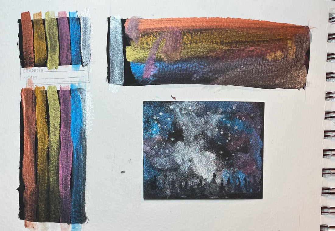
I filled the gap while waiting for supplies with a test of a ground I had never used and here is the result: DANIEL SMITH'S Iridescent Gold Watercolor Ground applied to watercolor paper creates an iridescent gold surface to paint on. It can also be painted on other surfaces so that you can paint with watercolors on a substrate other than paper. That is not part of this challenge, but it was interesting to see what can be done over the top of the iridescence and still "read" as a watercolor painting. I am intrigued by the possibilities. Daniel Smith's website is a wonderful resource for ideas and inspiration, but my test for this challenge was to see how it would work for a little quick sketch of one of the most amazing horses I have ever seen. The Akhal-Teke horse is a magnificent, ancient animal that positively gleams and shimmers gold. Go check them out if you haven't seen one, its worth a rabbit hole! Here is one place to see them, have fun. BLACK WATERCOLOR GROUNDAs you can see, I have run out of granulating watercolors, which was the original reason for the challenge. I have coincidentally run out of sketchbook. So I am taking short break while I wait for my online order of some granulators I don't have and a new sketchbook. They should arrive in the next few days. In the meantime, I tired out my set of Jean Haines iridescent watercolors from Daniel Smith on a black watercolor ground, also by Daniel Smith. They certainly are gorgeous, but I feel like a duck out of water here. Fun to play, need to think of reasons. See you tomorrow with another watercolor ground while I wait for more supplies.
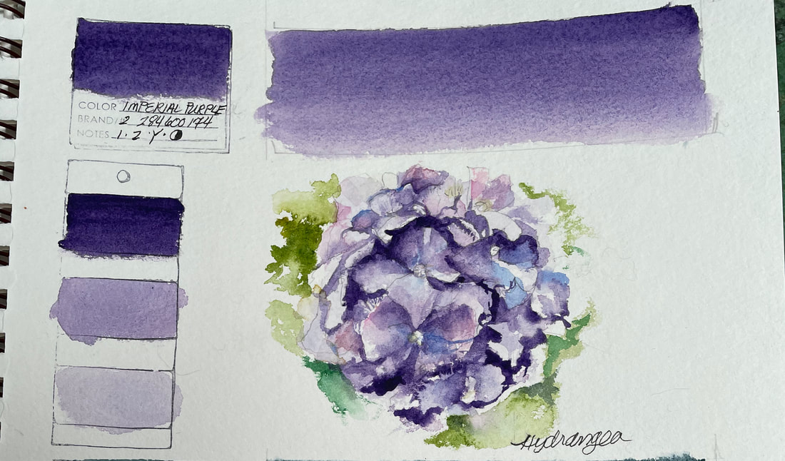
IMPERIAL PURPLEThis gorgeous semi-transparent pigment is named aptly. Imperial Purple is absolutely regal and delivers a full range of values from deepest purple to ultramarine. It is low staining and with a ratio of more water to pigment, it becomes a lovely lavender and quite delicate. I immediately thought of my garden favorites, hydrangeas, lilacs and irises as perfect candidates for a touch of royalty like this.
|
SOUL“I am a contemplative artist who has trouble accessing verbal skills. Finding the right words to talk about the amazing things I observe around me can be frustrating. It is much more natural for me to pick up a paintbrush, some embroidery floss or my camera when I wish to share some new discovery. The artwork I create is meant to be enjoyed on whatever level the viewer experiences it and not layered with complex meaning. Feathers, fur, flowers and the incredible variation I find in wildlife not only inspire me, but compel me to share every nuance with you. Archives
July 2024
|
 RSS Feed