|
Every year about this time I feel the "urge to purge", but more so this year than I recall in years past. My husband calls me the most organized hoarder he knows, and he is right, for the most part I can find just about anything I have pack-ratted away. But it has finally come to a level of stuff that even I can no longer tolerate. By the number of friends and family I have that are currently purging right alongside me, I wonder if there is something in the air.
The most recent area that I have been sorting through is the garage. No one needs three or even two of certain gardening tools, and you can only put so many used and reused plastic pots on one shelf. The vintage airstream has been remodeled for a few years now and if there is a screw or door handle that hasn't been employed by now, it is a good bet it can find a new home. I am very proud of the newly organized area that is my dye studio in the garage as well as the house and spray paint cabinet that is now sorted and labeled. But I am not at all proud of the eight Rubbermaid tubs of paper that seems to have reproduced and multiplied. Did I really put all that out there? Or better yet, when did that happen? The first four were household records, which within minutes of a google search I learned that the IRS really doesn't care about seven years of my grocery store receipts. Those first four boxes were pretty easy and with a trip to the shredder has reduced the tubs to one plus a small filing box. It is the other four that have caused me so much fretting this week. They house all the evidence that I ever went to school, several times as a matter of fact. There are boxes full of academic articles, flash cards and notes. One entire box was essays and papers written over the years. I am sure, another google search and I'd find that most of the articles are readily available online, at least at various universities or museums. And while flash cards were the only way I could remember all those dates and the minutia about Greek, Hebrew and Gaelic language, they haven't been looked at since 2007. Was it that long ago? I have a few degrees, but nothing big and important like some of my siblings or my father and his siblings who held Doctorates achieved. I couldn't pass the GRE which kept me from a master's degree because it meant math skills I never acquired. I have a double major in Comparative Religion and Art History and degrees in Biblical Studies and Biblical language as well as Fashion Illustration. I say that not as a point of pride but to describe the disparate collection of papers I have amassed. My quandary is what to rid the garage of that I won't regret having thrown out in the future. Each night I sort through a box and often revisit it and sort again letting go of a little more each time. I am certain that if I put some time into looking for some of the articles online and created some sort of index and how to find them again, that it would make parting with the articles easier. After all, I haven't read them since graduation. The most difficult papers to part with are the essays. I am trying to understand why. Is it the amount of work that went into them? They represent hours and hours of research. As a perfectionist, who also happens to be dyslexic as well as reading challenged, each assignment was a painful at best. Or is it the accolades my very kind professors gave me and the marks they were so generous with. Is that little ego bump so valuable to me that it causes me to want to hang onto the past this way? Whatever it is that is making it so painful to part with paper, I think I have an idea that might make it a little easier. I will try it once and see if it is the way through to the recycle bin. Starting this week, I will begin to digitize, either by retyping the essays or scanning them and then posting them here. In the process, they will be able to be archived just in case I decide to hang on to them. Additionally, if there are any art history buffs, religious studies majors or just plain academically curious readers who might find some entertainment from my efforts, I will have done something useful aside from clearing space in the garage for new and different collections of things. Stay tuned for the first of potentially many essays from the past.
0 Comments
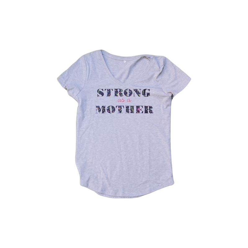
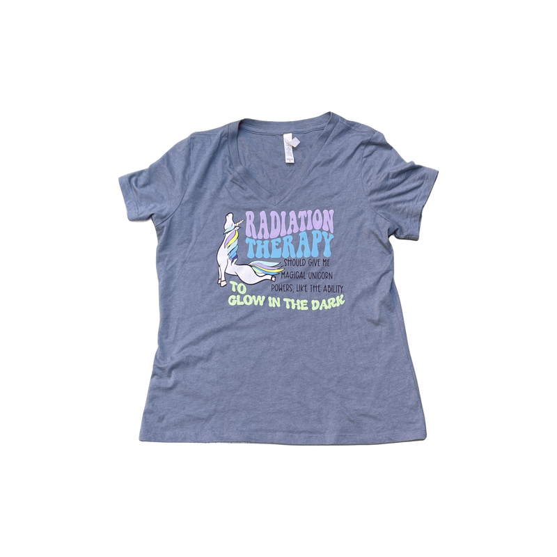
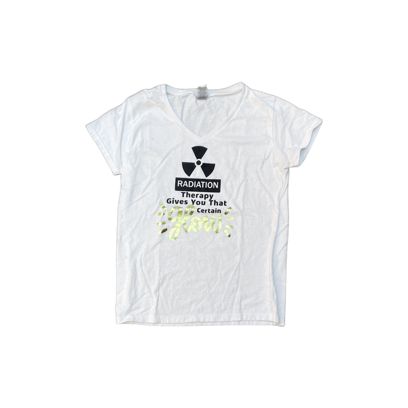
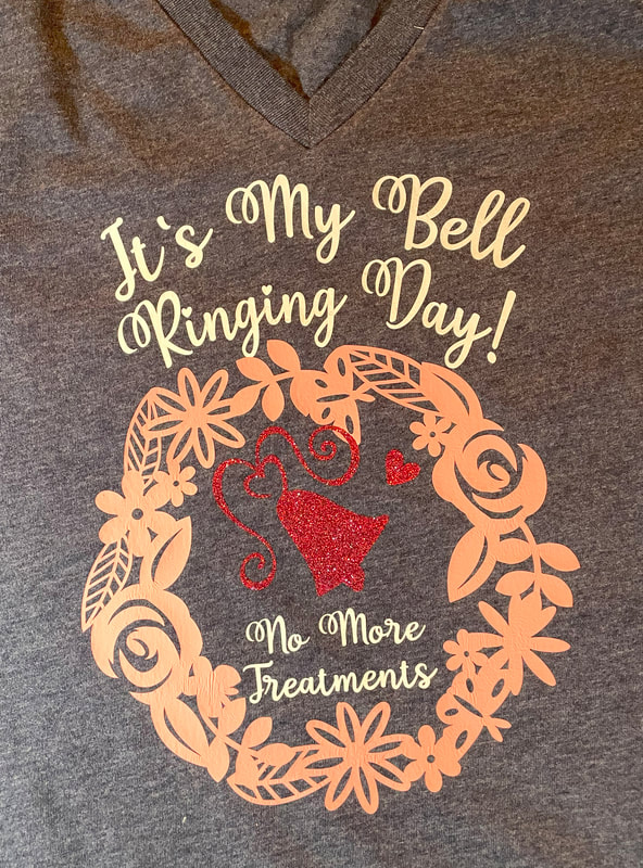
My Husband has a great laugh. It's one of those deep down from the belly, uproarious, a wee bit too loud and very contagious laughs. You can't help but giggle, or even join in with gusto if you hear him. In fact, it doesn't even matter if you heard whatever started the outburst. I grew up with a family full of comedians. The quick wit of my siblings and father were unmatched, or at least I was no match for them. My youngest brother never stops. It seems to roll out of his brain effortlessly and continuously and can cause sore stomach muscles by the end of an extended visit. I know for certain the healing capacity of laughter, it is as they say, medicine for the soul, and free. While I didn't get the gene that makes me funny, I do like to make people laugh if I can. During the seven weeks of radiation therapy, I recently went through, I became close to the other patients in the waiting area each day. They were always so upbeat and cheerful, and while I do my best to be as positive as possible, I am also a shy person. I am more comfortable in the background. To remedy this, I made t-shirts emblazoned with humor, or at least, happy thoughts. You can see some of them in the gallery of photos below. In an almost ritualistic manner, I would walk into the waiting room, ready to reveal my t-shirt to any who might ask. The smiles I received were my pain management for the day, and my hope was always that it was mutual. Before I was finished with my treatments, I had also gifted anyone else there each day with a shirt of their own, including all the wonderful staff of Radiation Specialists. It is the simple things that we often take for granted, like laughter, that can make even the darker moments bright and shiny, and maybe even a little fun. My T-Shirt Humor WardrobeGifts for OthersToday was a momentous day. What started as a little glimmer, blossomed and grew and has become a reality. The once frightening mask that caused some apprehension, has been transformed into something that for me is a symbol of a sort of resurrection. Butterflies are traditional representations of that transformative power of rebirth.
I love fairy tales. Even though they sometimes have a frightening component to them, usually a dragon is slain, and the story culminates with a happy ending. There is something very compelling about the prospect of living happily ever after, isn't there? I am about to share a story with you that while it is not a fairy tale, does have a some potentially fearful moments as well as many very happy ones. This story has not been shared with many people until now. It is my hope that in its telling, you will find the same hope and happiness that I have. I suppose I should start with "Once upon a time", but that would be rather silly, since it was, to be specific, March 12, 2023. On that day I received unexpected news, delivered very clinically, I was diagnosed with cancer. A type of cancer that is not particularly rare, that in fact there is a vaccine against, (parents, please be sure your children are vaccinated). In my case the cancer found its way to the soft palette of my mouth and my left tonsil. Because of its location, surgery was not advisable. Treatment took the form of seven weeks of radiation therapy every day. The days following were full of uncertainty and a fair dose of fear, but rather than dwell there, (I did say I like fairy tales, right?) let us get right to the dragon slaying.
I hope you will stay tuned to see what becomes of the BIG IDEA, the less scary, more beautiful, hope filled mask. In the meantime, here is a little sneak preview of the goings on, behind the scenes. 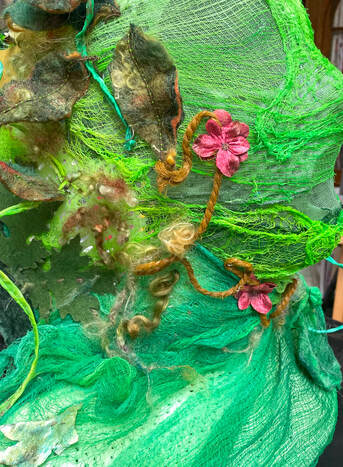 My deepest gratitude to the entire team of Swedish Cancer Institute, Issaquah Campus.
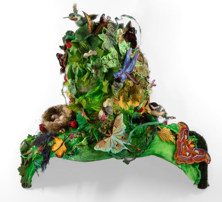
The same creative possibilities that widen your visual vocabulary, can also overwhelm and stall the creative process. At some point creative play may border on procrastination. When I get a bit lost, I can ask why the BIG IDEA has come, what is its purpose. If I have already been given my marching orders, and have just lost sight of them, moving from gathering and making into action helps me refocus. It is now time to take the materials and elements which have been created and transform and compose them in a manner that will best honor this BIG IDEAS’ message. A message of new life, hope and beauty. A visual presence that will quiet fear and shed light even in dark places. There is more to the story . . . stay tuned. 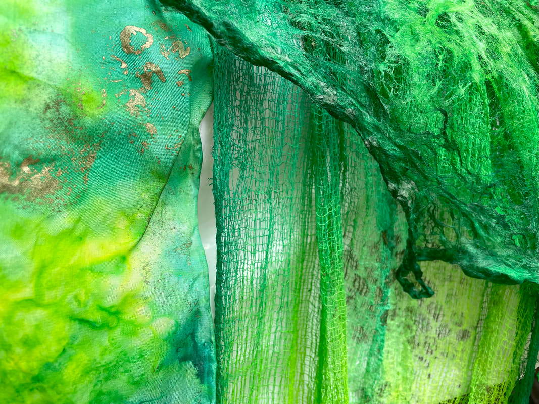 If you entertain a big idea, you must be willing to experiment, it will demand that of you. Give it space, and it will guide you into some of the most unexpected places. What do you do with that big idea? The one that awakens you in the night, taps you on the shoulder, as if to remind you it needs to be birthed. I begin by gathering, collecting its colors and textures. I ask what it's essence must feel like and what part of the spectrum it wants to land in. Sometimes a big idea charges into the room demanding to be created this way, or with that color and that feels like this. At other times the idea enters softly, no less large and every bit as persistent, but less defined, that can be frightening, or it can be an invitation. Listen, let it breathe into your heart, let it blossom, but begin, somewhere. I remember its first glimmer, that thing that woke me not so gently in the night and whispered, this is how it shall be. It took the form of butterflies. And now, it grows into so much more.
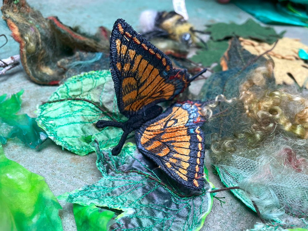
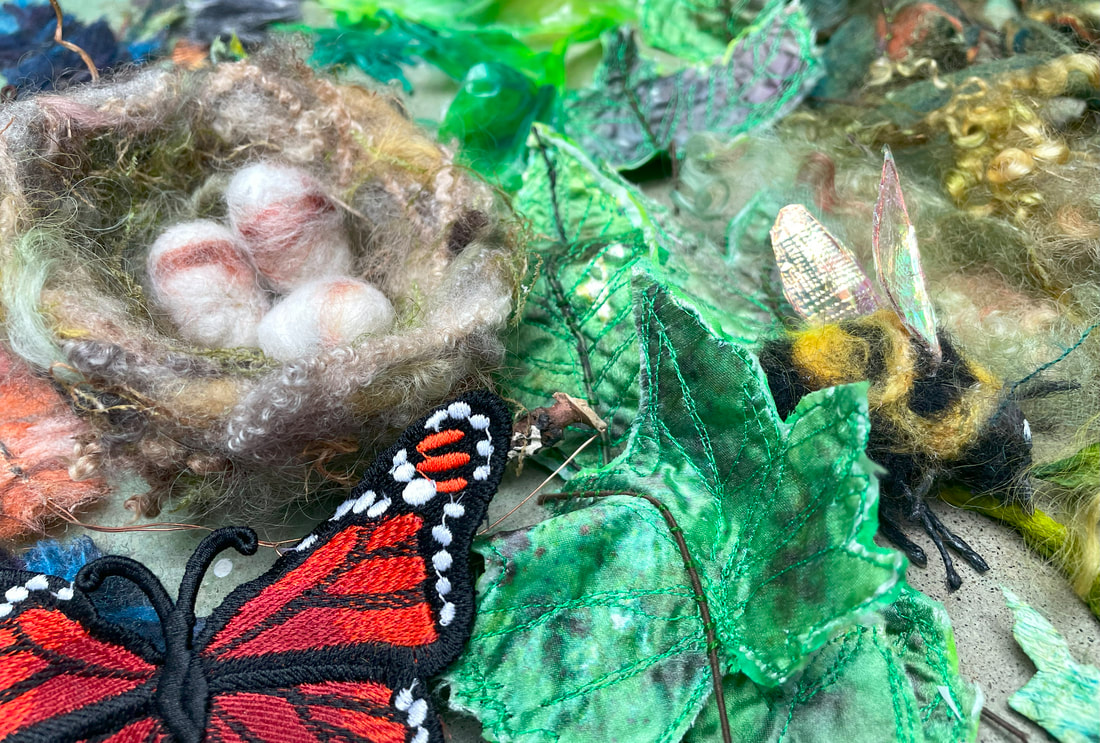
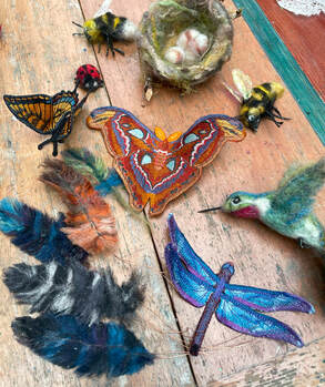
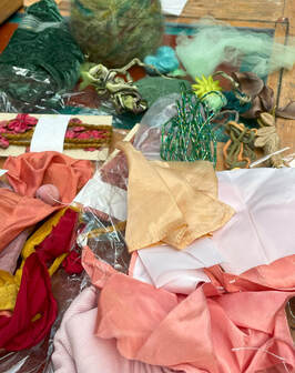
Once I have gathered materials and set my sights on a course of action, I begin by creating some of the elements that appear in the vision in my mind. Here are some of the components created so far, including needle felted wool feathers, bees, a nest and a hummingbird and machine embroidered freestanding butterflies.
There is a delightful book by Kobi Yamada and illustrated by Mae Besom called "What Do You do with an Idea?"
(check it out HERE). What I love about the book is that the idea is as an egg with legs that can walks around with the main character, nudging him along until he has the confidence to bring the idea into being. I have always felt like the really Big Ideas do take on a life of their own. I have learned to pay attention, from their very inception, perhaps just a passing vision, giving the idea space to grow and being careful to listen to its nudges and taps on my shoulder. The process is fascinating to me, and most likely different from your process. I think we all find our way with this Big Ideas, sometimes ignoring them completely because we are "too busy". It saddens me to think that as adults, we "grow up" into the notion that entertaining a Big Idea, or submitting to the sheer joy of creative play, is somehow folly and far too frivolous for a normal, responsible, adult to engage in. I don't profess to be a normal adult, although I am pretty responsible. Follow me if you dare, and see what can happen if you entertain a Big Idea.
Brenda Swenson's suggested add-ins
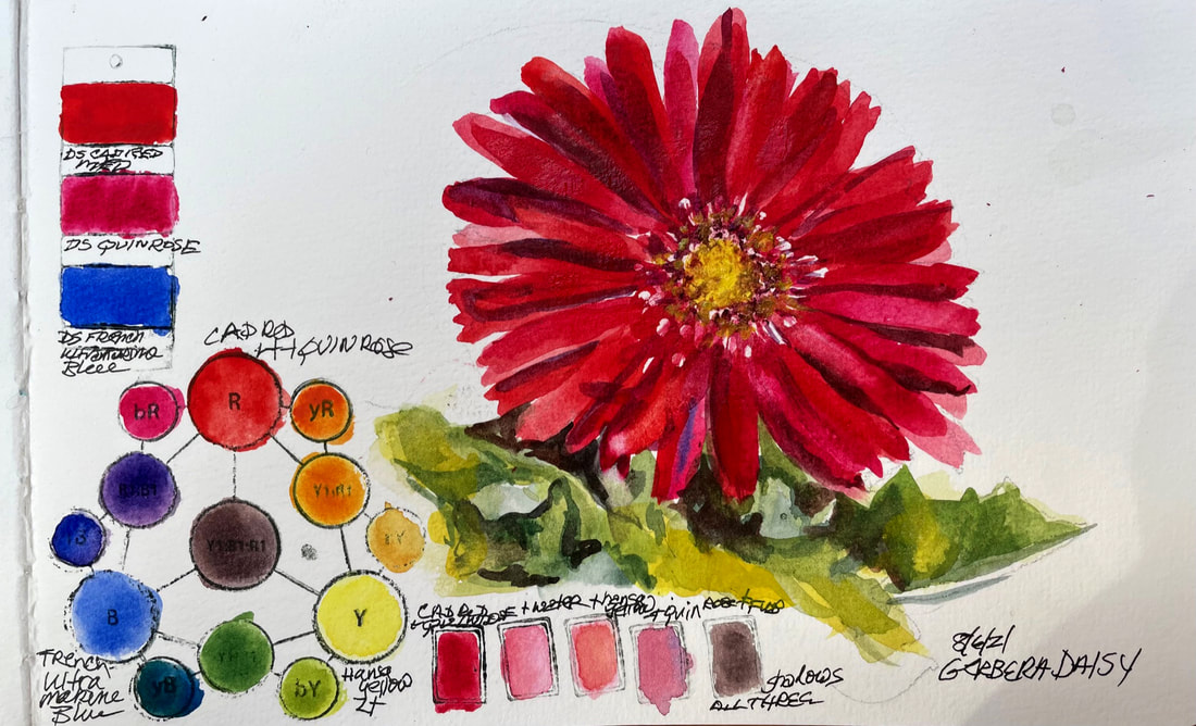 GERBERA DAISYToday's subject didn't just catch my eye but grabbed me and stopped me in my tracks on the way to the garage. This stunning daisy is my favorite color, red of course so that may be partly why it spoke so loudly to me today.
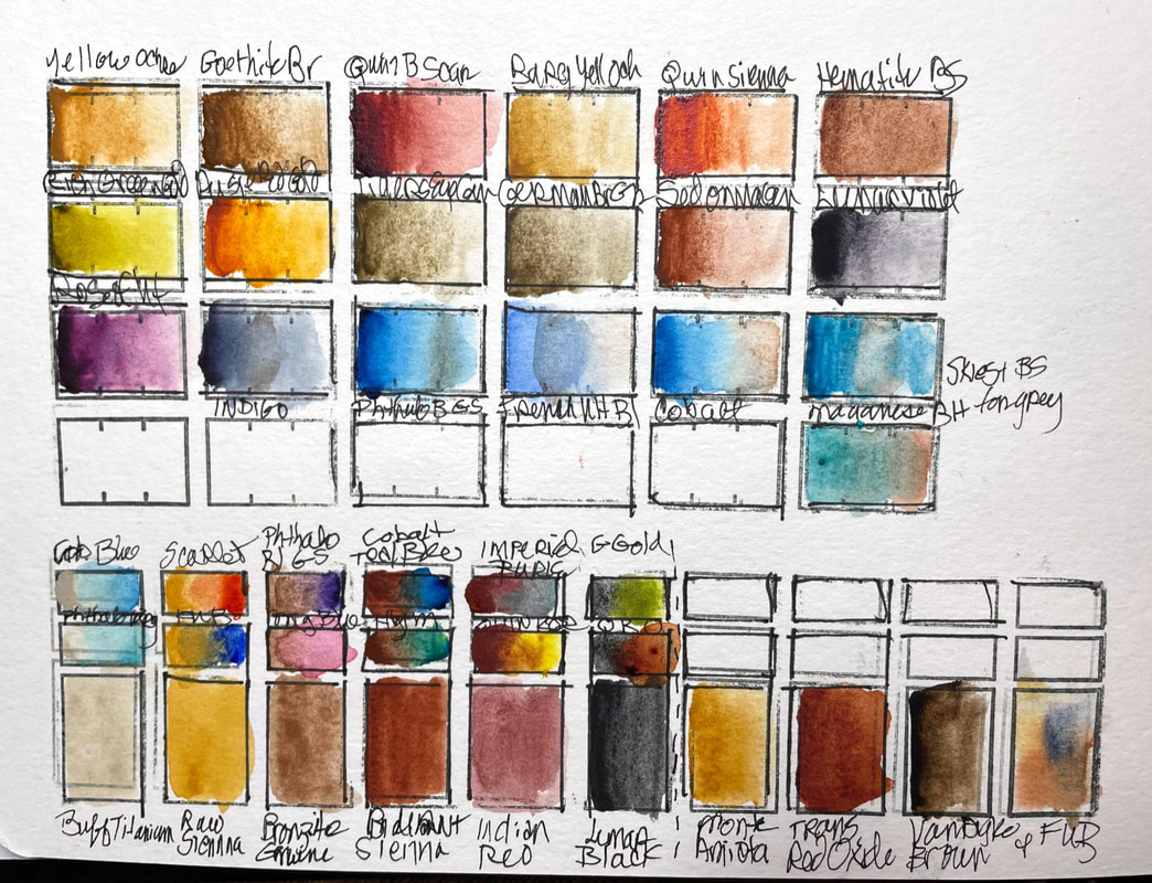
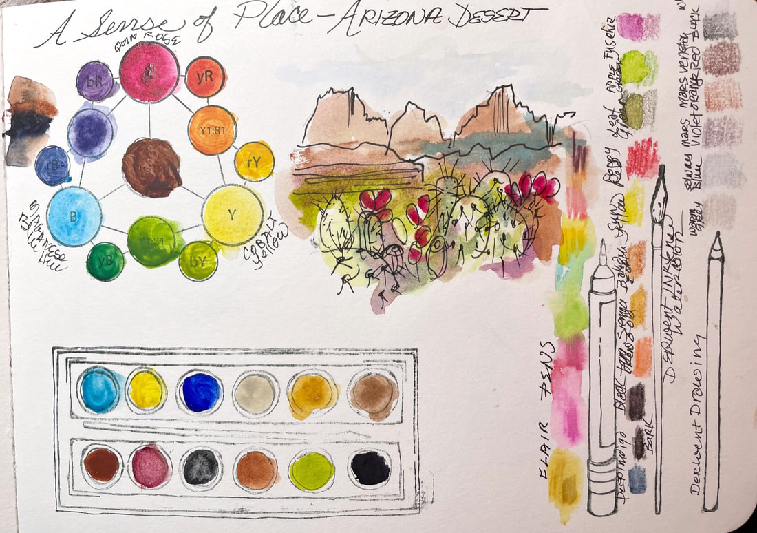
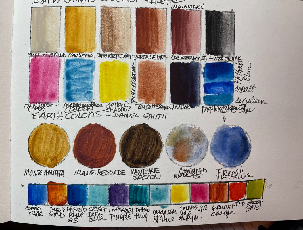
To mix this color I began with Daniel Smith Watercolors: Cadmium Red Medium Hue, Quinacridone Rose, with French Ultramarine Blue for shadows and Hansa Yellow Light for the flower center and to mix a leafy green. I warmed my red with the yellow and cooled it with the French Ultramarine blue and created my neutral dark with all the colors in this palette. This was another fun exercise. I do find that the process takes a bit more time than the previous challenge did. This may mean fewer posts but they will continue with as much frequency as I can manage 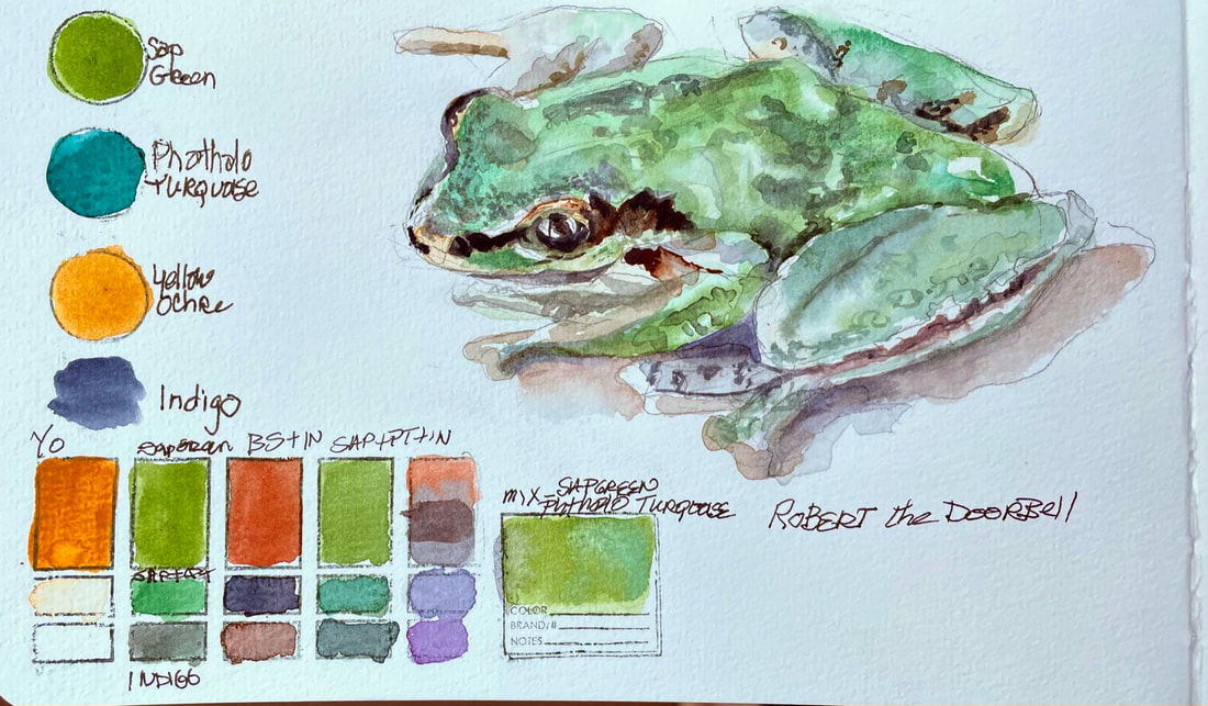 Day one of a new challengeAnd not completely sure where this one is going . . .but the idea being, a practice that gets me outside before the summer comes to a close and painting what I see in my backyard, either from life or a photo. My "rules" this time are, drawing or painting from life if at all possible, without creating more stress in an already too full schedule. If weather or time makes that impossible, then from a photo, but the photo has to be from something I notice while outside that day. My challenge will be to look for the predominant color of the subject matter, and then mix that color, rather than using a straight from the tube color. So, lets see how this goes.
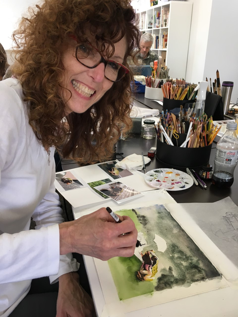
I started by choosing a familiar subject, the frog name Robert, (because he came from a plant, jumped out of the hanging basket I was watering) who lives at the front door. We think he has taken on the roll of the doorbell since he lives where one would be if we had one and his croak is so loud that an approaching visitor would be well announced regardless of our doorbell deficit. I limited my palette to sap green, yellow ochre and Phthalo Turquoise, mixed all my greens with those three colors I added burnt sienna, quinacridone purple and indigo to darken shadows. I cooled down my greens and shadows with purple and warmed them up with burnt sienna. This is going to be fun.
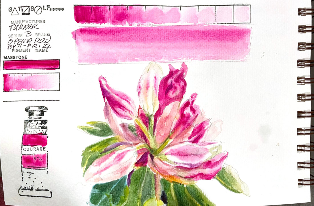
OPERA REDMuch like Opera Pink by Daniel Smith, this Turner Watercolor Opera Red is a very bold, bright red on the magenta side and a staining pigment. It's wide variety of values allowed me to use it almost exclusively to render all the different stages of this Rhododendron's bloom from completely closed to about to open.
This is the very last of my watercolor paints. I have swatched them all, and some more than once by accident. While that might be a good excuse to stop challenging myself in this way, I am not going to give it up just yet. I will reveal the next challenging idea tomorrow, but for now, it is nice to have met a goal of test driving every single tube of watercolor paint in my studio and in the process, now have a well established daily, (or almost daily) practice of painting in my sketchbook.
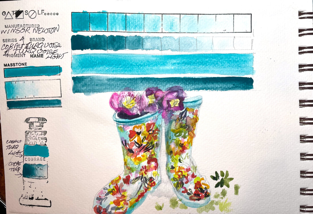
COBALT TURQUOISE & COBALT TURQUOISE LIGHTWinsor Newton's Cobalt Turquoise and Turquoise Light are sister pigments and similar enough I swatched them together.
Cobalt Turquoise is a blend of blue and green pigments named for the for the semi-precious stone, turquoise. Cobalt Turquoise Light is a paler, slightly greener color than Cobalt Turquoise. My garden boots are the same beautiful greenish blue as Cobalt Turquoise light
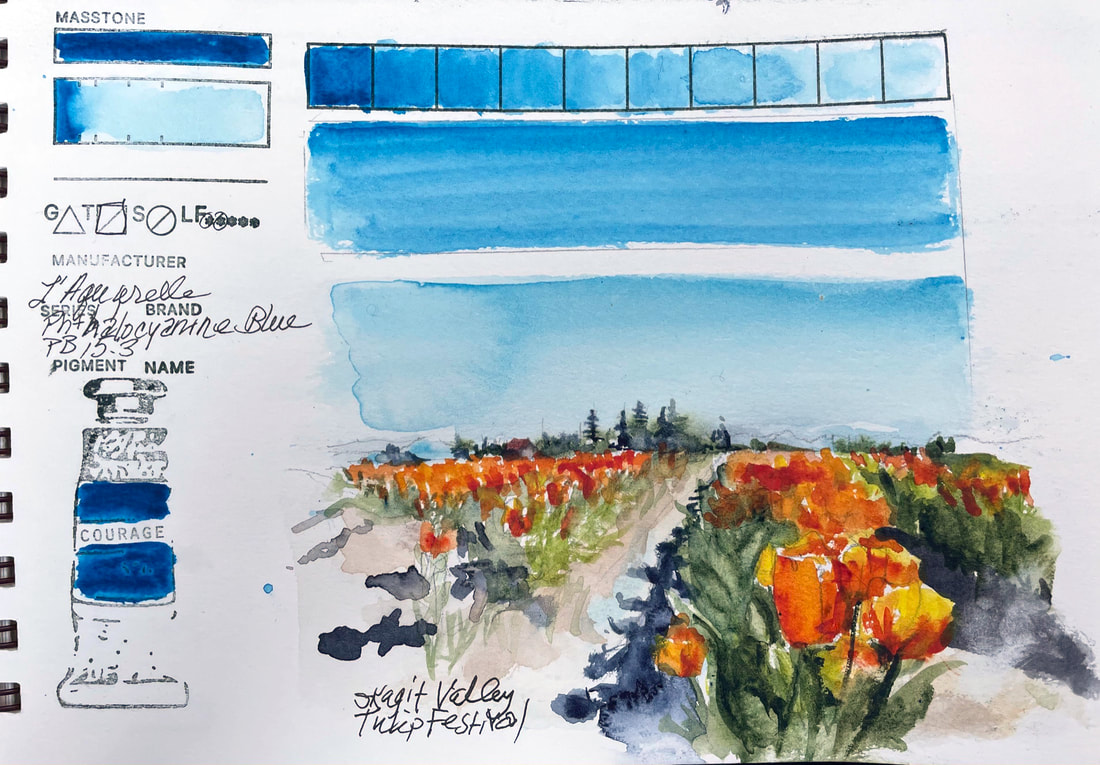
PHTHALOCYANINE BLUE L'Aquarelle by Sennlier makes this sky blue derivation of Phthalo Blue, the organic blue chemists came up with under the name of "monastal" blue. It is a highly complex organic synthesis. Even though Ultramarine Blue is considered the most important blue in a landscape painter's palette, it just cannot produce the blue of Phthalo Blue even mixed with other colors. It certainly nailed the color of the sky over the tulip fields in the Skagit Field on this particularly clear and bright day.
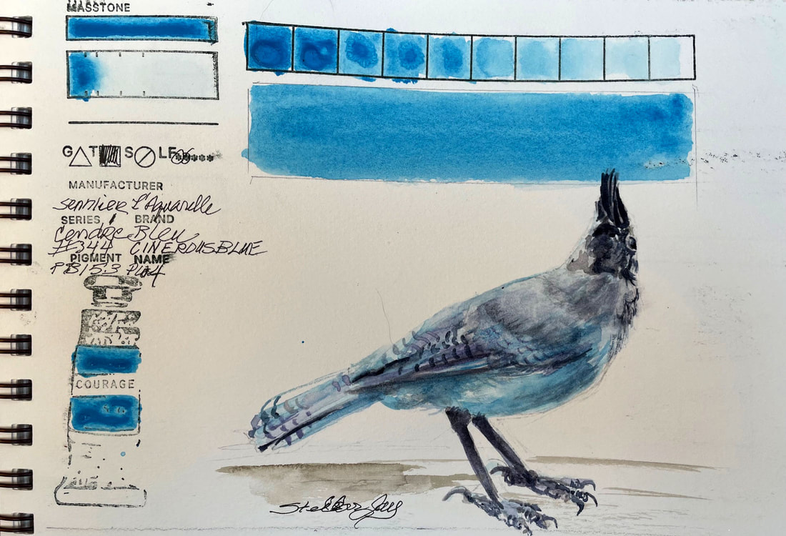
CINEREOUS BLUESennlier L'Aquarelle uses a variant of Phthalo Blue that has a bit of a greener shade. Phtahlo Blue was a pigment that chemists developed with the trade name Monstral Blue in 1935 more or less by accident while creating a dyestuff to replace Prussian Blue. This version has zinc white in it and with a honey binder, is more opaque than most Phthalo blues. It is another interesting color
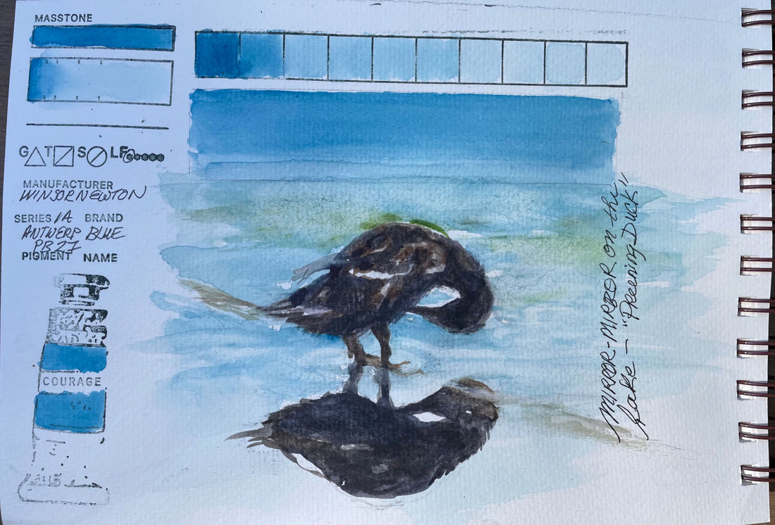
ANTWERP BLUEWinsor Newton Antwerp blue is a transparent blue color. and a softer version of Prussian Blue. It lifts well and would be a nice addition to the palette of a landscape painter for both water and sky.
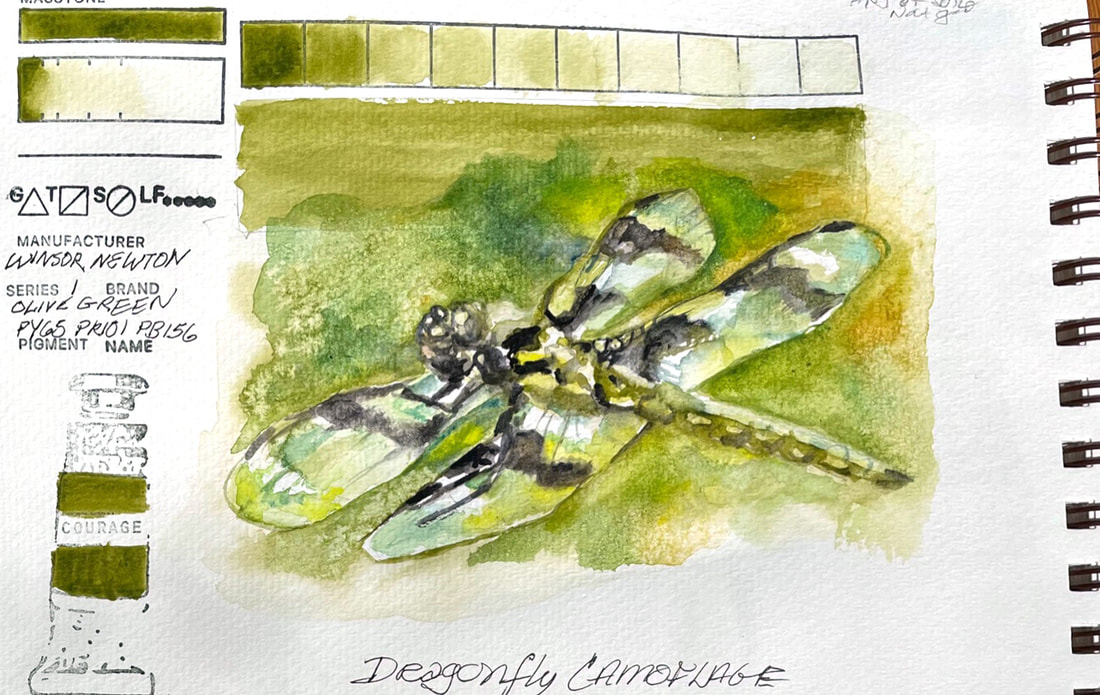
OLIVE GREENOlive green is a soft, warm, brownish green from Winsor Newton Watercolors. It is a natural for the leafy greens in landscapes and botanicals. The dragonfly in this quick sketch was so clear and see-through that the greenery around him seemed to camouflage him.
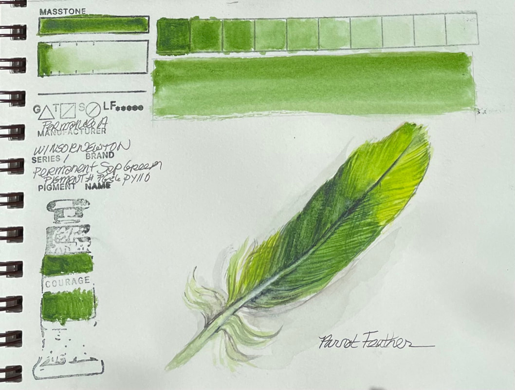
PERMANENT SAP GREENWinsor Newton Permanent Sap Green is exactly what you would expect from a high quality water color. From their website, "Sap Green Permanent is a rich mid-range green with a yellow undertone." It's chemical composition is similar to other brands of sap green, Phthalo Green or Hooker's green. According to the website "Natural Pigments" sap green was made from the unripe berries of the Buckthorn plant historically. "In medieval times the extracted colorant was reduced to heavy syrup and sold in pig bladders, not as dry pigment." It was the right choice for the parrot feather rendered here.
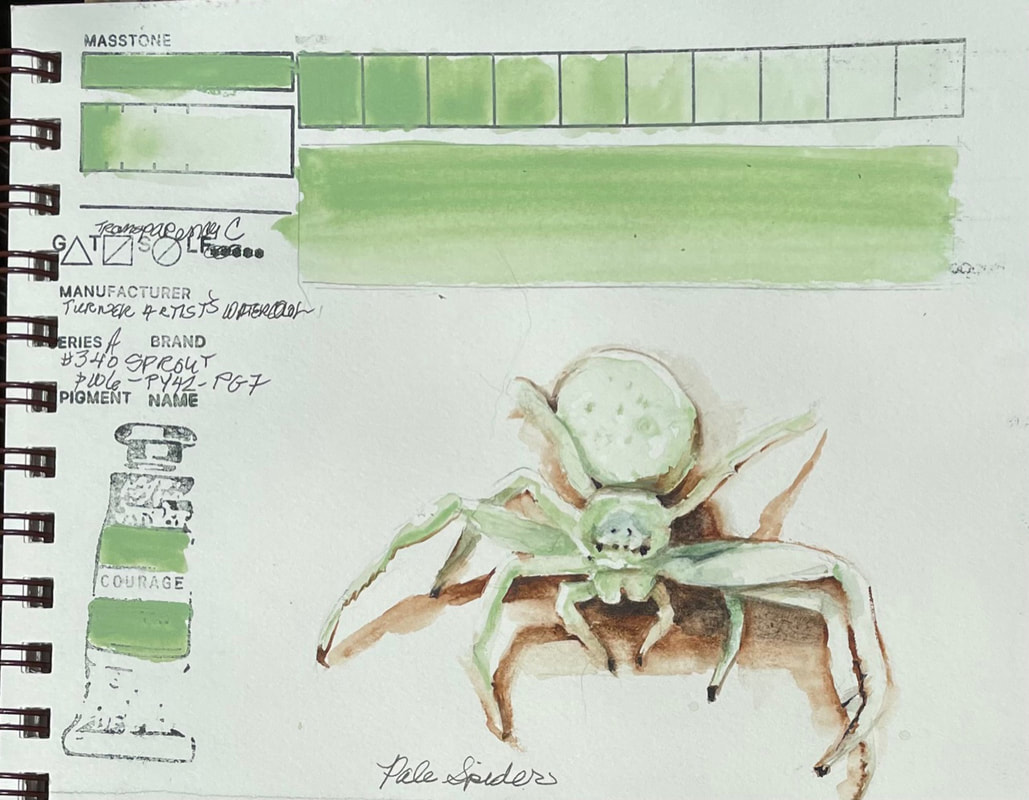
SPROUTTurner Watercolor's Sprout is certainly an interesting color. Falling somewhere between opaque and semi-opaque, the pale green washes down to nearly nothing. When you look at the pigment combination, it allows a fair insight into the reason it it what it is, a pale, cool green with a bit of phthalo green in the undertones. The chemical composition (phthalo green titanium dioxide, synthetic hydrated iron oxide, chlorinated-copper phthalocyanine), something outside my realm but easily researched, confirms my thought that the three ingredients would result in a chalky phthalo green. Fun to sculpt the little ghostly white spider I recently found in my home.
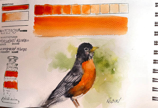
TRANSPARENT ORANGETransparent Orange is a fairly straight forward pigment by Schmincke . Their Hordam Aquarelle pigments, are created with unique pouring method that guarantees "that the first stroke of a wet brush captures the maximum pigment load". Transparent orange is an example off the beautiful uniform color, and ease of lifting, and excellent flow properties of all the quality Schmincke pigments from Germany.
|
SOUL“I am a contemplative artist who has trouble accessing verbal skills. Finding the right words to talk about the amazing things I observe around me can be frustrating. It is much more natural for me to pick up a paintbrush, some embroidery floss or my camera when I wish to share some new discovery. The artwork I create is meant to be enjoyed on whatever level the viewer experiences it and not layered with complex meaning. Feathers, fur, flowers and the incredible variation I find in wildlife not only inspire me, but compel me to share every nuance with you. Archives
June 2023
|


 RSS Feed