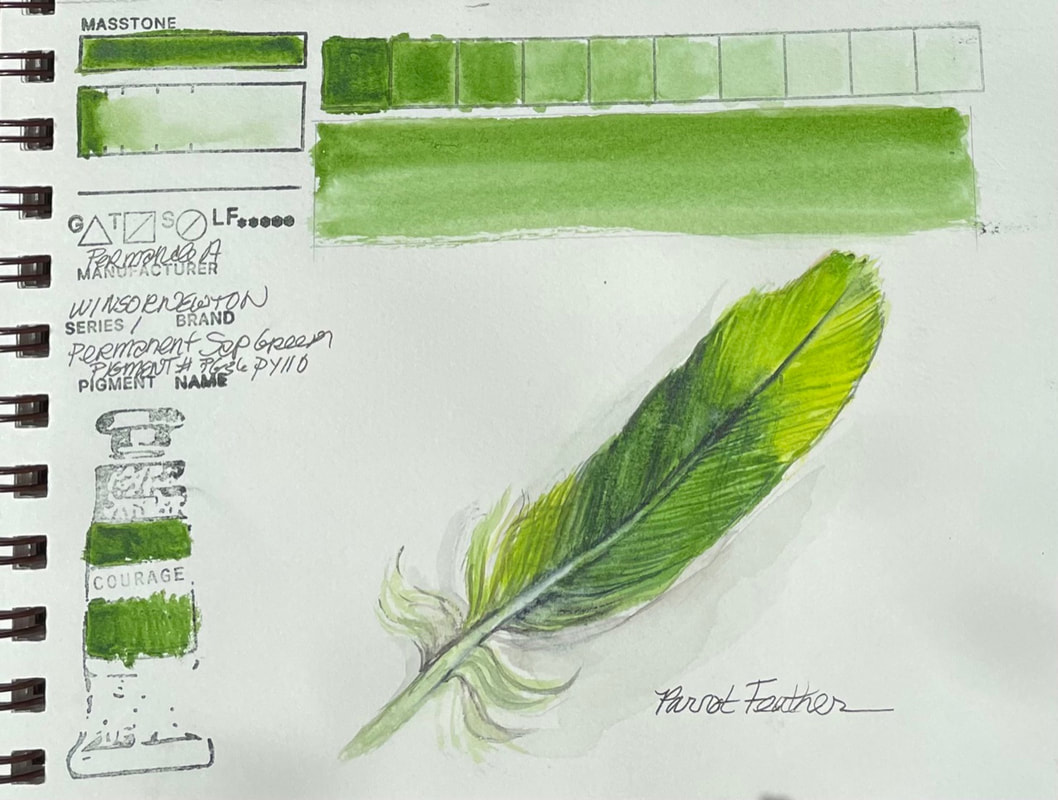
PERMANENT SAP GREENWinsor Newton Permanent Sap Green is exactly what you would expect from a high quality water color. From their website, "Sap Green Permanent is a rich mid-range green with a yellow undertone." It's chemical composition is similar to other brands of sap green, Phthalo Green or Hooker's green. According to the website "Natural Pigments" sap green was made from the unripe berries of the Buckthorn plant historically. "In medieval times the extracted colorant was reduced to heavy syrup and sold in pig bladders, not as dry pigment." It was the right choice for the parrot feather rendered here.
0 Comments
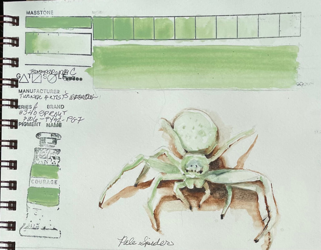
SPROUTTurner Watercolor's Sprout is certainly an interesting color. Falling somewhere between opaque and semi-opaque, the pale green washes down to nearly nothing. When you look at the pigment combination, it allows a fair insight into the reason it it what it is, a pale, cool green with a bit of phthalo green in the undertones. The chemical composition (phthalo green titanium dioxide, synthetic hydrated iron oxide, chlorinated-copper phthalocyanine), something outside my realm but easily researched, confirms my thought that the three ingredients would result in a chalky phthalo green. Fun to sculpt the little ghostly white spider I recently found in my home.
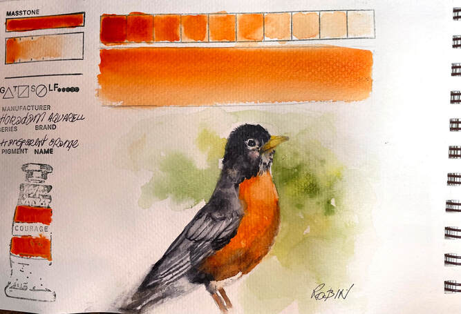
TRANSPARENT ORANGETransparent Orange is a fairly straight forward pigment by Schmincke . Their Hordam Aquarelle pigments, are created with unique pouring method that guarantees "that the first stroke of a wet brush captures the maximum pigment load". Transparent orange is an example off the beautiful uniform color, and ease of lifting, and excellent flow properties of all the quality Schmincke pigments from Germany.
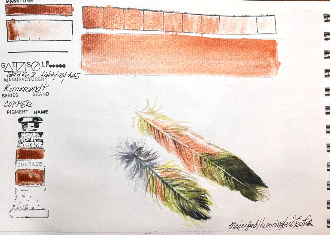
COPPERRembrandt watercolours are made in Holland and made from the purest pigments and purest gum Arabic for brilliant, colors that are uniformly consistent. Their copper is formulated with pigment-coated Mica. It has a very high lightfastness rating and is semi -opaque. I found the metallic consistency to be of high quality and the particles were suspended uniformly. This was the perfect way to capture the little hummingbird feathers I put under a microscope last night.
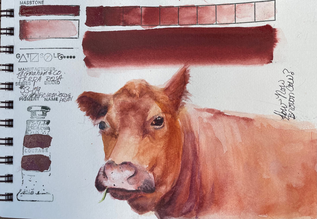
TERRA ROSATerra Rosa by M. Graham is so much like the color I swatched yesterday, another very reddish brown. This one is, like all M. Graham paints, has honey as its binder, a fact that I was forgetting until I had applied the pigment so densely on the bar marked "mass tone" that it was still sticky this morning. Fortunately it was another very warm day and my studio gets quite warm because its lots of glass. It did eventually dry. I will remember to make sure I check how much binder comes out if I grab another tube that has bee laying around awhile. The color is lovely and with a little addition of orange or purple, it offers a full range of warm brown just perfect for this beautiful free ranging cow we encounter on a drive last year.
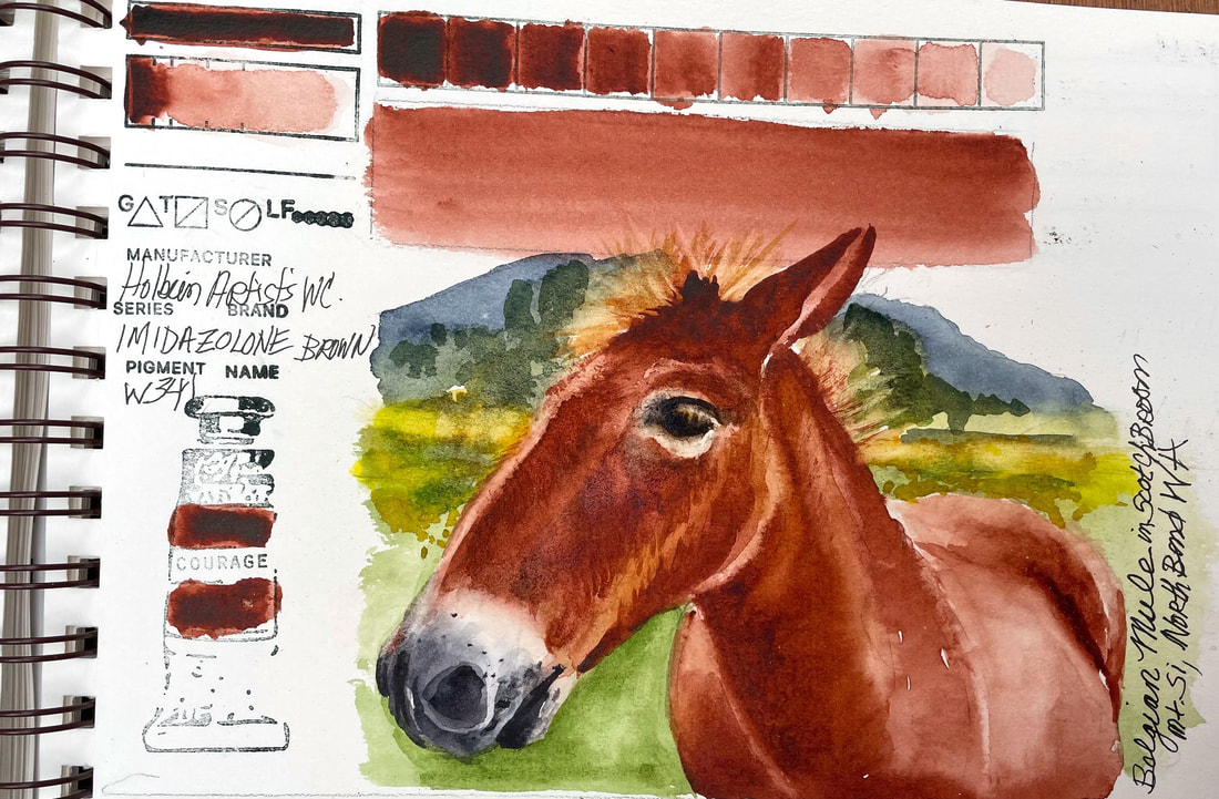
IMIDAZOLINE BROWNAnother lovely Holbein color, this brown is reminiscent of root beer straight from the tube. It is a relatively new color and not one that I am familiar with till now. There are other brands that have made Imidazoline Brown but I am unable to find out much information about its components and if it is a new synthetic version of an old organic color that is either no longer feasible to make or harmful to us or the environment. I am sure I will learn more with time. What I can say is that this brand of this pigment lays down beautiful with little effort and lifts easily. What a joy to use it to spend some time with one of the sweet Belgian Mules that used to live under Mt. Si in the meadows of scotch broom before they decided to mow it all done and put up condos. Miss this gals, seven beautiful ladies with blonde manes that shimmered in the sun.
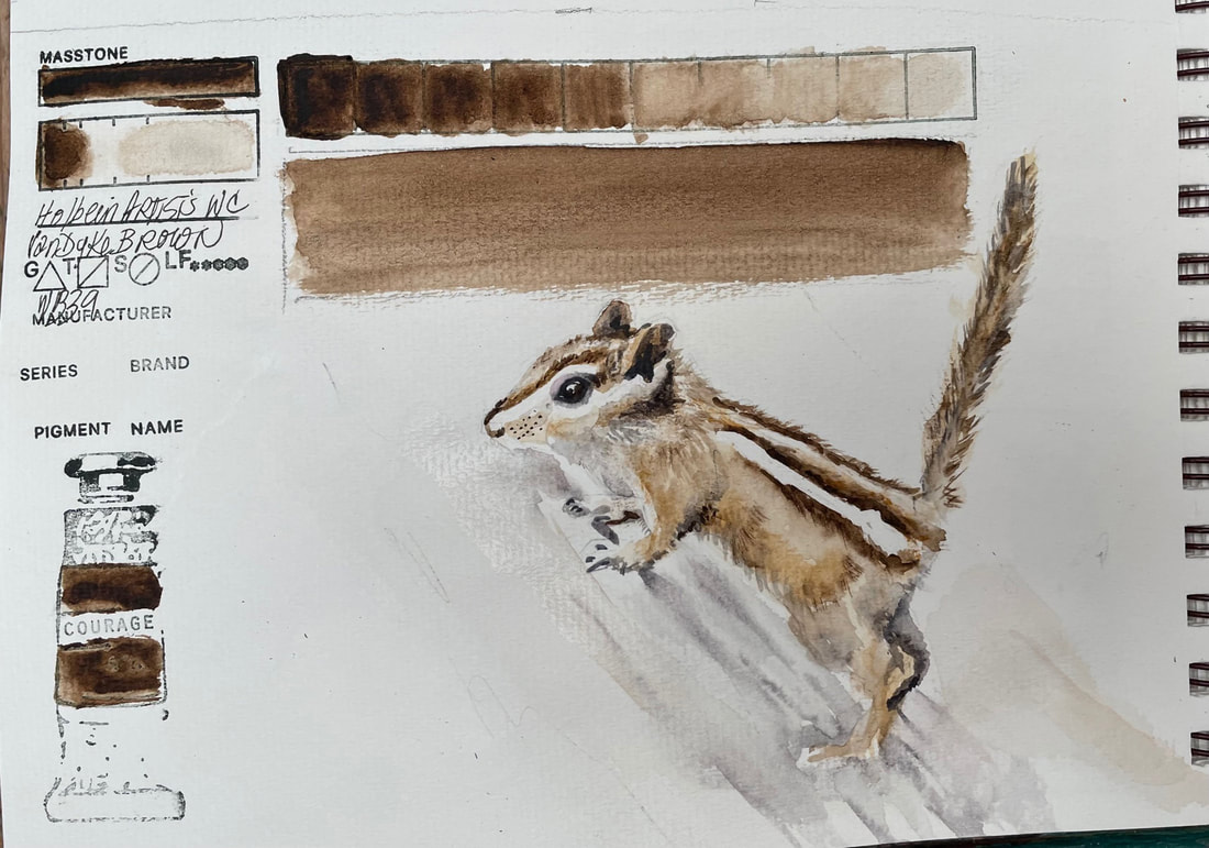
VANDYKE BROWNHolbein makes a VanDyke Brown as does Winsor Newton and both are great for creating shadows, adding depth. I noticed just now that when I swatch tested the other brand of this color, I also did so with a chipmunk as subject matter. I guess VanDyke Brown is then "Chipmunk" colored.
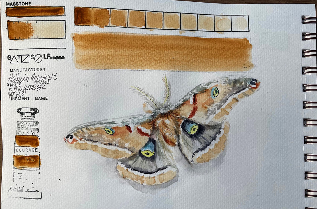
RAW UMBERHolbein Watercolor is a brand with a long reputation. Originally introduced in the early 1920’s, Holbein Artist Watercolor is a transparent watercolor that handles differently than other brands and more like Japanese Watercolors. Their website says that it is more finely ground than any other watercolor and not produced with ox-gall. They follow that statement up with a pretty strong claim about its being the reason for the fine handling quality of their pigments. And after playing for an afternoon with Raw Umber, I'd say they back it up well. This one at least was lovely to work with, layered beautifully, is transparent and a very consistent pigment.
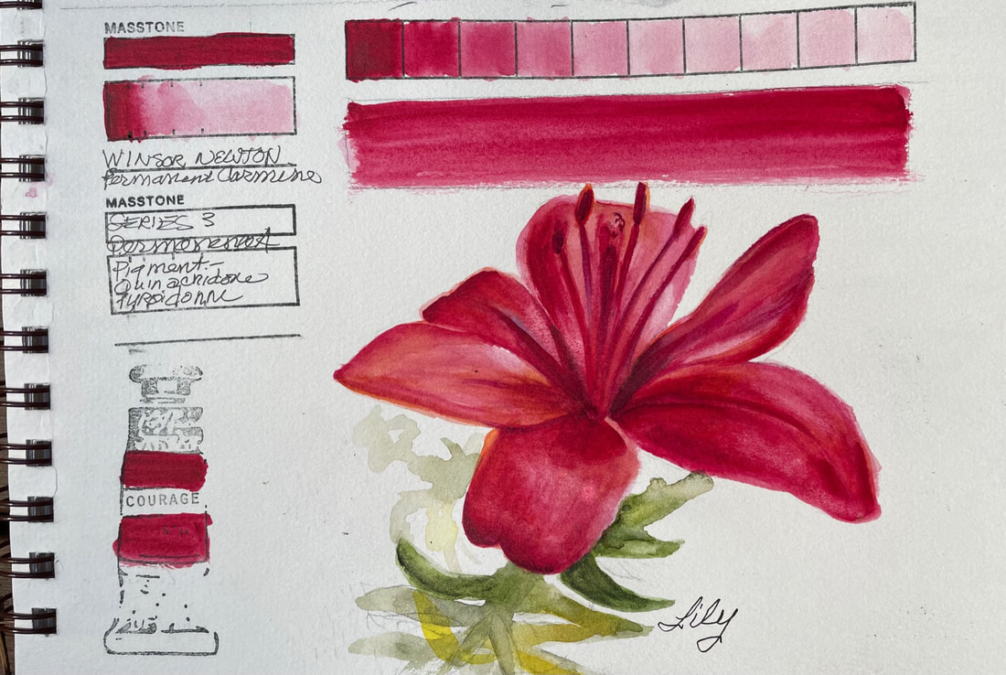
PERMANENT CARMINEWinsor Newton's Permanent Carmine is a jewel like pigment that layers beautifully. It builds to a deep ruby red after beginning as a baby soft pink. "In Antiquity, Carmine was made from thousands of crushed kermes insects." according to the Winsor Newton Website.
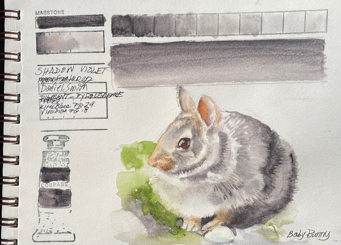
SHADOW VIOLETDaniel Smith's Shadow Violet is a complicated pigment that on the surface appears a smooth gray-mauve. On closer examination it displays a fascinating granulation, especially when applied in more than a light wash. In mass tone, Shadow Violet is a deep warm violet , shifting to a warm glow in thin applications. Shadow Violet's transparency makes it a great for glazing. I needed little else to paint this little bunny.
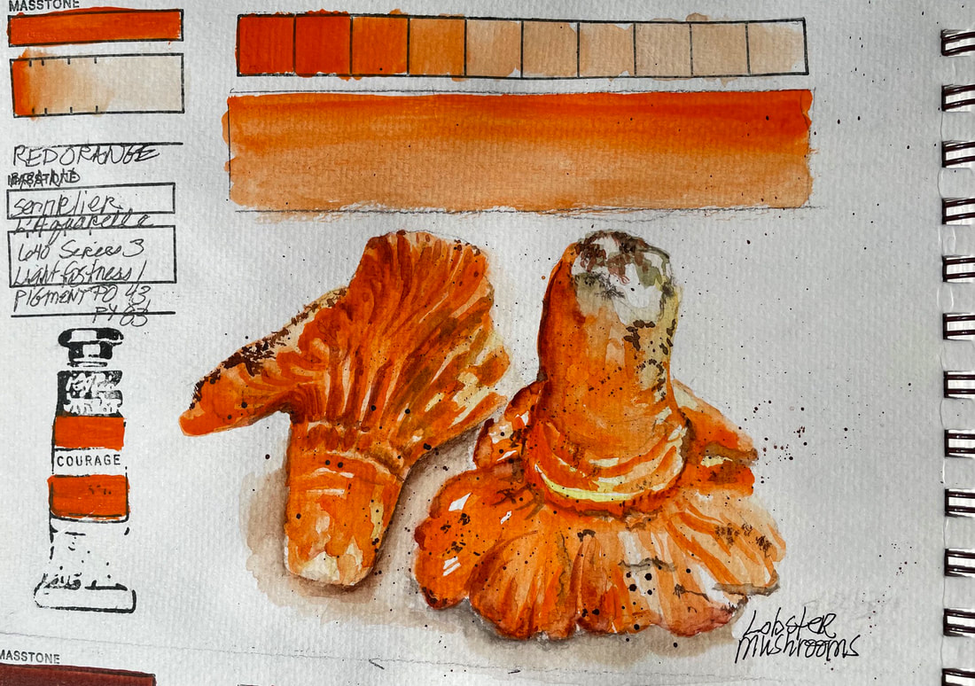
RED ORANGESennlier L'aguarelle Watercolors, made with honey as their binder, are a very different experience to paint with. The pigments feel somehow more luxurious than those with other binders, but perhaps it is my imagination. Add to the unfamiliarity of the paint and its consistency, the fact that it is extremely hot here in the Pacific Northwest at the moment and paint dries super fast. I love the color, and the consistency is a treat. I will paint on a cooler day next time.
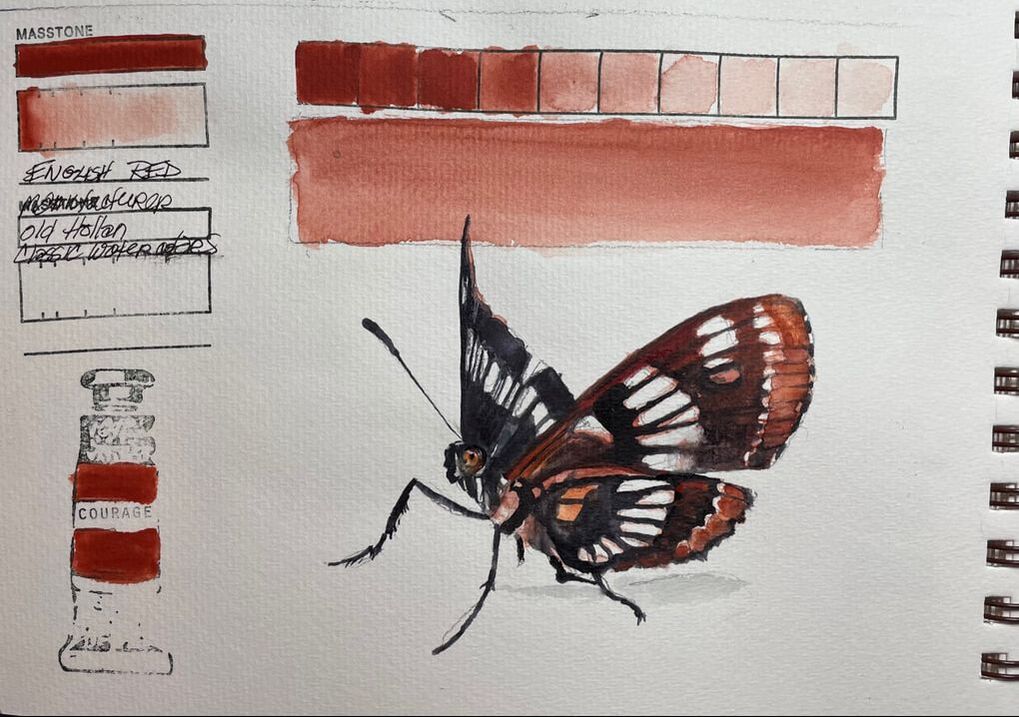
ENGLISH RED Old Holland English Red is unique in several ways. Semi-opaque to opaque, rich earthy reddish brown, this pigment doesn't wash down easily. It's consistency is hard to report on as my tube is very old and I may not be getting a good representation of what it is really like to work with. But the color was lovely mixed with black and worked well for this Mourning Cloak Butterfly.
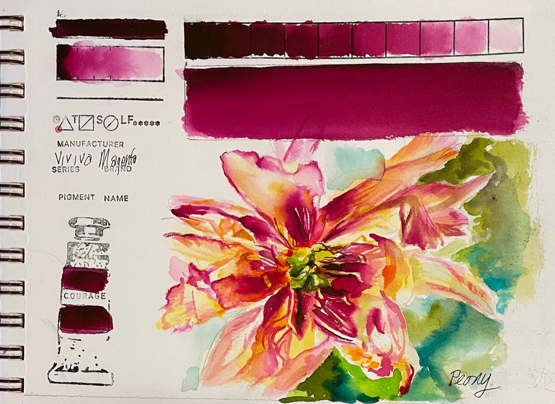 MAGENTAWell we have made it to the end of the full palette of Viviva Colorsheets. And fitting that the last color I tried, Magenta, is so beautiful. This red violet is warm for a magenta and is magic mixed with their yellow ochre. I found it the perfect combo for to capture the end of this peonies radiant bloom. The two colors lit the delicate shimmering petals from the inside out and replicated the torchlike essence of its passing beauty.
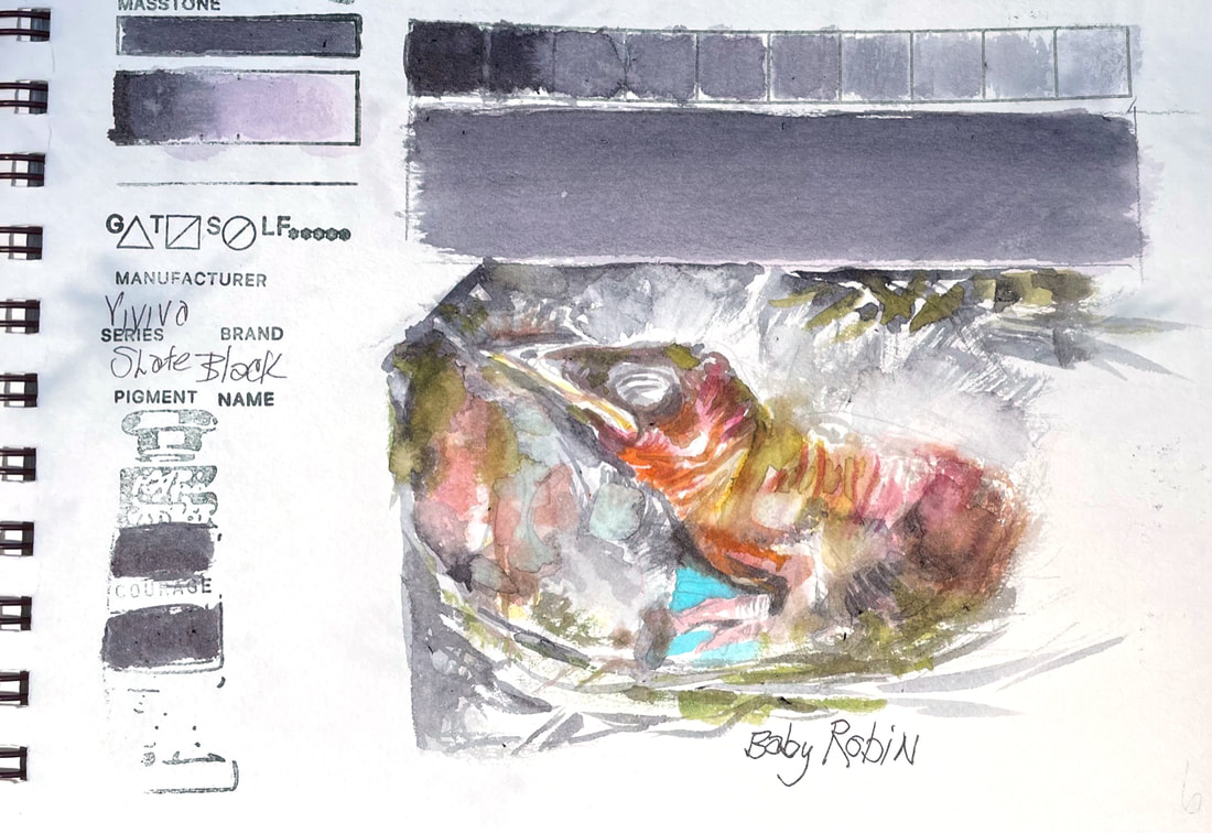 SLATE BLACKI needed this Viviva Colorsheet neutral today. Slate Black is dark charcoal on the cool side of gray and neutralizes any color mixed with. I have a close eye on a robin's nest that is well within my view on my way to the garage and while I try not to disturb mother robin, I just can't help peeking. This amazing process from laying the brilliant blue eggs to the hatch of little wrinkled fuzzy babies is a sight to behold. I feel honored to be a witness to the daily miracles of this robin family. Having Slate Black in my arsenal of colors today was exactly what I needed to help express all the colors, wrinkles and bird beginnings happening in that nest.
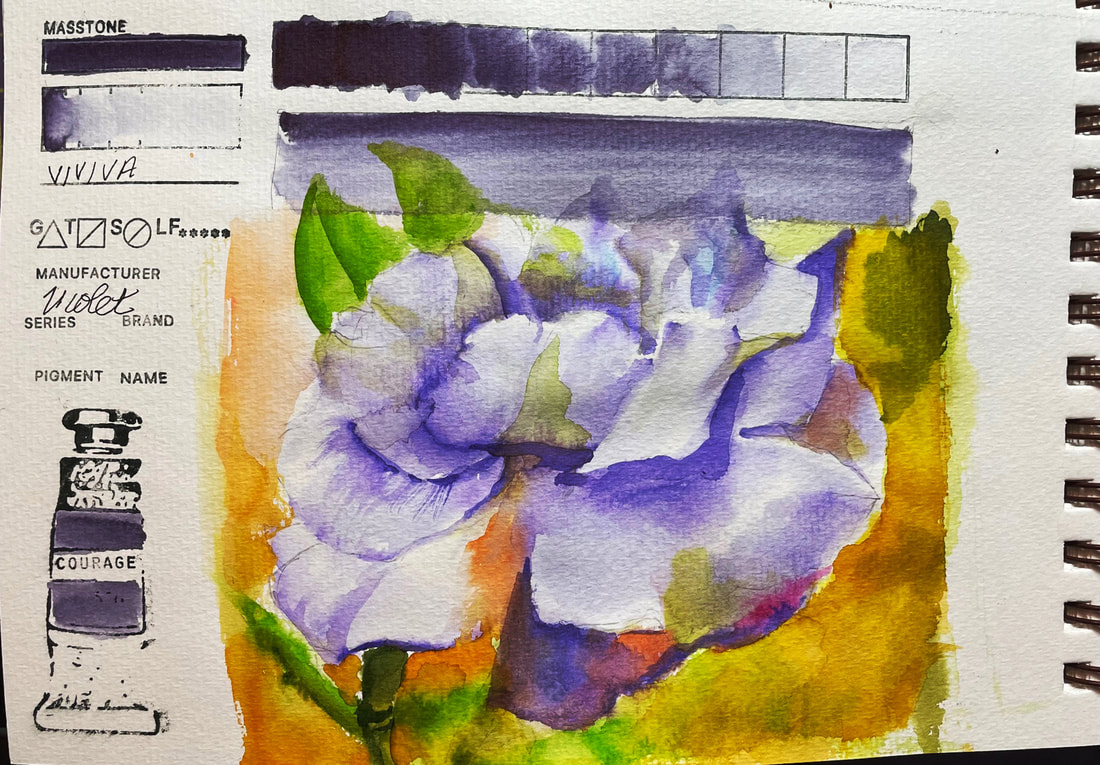 VIOLETViolet one of the Viviva Colorsheets purples, is a unique color. It has a bit of a randomness in the way it lays down, depending on the location of the dip you make onto the sheet with your water laden brush. Often it is truly violet, but in some situations it reports back as an amethyst or dusky gray. The inconsistency doesn't bother me, it adds interest, but it is difficult to control. In the case of this rose, and through no fault of the paint, but entirely the fault of the artist, I lost control in a big way. When I first began this challenge I committed to posting whatever I painted each day. I am posting this, and I am trying to be okay with putting it out there for all to see. I am still learning and I hope I never stop.
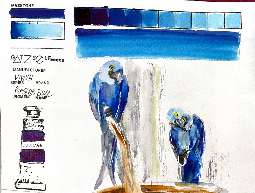 PERSIAN BLUEViviva Colorsheets provides a basic blue, akin to Ultramarine blue here with their Persian Blue. Another strong, transparent color, this blue fills the gap where a cooler blue is needed. What a fun way to get to paint the Hyacinth Macaw from our local Issaquah Zoo. Their plumage is a clear bright, cobalt blue with gray undersides and the strong yellow markings of their bare skin around the eyes is striking against the Persian Blue I used here. Their 45 inch wingspan and 3 foot long body make for an impressive presence of blueness.
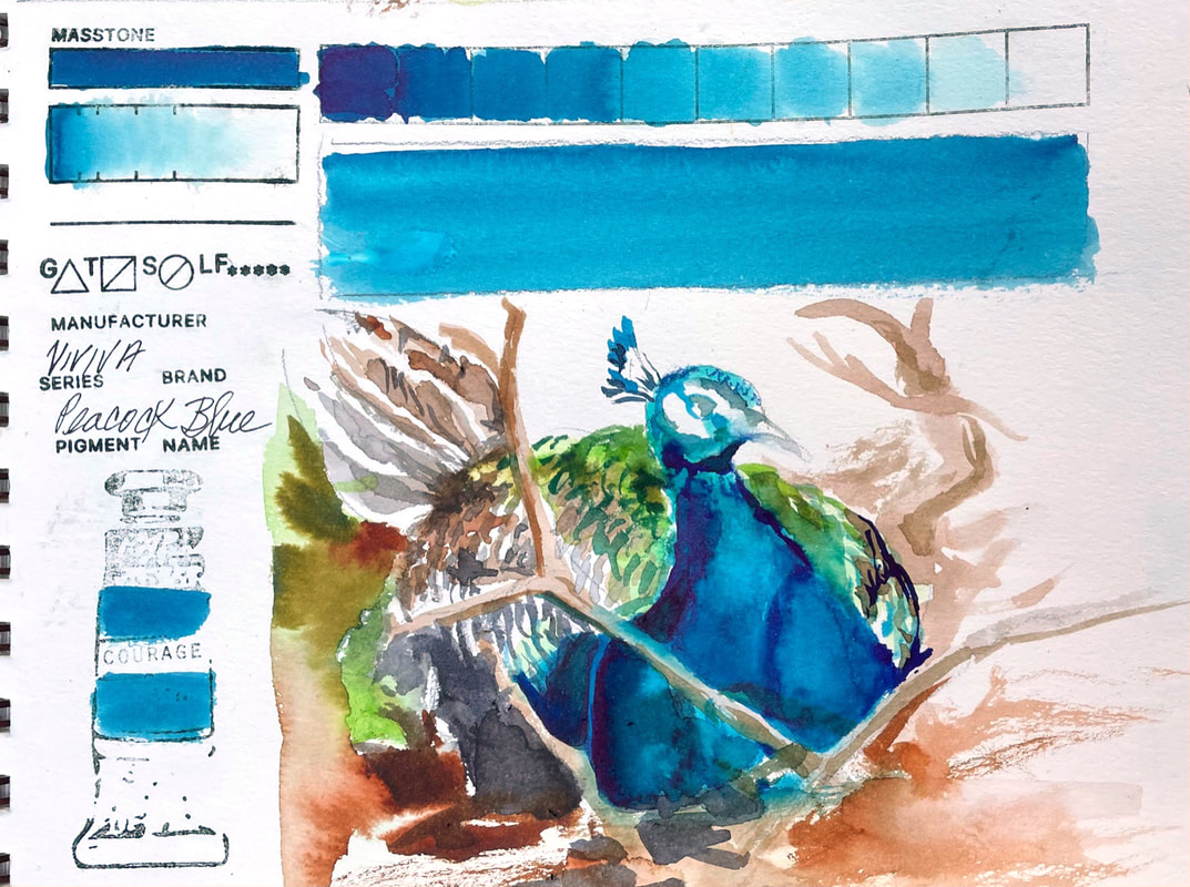 PEACOCK BLUEViviva makes this gorgeous blue colorsheet that is close to cerulean blue and the warmer blue version of their original set of colors. They have cool range blues as well but this follows up the blue green viridian nicely. And just because of its name, I had to use it for the peacock my grandson and I found at the local zoo laying way back in the bushes in a nice cool place.
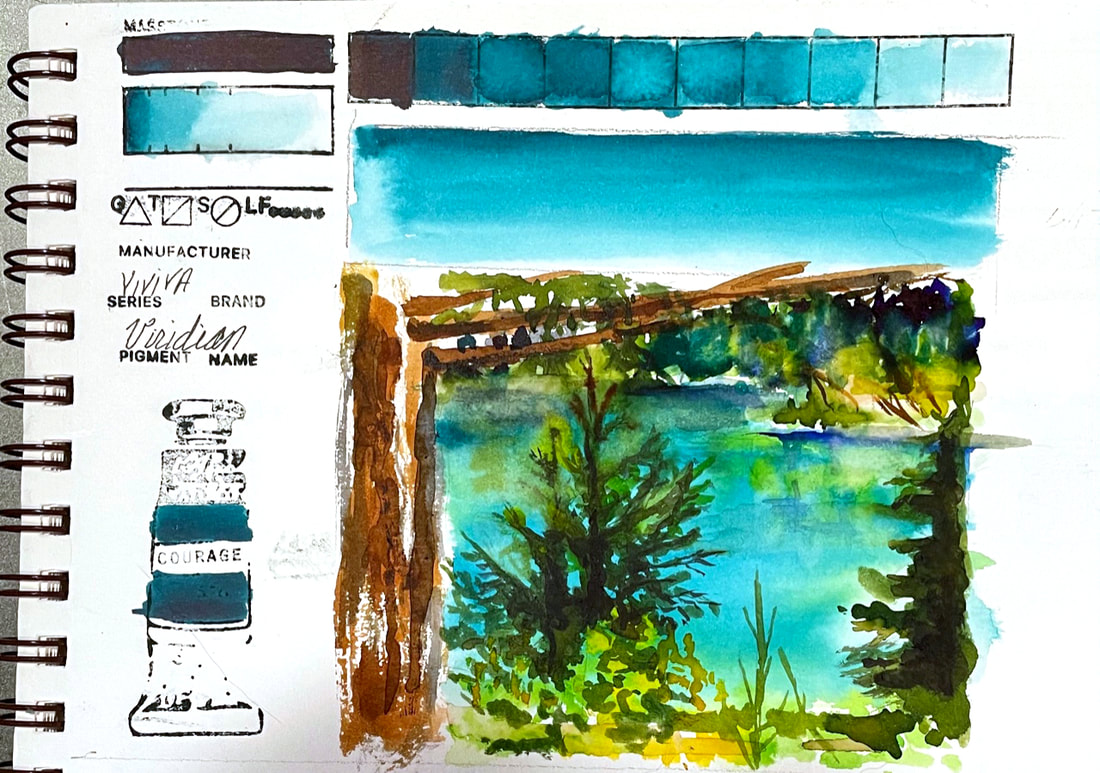 VIRIDIANViviva Colorsheets Viridian is a lovely turquoise bluish green that is strong and staining. I don't normally paint landscapes, but this scene from a trip east of the mountains to Cle Elum Washington had such strong colors that I really wanted to try to capture that gorgeous turquoise water.
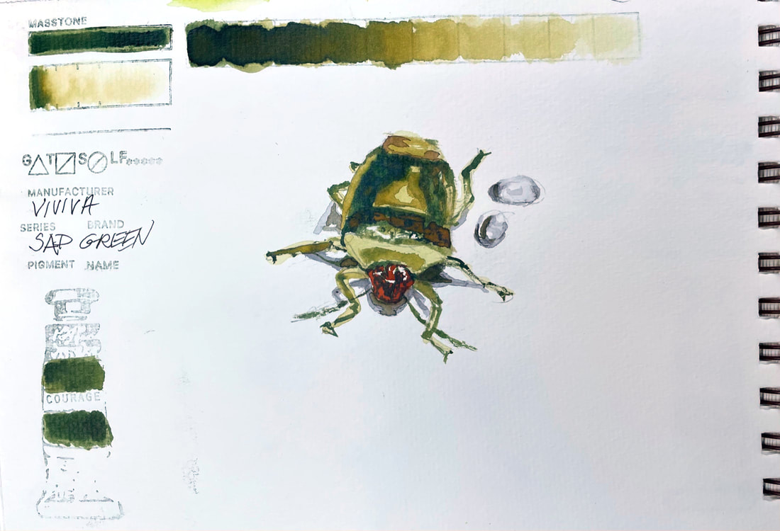 SAP GREENViviva's Sap Green lives in the neighborhood with Green Gold, Olive Green and some of the earth tones in my estimation. A versatile warm and earthy green, this would fill many buckets if you needed one green and were in the field. True to the Viviva form of delivering intense saturated color, I was able to use very little else and still indicate the spectrum of greens this little bug was adorned with. I suspect this guy is some sort of a stink bug, although he did not match any of the dozens of images a general Google search netted. I found dozens rampantly devouring my lilacs. When I brought freshly cut blossoms into the sink to wash them off they beetles scattered all over the kitchen. Lesson learned, I now do the rinsing in the garage sink.
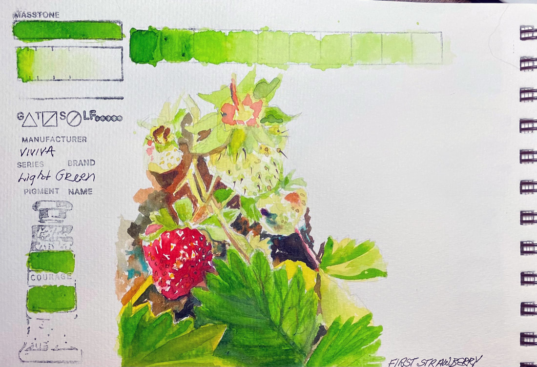 LIGHT GREENViviva Colorsheets Original set has a couple of greens, in both cool and warm directions. This clear and bright spring green is versatile and my favorite for the range it provides. There other greens are the extreme of warm or cool, this one rides happily down the middle.
I was able to get a very pale, brand new strawberry green out of Light Green and with the addition of a little bit of yellow, was happy with the way I was able to render image today of the fresh discovery of the first strawberries of the summer out in my garden today. |
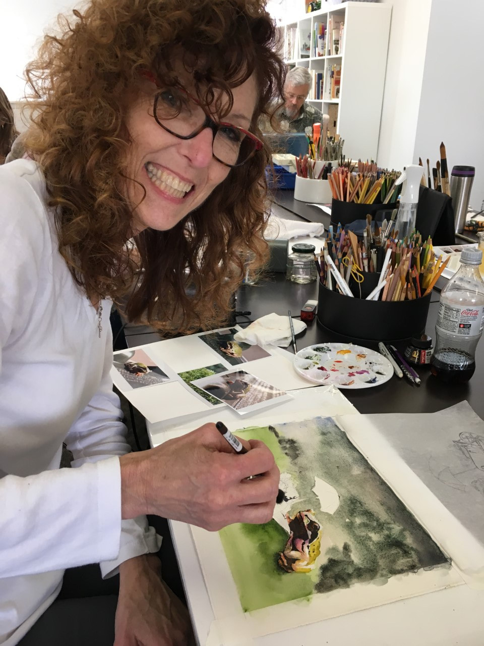
SOUL“I am a contemplative artist who has trouble accessing verbal skills. Finding the right words to talk about the amazing things I observe around me can be frustrating. It is much more natural for me to pick up a paintbrush, some embroidery floss or my camera when I wish to share some new discovery. The artwork I create is meant to be enjoyed on whatever level the viewer experiences it and not layered with complex meaning. Feathers, fur, flowers and the incredible variation I find in wildlife not only inspire me, but compel me to share every nuance with you. Archives
July 2024
|
 RSS Feed