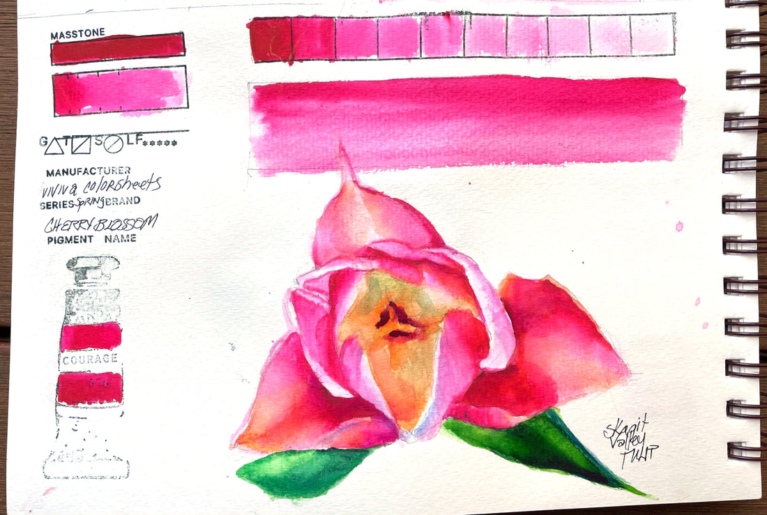
CHERRY BLOSSOMCherry Blossom, the second in my swatches from my new set of Viviva Color Sheets, this one from the "Spring Set" is quite similar to the color tested yesterday, Vivid Red, but a wee bit pinker and reminiscent of Opera Rose. Like Opera Rose, a wash of this pigment over the top of other colors gives new zing to the color it overlays.
As with Vivid Red, this is another intense, staining pigment but with a little effort can be lifted somewhat, but not back to white very easily. Over time, I am sure I will get used to the differences, like the propensity to blooms, but not until you have walked away, cheeky little tricksters. I was able to soften edges a bit easier today than the first try at my new color sheets. I do love the bright, cheery colors they produce so far.
0 Comments
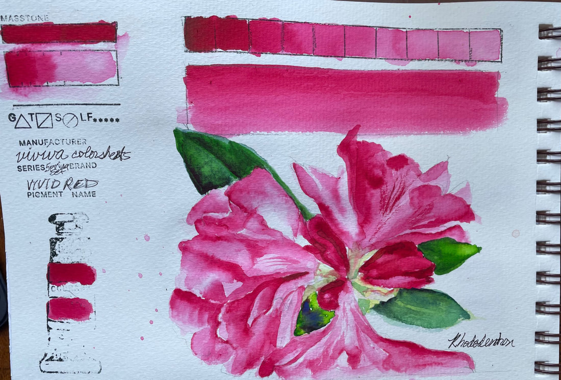
VIVID REDVaVa Voom Viviva Vivid Red, say that three times fast. Today I began swatching the full range of Viviva colors in my hands, currently about 30. This is a brand new product for me, little pads of "color sheets" imbued with very vivid, transparent watercolor that has been baked onto the sheet and magically transforms when activated with a water brush into pigment. It then dries right back up and you can tuck the whole paper palette pad and water brush conveniently in your pocket or purse. Perfect for a sketchbook artist, right?? I choose Vivid Red to begin with because it is the color of an also new to me Rhododendron that just exploded into bright red lollipop bouquet yesterday,
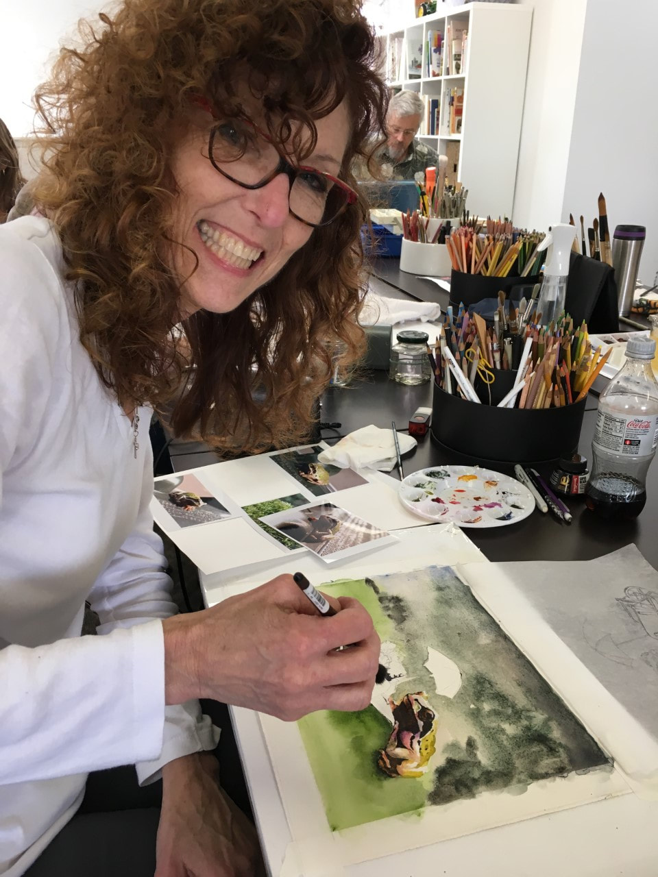
I don't have much in the way of technical data for you yet, but I can say my first experience with viviva color sheets has been enjoyable. I had a bit of a learning curve to begin with as the consistency is of course quiet different than what I was used to, water to paint (chip) was hard to ascertain initially, but I was feeling more confident as the sketch moved along. I found the value range to be had excellent and the ability to layer wash over wash over wash outstanding. But inherent in their nature, and likely by design, they pigment dries in a hurry. I found it a little difficult to lift this color anyway and I imagine that is due to the intensity and its ability to stain. But after a little time playing, I found work arounds and ways to reactivate a layer to some degree to at least soften an edge that had dried before I got to it in the first pass. What is extraordinary about this set of color sheets is that I can now jump right into a watercolor sketch in my little book the minute I hit the trail. I am sure I will have more to say as I work my way through the two sets I have, but for now, kudos to Viviva Color, innovative and creative. Here is a link to their site so you can see for yourself.
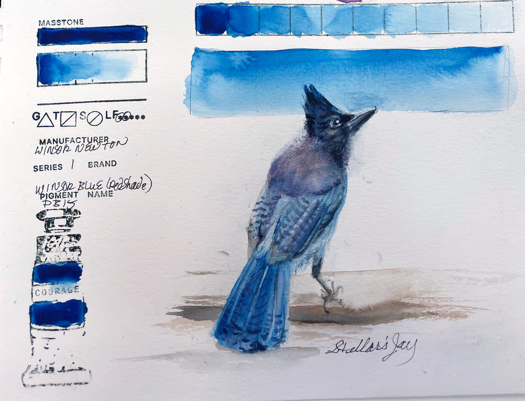
WINSOR BLUE (RED SHADE)Winsor Blue, Red Shade is an intense blue, with great tinting ability and similar to Phthalo blue, with red undertones. This pigment is transparent and a stainer, although it is possible to lift the color a bit. According to their website, Winsor & Newton first launched this color in 1938 and Winsor Blue Green Shade a few years later.
The phthalocyanine family of colors were first chemically synthesized late in the 1920's. Winsor Blue, created to replace Prussian blue, has many of the same properties, including its intensity. It mixes very well with other colors, here I used it with Turner Artist Color's Purple Gromwell and I would caution that as with other Phthalo Blues and Prussian Blue, Winsor Blue does want to dominate. Blue is always one of my favorite colors and this one is no exception.
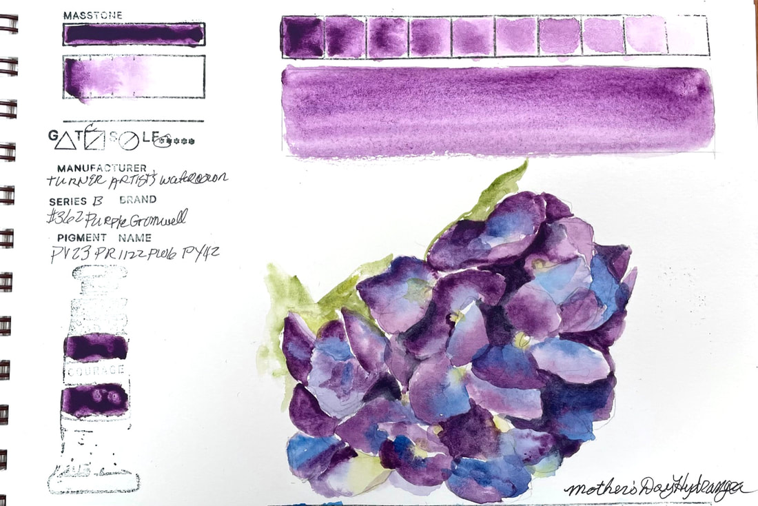
PURPLE GROMWELLTurner Artist's Watercolor Purple Gromwell is a mixture of four pigments, and most likely, for that reason, I have not found any one comparable color in other brands. It is a lovely red violet that moves toward a bluer purple and blends beautifully with blues. This color was the perfect option for the hydrangea my daughter and grandchildren sent me today for mother's day. It filled my heart to receive and painting it just added to the joy.
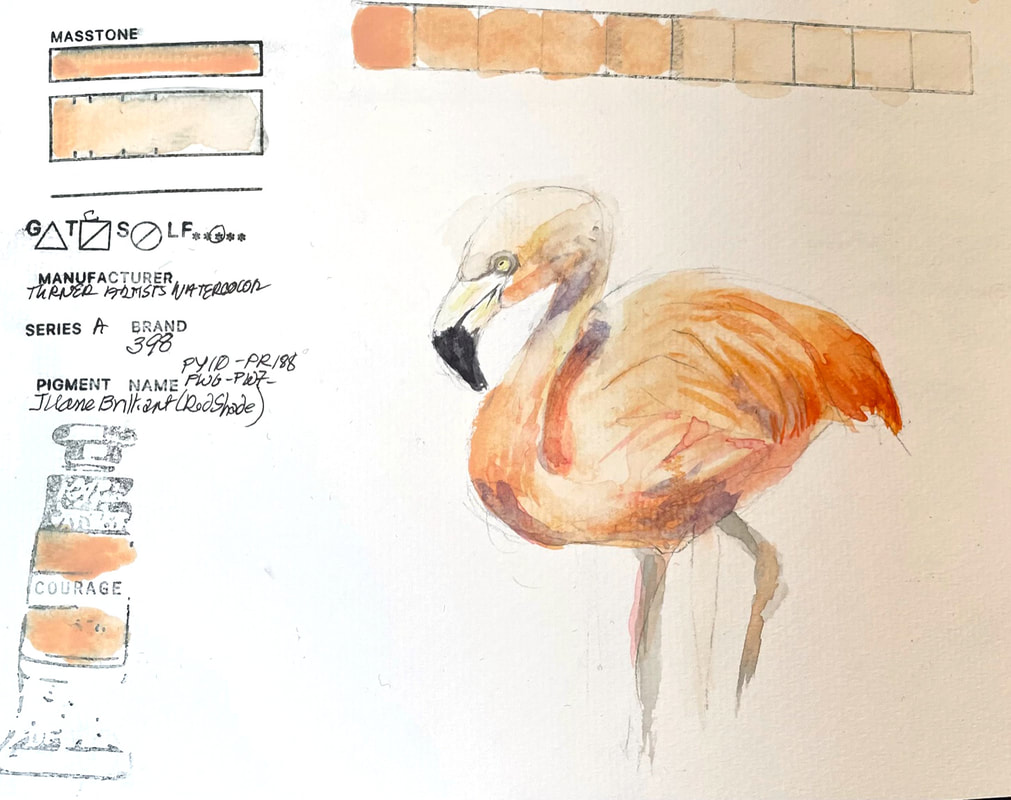
JAUNE BRILLIANT (RED SHADE)Turner Artist's Watercolor Brand Juane Brilliant is an opaque salmon-ish shade that is lovely for a painting of flamingoes, at least the paler variety. Their website mentions that the mixture of pigments used to get to this color includes both titanium and zinc white which I guess is what is making Juane Brilliant almost chalky in it's strongest mix of pigment to water. Interesting color.
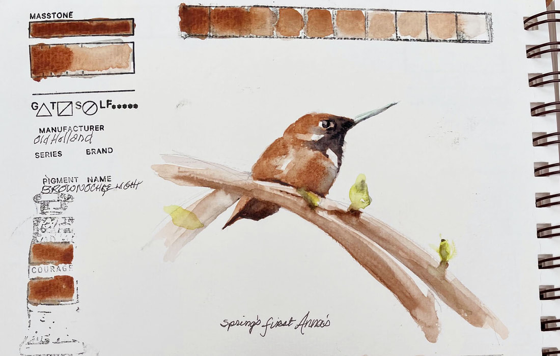
BROWN OCHRE LIGHTOld Holland Brown Ochre Light lands somewhere between Yellow Ochre and Burnt Sienna and is slightly transparent. It lifts and layers well but does granulate as much as it lays down a bit blotchy. My tube is of Brown Ochre Light is fairly old and may be the cause of the "separation" not granulation that I was experiencing.
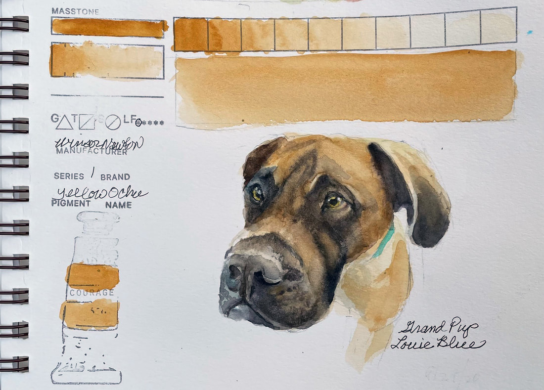
YELLOW OCHREWinsor Newton Yellow Ochre is a warm yellow. Originally made from natural iron oxides found in earth, it is one of the oldest pigments used by mankind. Yellow Ochre is one of my palette staples and always there for my neutral mixes. Winsor Newton's is more transparent than most brands and was easy to use as a glaze in this little quick sketch of my grand puppy, Louie Blue is much, much bigger now.
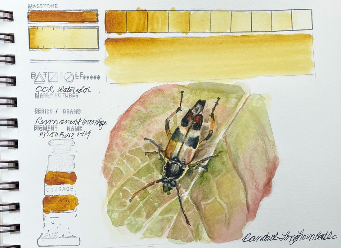
PERMANENT GAMBOGEQoR watercolor brand Permanent Gamboge is one of the 83 or so pigments in this relatively newish line of watercolor paints with a unique new binder. They are a Golden Company product and new to me. This particular yellow reminded me of a combination of New Gamboge by Daniel Smith and either cadmium yellow or raw sienna. In this quick sketch, rather than find an image that had a comparable yellow as its primary color, I chose to lay down a watery wash over the entire area and then add layers to build the colors of the leaf and beetle.
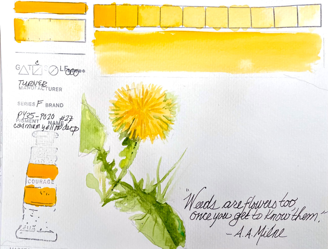
CADMIUM YELLOW DEEPTurner's version of this standard is pretty much the same as the others. If any different, perhaps in the watery version where it is a little bit less warm yellow.
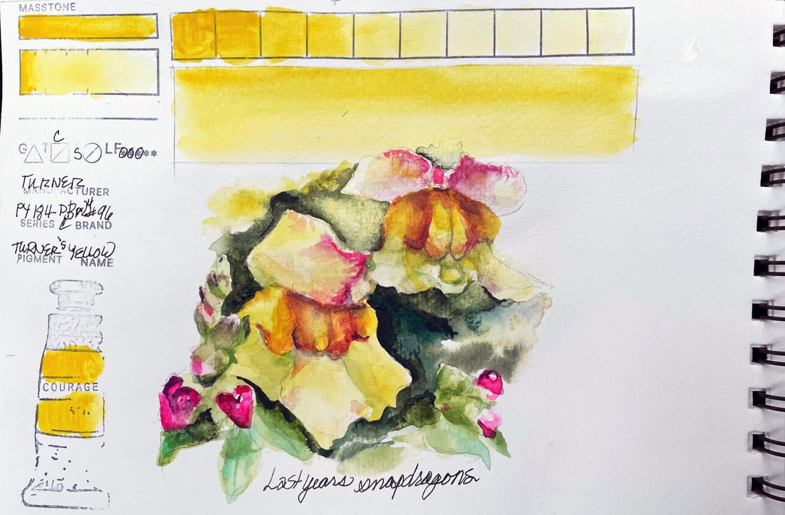
TURNER'S YELLOWTurner Artist Watercolors, Turner's Yellow has an interesting legend or mystery behind it. The history of Indian Yellow, one of the colors used by J.M.W. Turner, seems to be rich with contradictory stories about its origins. According to an article on the Artists Network Website "Turner's Mysterious Yellow" by John Hulsey and Ann Trusty, recounts the process of making Indian Yellow as recounted in a letter written by Mr. T. N. Mukharji sent to the Society of Arts in London in 1883 as follows "the making of Indian Yellow as consisting of collecting the urine of cattle left to roam in mango orchards in the Bihar province of India. In one version of this story it was said that the cows were made to urinate into buckets on command. The urine was then concentrated over fire, filtered through cloth and made into balls left to dry in the sun. Another version says that the urine was collected somehow, then mixed with clay and rolled into small balls of about three to four ounces." The mystery gets more complicated by other stories that tell of the banning of the Indian Yellow production due to cruelty to cows. A more recent author researched this story finding no basis to any banning of the pigments production. The article explains that the dispute over the veracity of that letter is further dispensed off when in "1839, M.J.F.L. Merinee wrote in the book, The Art of Painting in Oil and in Fresco, that the color may be extracted from a large shrub called memecylon tinctorium (used by natives for yellow dye) which exudes the smell of cow urine." This more acceptable origin is given more credence when in "1844 a German chemist, John Stenhouse, examined balls of the color and also concluded that it was of vegetable origin." Whether is was urine or a plant that smelled like it matters not. Turner's yellow is a delicate landing somewhere between Hansa Yellow light and a warmer, cadmium yellow.
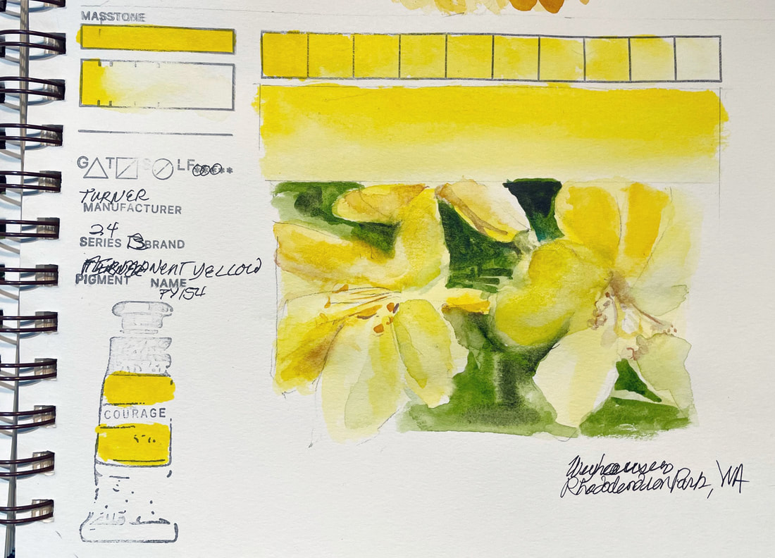
PERMANENT YELLOWTurner Watercolor's Permanent Yellow, similar to Hansa Yellow Light, is clear, bright and intense. According to their website their watercolors " combining the finest pure pigments and gum arabic with high lightfast ratings and superb transparency and flow" are a "true professional paint". I am not used to this brand, but purchased the color as one listed as valuable by one of my favorite botanical artists from the U.K. To be fair, I only played with this pigment for a few minutes, so my assessment may not be accurate. This yellow was free flowing as advertised and intense. But the water to pigment ratio and how it mingled with other colors was odd. At times it seemed to just stop in its tracks far sooner than I thought it would or almost repel other pigments. My verdict is not complete yet, I will make a few more swatch tests with other pigments by Turner lest it be about the pigment and not the brand.
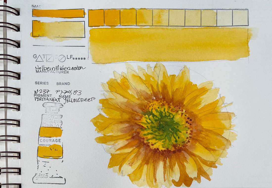
PERMANENT YELLOW DEEPHolbein's Permanent Yellow deep is made up of two pigments. PY74, Hansa Yellow, is considered superior to many others Hansa Yellows due to its finer particle size, the effect of which is its brilliance and transparency. It has high tinting strength. The second pigment Yellow 83, comes from a family of azo pigments called Diarylide. These yellow hued pigments were developed around 1940 and are a semi-opaque, somewhat staining, deep reddish yellow with good tinting strength, good lightfastness and permanence. However, it can fade in tints. Other Diarylide pigments are reported to have poor lightfastness, some completely fugitive.
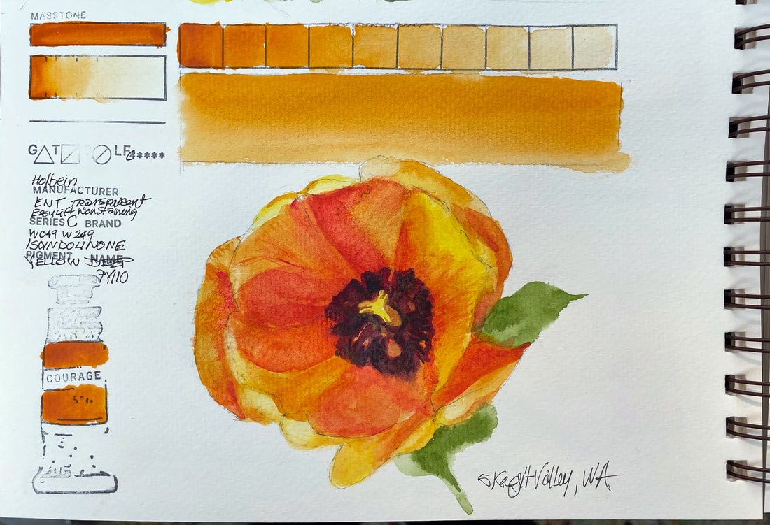
ISOINDOLINONE YELLOW DEEPHolbein Isoindolinone Yellow Deep, besides being an unpronounceable name, is similar to Quinacridone Gold or other deep warm yellows that border on orange. According to the Holbein website, it is more finely ground than other brands of watercolor and made "without ox-gall, animal by-products or other dispersing agents." They state that these are the qualities that help their pigments deliver "color of unequaled intensity, purity" and create beautiful transparent washes while gaining to deep, clean darks.
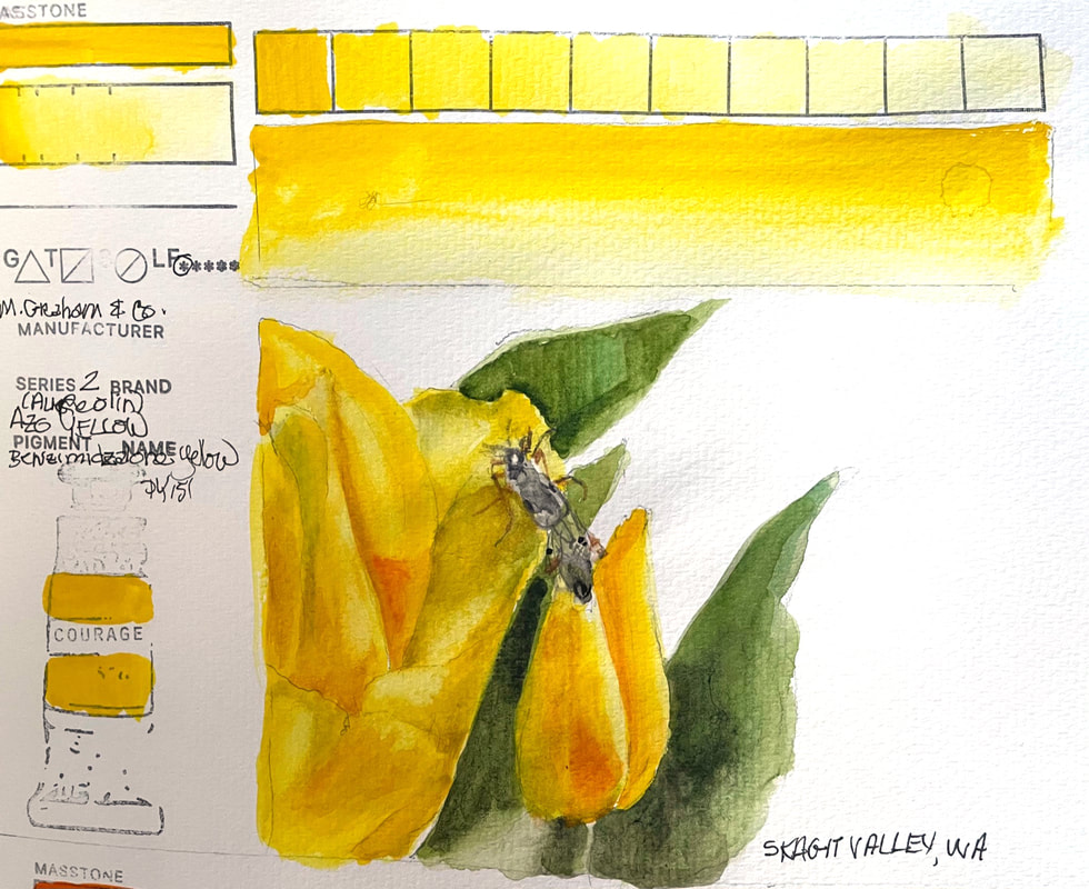
AZO YELLOW (AUREOLIN)M. Graham Azo Yellow, 018 is more transparent than Cadmium Yellow and more lightfast than Hansa Yellow according to their website. While it is a transparent pigment and staining, this strong warm yellow does not really granulate. I spent the morning in the tulip fields on my hands and knees looking at yellow tulips among others so of course, this yellow beauty, host to a couple of bugs, begged for some Azo yellow.
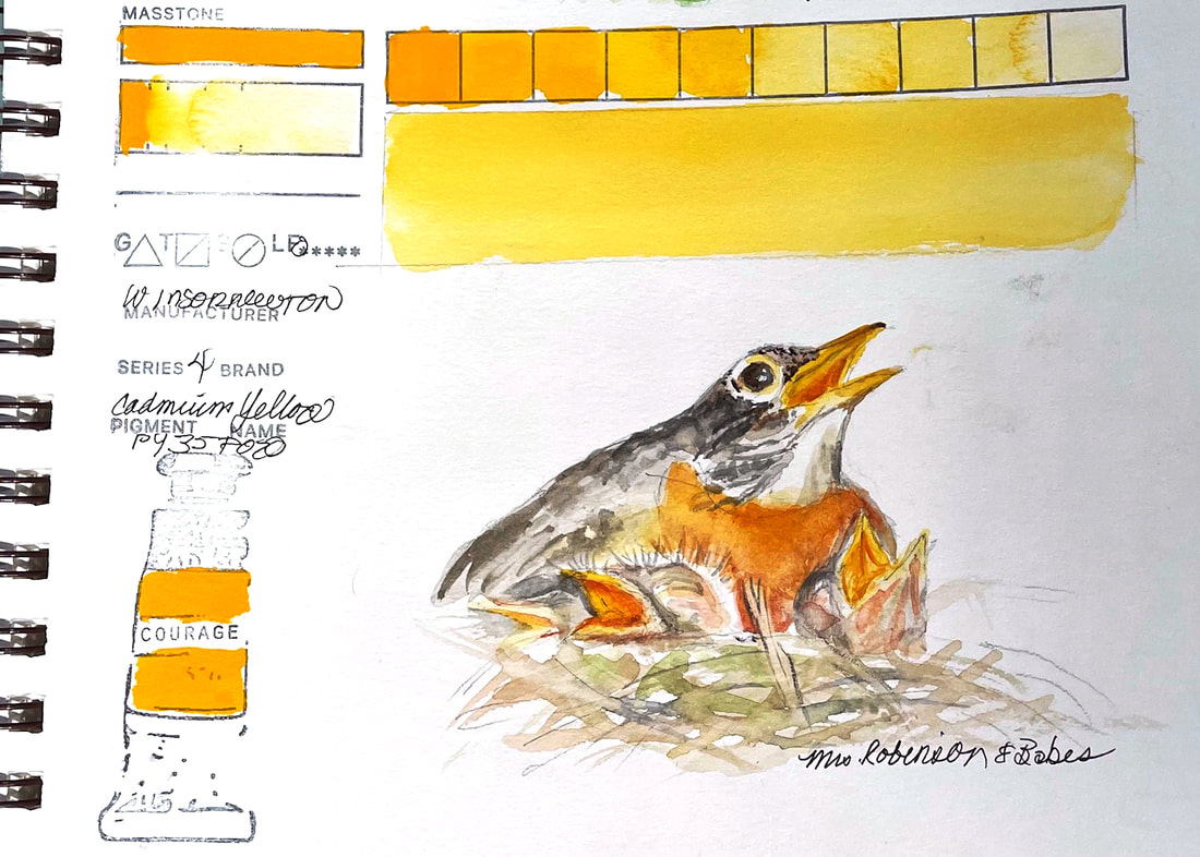
CADMIUM YELLOWWinsor Newton's Cadmium yellow is a deep, yellow with a warm red tinge applied full strength. Strong and clean pigment. Cadmium-based pigments are permanent lightfast and brilliant. Cadmium Yellow was discovered by German chemist Friedrich Stromeyer in 1817 and was popular in the UK in the latter half of the 19th century. Mondrian often used cadmium yellow and cadmium red in his limited palette which also included flake white, ivory black and French ultramarine. Before cadmium yellow, artists used orpiment – a rich, deep yellow from the mineral orpiment. Its name is from the Latin auripigmentum (aurum “gold”, pigmentum “pigment”). Orpiment was popular with Renaissance painters including Titian. Unfortunately it was an arsenic sulfide compound and toxic. Cadmium Yellow was the replacement for orpiment.
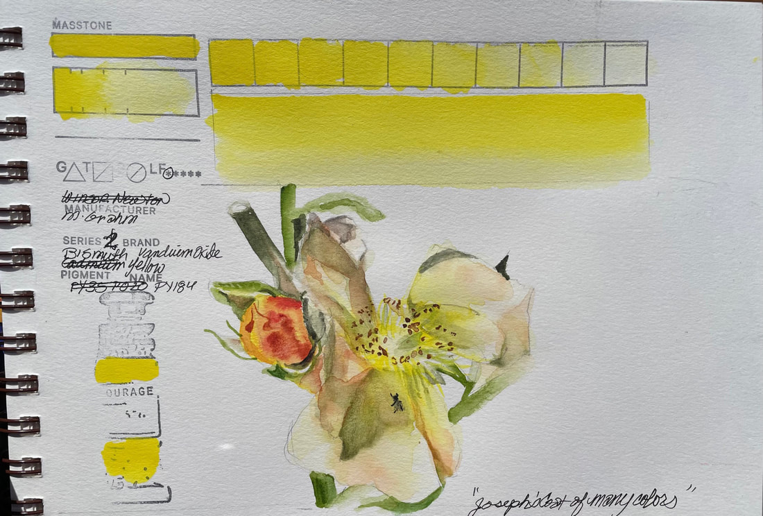
BISMUTH YELLOW M. Graham's Bismuth Vanadium Oxide 019 is a bright lemon yellow, greener than Hansa Yellow and more lightfast. M. Graham watercolors are made with Northwest blackberry honey, according to their website. Bismuth Yellow washes down to a very pale, delicate yellow. perfect for this aging rose blossom.
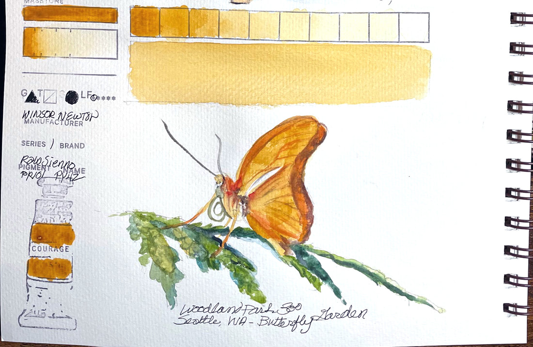
RAW SIENNAWinsor Newton Raw Sienna comes from iron ore or ferric oxide which occurs naturally in clay. Yellow ochres are generally opaque, but siennas are more transparent. Sienna, one of he earliest pigments used for painting and found in prehistoric cave art. During the Renaissance in the 14th century sienna was further developed for painting. Sienna gets its name from the city it was produced in, the Italian city-state of Siena. The Italians stretched the range of hues of Sienna by roasting it, leading to the creation of raw sienna and burnt sienna pigments. Raw Sienna is a bright brown pigment but Winsor Newton's Sienna has brilliant golden undertones and is transparent, layering beautifully with other earth tones if laid over the top.
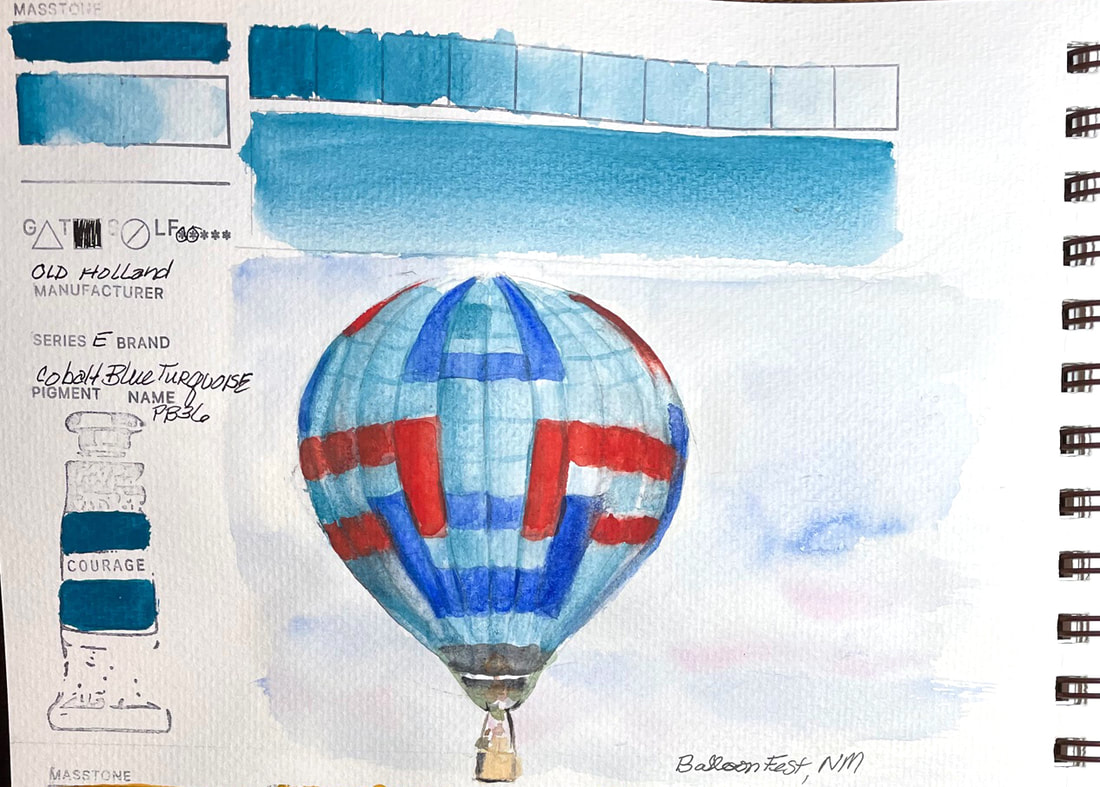
COBALT BLUE TURQUOISEOld Holland Cobalt Blue Turquoise is opaque and in its full tube strength, a deep turquoise. It washes down and lifts and can produce a wide range of values. This pigment is classifieds as oxides of cobalt and chromium. I am no chemist but that sounds like the explanation for this blue shifts to a greener side than most cobalts.
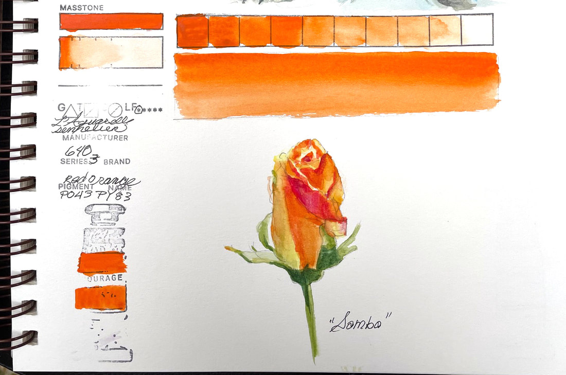
RED ORANGESennelier Red Orange, a fiery orange with excellent lightfastness, like all Sennelier has honey has a binder that improves the longevity of the paint. Radiant, creamy, bright sunset colored orange is fabulous for this favorite rose of mine, "Samba".
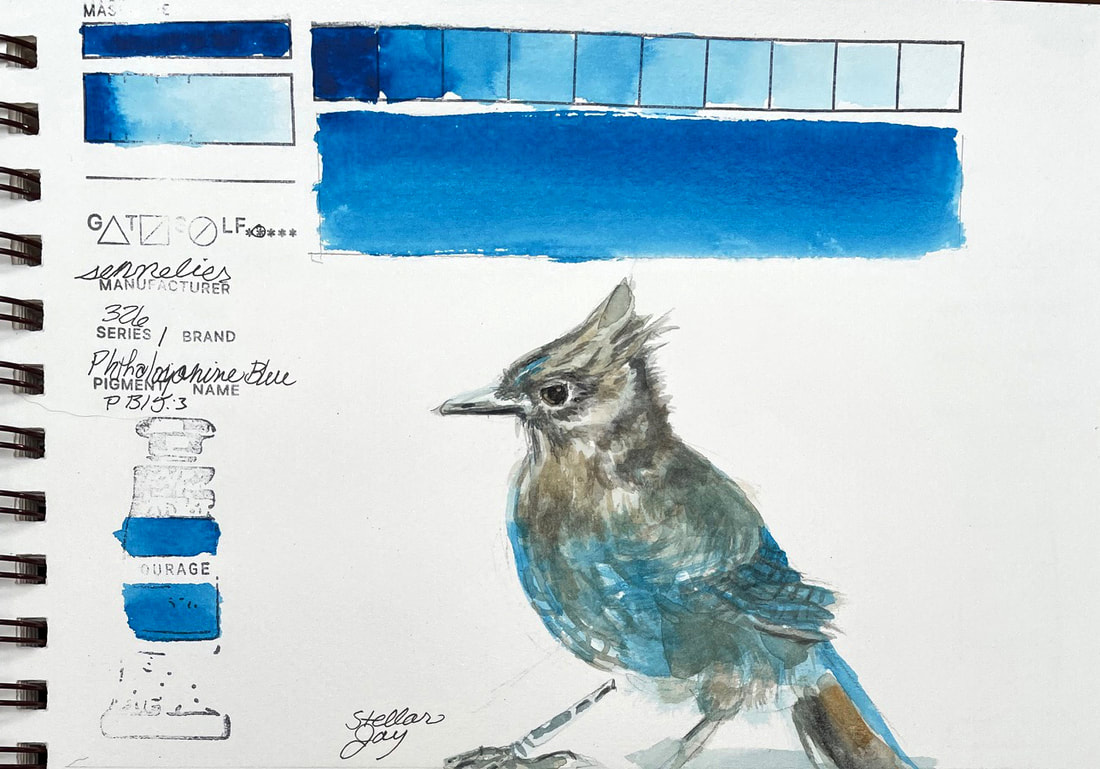
PHTHALOCYANINE BLUEPhthalocyanine Blue is lightfast, transparent and an intense blue. The chemical composition of Phthalocyanine contains copper and shifts this blue toward the green side. Chemists in London in 1935 developed the pigment they gave the trade name Monastral Blue by accidental discovery. The kettle containing a Bristish dye plant was a byproduct of the dye process. The discovery filled the demand from printers for a pigment to replace Prussian Blue.
|
SOUL“I am a contemplative artist who has trouble accessing verbal skills. Finding the right words to talk about the amazing things I observe around me can be frustrating. It is much more natural for me to pick up a paintbrush, some embroidery floss or my camera when I wish to share some new discovery. The artwork I create is meant to be enjoyed on whatever level the viewer experiences it and not layered with complex meaning. Feathers, fur, flowers and the incredible variation I find in wildlife not only inspire me, but compel me to share every nuance with you. Archives
April 2024
|
 RSS Feed